We found 3 issuescosting you truston direktadesign.com.
Watch the inspection.
We navigate your site the way customers would. Idle time is skipped.
How the composite score works
The overall score is a weighted average of the categories: Getting the product 40%, Trust before buying 20%, Mobile 15%, Speed 15%, and Polish and audit 10%. It is never more than 10 points above the Getting the product score, because a product a visitor cannot get cannot score well on anything else, and never more than 25 points above the weakest category, so one badly broken area is not averaged away. Any issue in the main list caps it at 89, so a score above 90 means nothing worth fixing was found.
Each category starts at 100 and stays there when nothing was found in it, whether or not the inspection got that far. Each distinct verified finding deducts 60 points for a serious problem on the path from arriving to paying, 40 for another serious problem, 30, 15 or 8 by high, medium or low severity otherwise, and 4 for an audit finding. Each additional finding below the list takes 2 more points off the overall score, up to 10. Scores stop at zero and round to whole numbers. The formula is fixed and versioned, so the same saved evidence always receives the same score.
The sample audit's Direkta reply card is empty on phones
Phone visitors checking the sample audit to see what Direkta does see a blank answer where the product's reply should be.
On the home page at phone width, the demo shows the "direkta audit figma.com/design/.../Fieldnote" prompt, then a reply card with only the "Direkta" header and a large blank body below it. The empty card appears in three separate captures at different scroll positions, including one with the card fully in view. A buyer reads this demo at the understand step to judge the product's output, and right under it the page says "Real output from Fieldnote".
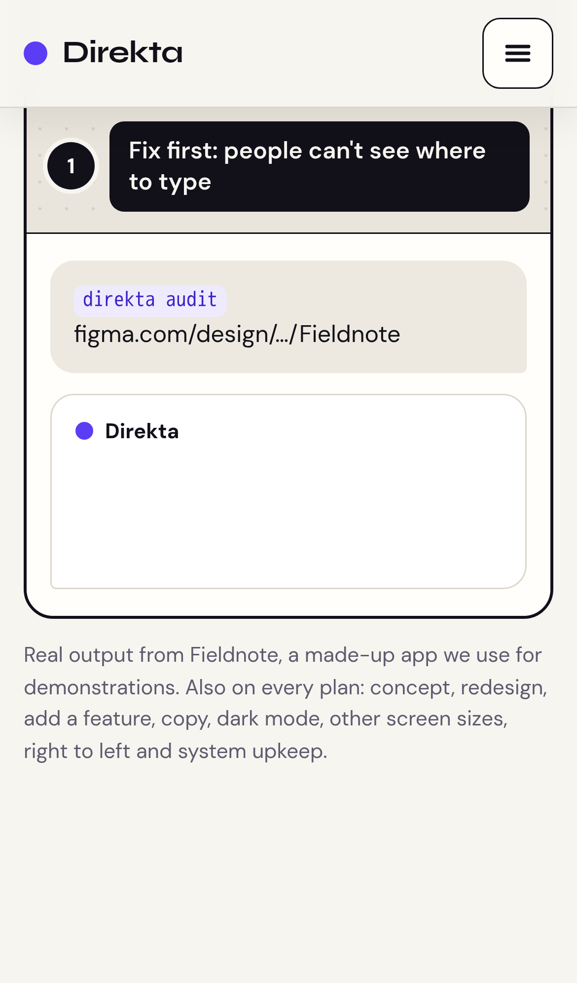
Try it: Open the home page on a 390px wide phone, scroll to the sample audit demo, and look at the white Direkta card under the "direkta audit" prompt. Its body stays blank.
The home page took 4.9s to show its main content on desktop
On one desktop load of /, Largest Contentful Paint came in at 4.9 seconds, above the 4 second line Google classes as poor. This is the page where a new visitor works out what Direkta does before looking at plans. A second load did not go over the threshold, so the delay is intermittent rather than constant.
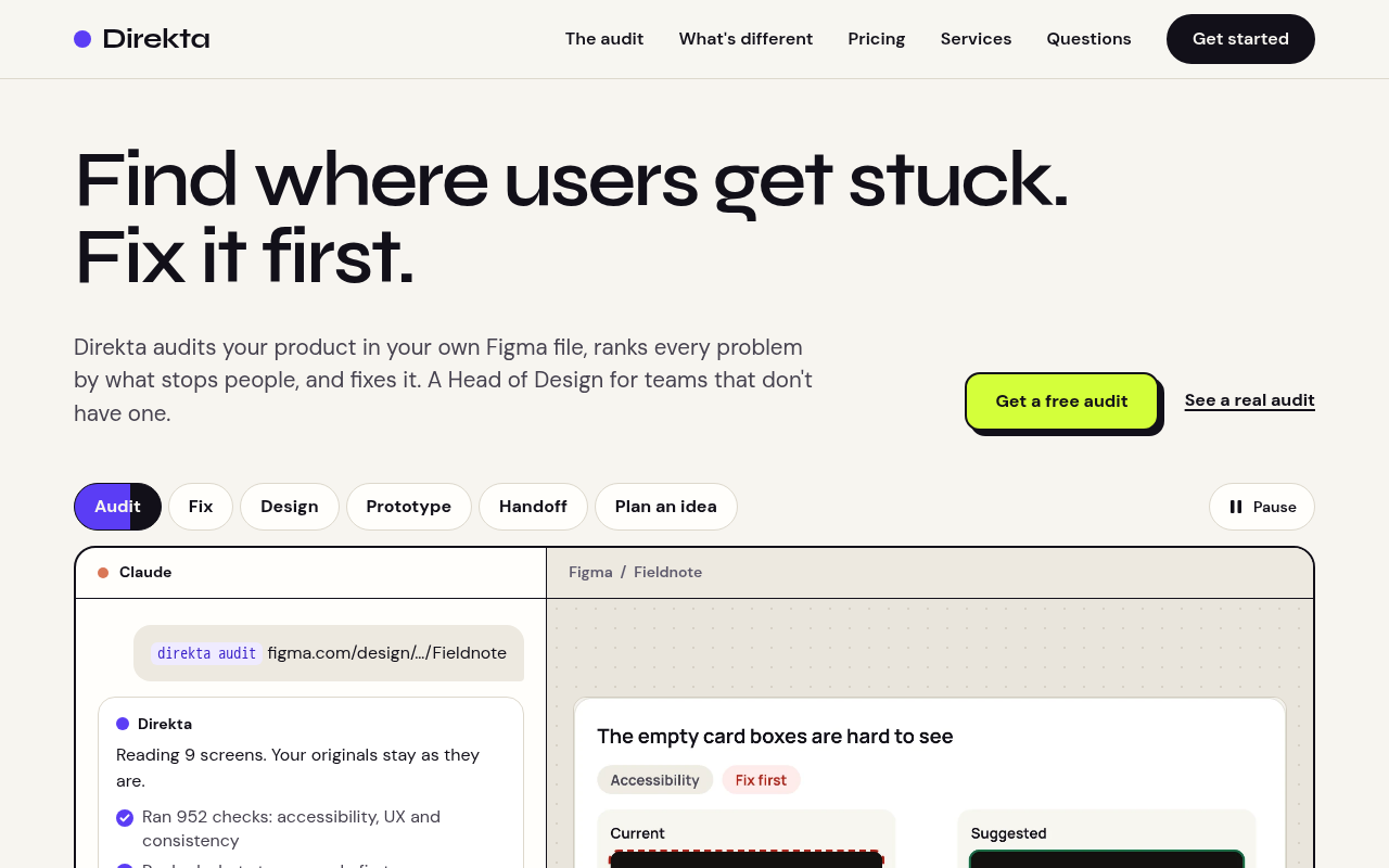
The pause button covers the Prototype demo tab on phones
Phone visitors who look at the hero demo to see what Direkta does find a cut-off tab that reads "Proto" on a product that sells design fixes.
At 390px wide, the home page demo's pause button sits on top of the right part of the Prototype tab (button#t-proto). The label shows only "Proto" and the pill's right edge is cut off. Hit tests at the tab's right side reach the pause button, not the tab, so the right side of the tab and its focus outline are hidden. A buyer meets this in the hero, at the step where they decide whether the product is worth a free audit.
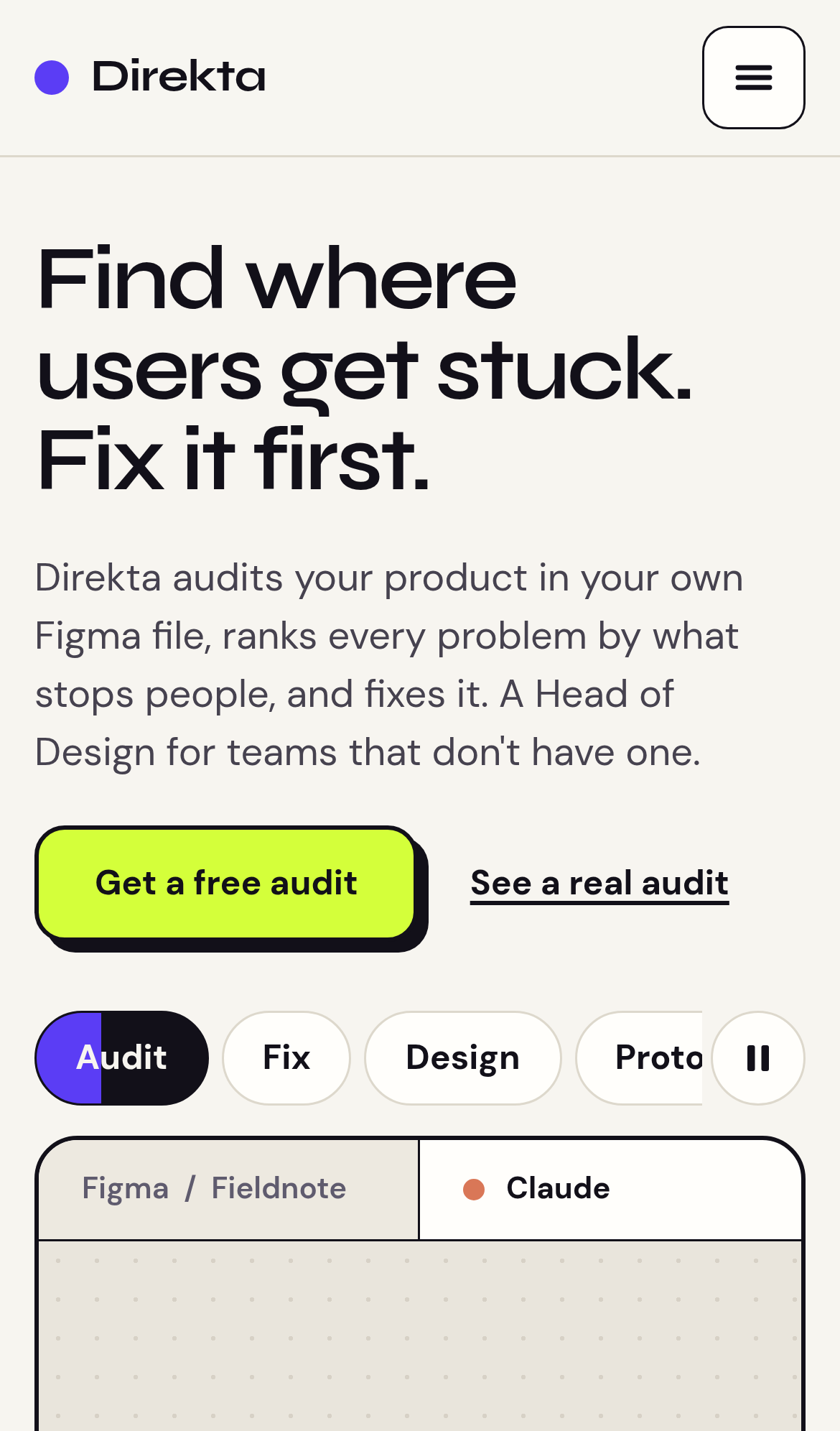
Try it: Open the home page at 390px width and look at the demo tabs under "Get a free audit". The last tab reads "Proto" and the pause button covers its right edge.
The Figma link field on the free-audit form is unstyled
On the #start form, the "Figma link to the flow" field appears when a visitor chooses "Free audit of one flow". It renders as a thin browser-default box in a small system font. Every other field on the form is a tall, rounded, cream input in the project font, and on desktop this box sits about 20px tall next to the 50px "Plan or service" select. Buyers reach this field at the last step before sending the request, and its small text can also make iPhone Safari zoom in when the field is tapped.
The Prototype demo tab is cut off by the pause button on phones
On /index at a 390px phone width, the demo's "Prototype" tab (button#t-proto, 117px wide) runs under the pause button, so the label reads "Proto" and taps on its right half land on button.pause. The demo still auto-plays and the tab's left half still responds, so this is a visual flaw in the product demo, not a blocked step.
The home page lacks six security headers and one cookie flag
The response from https://direktadesign.com/ is missing Strict-Transport-Security, Content-Security-Policy, CSP frame-ancestors or X-Frame-Options, X-Content-Type-Options: nosniff, Referrer-Policy, and Cross-Origin-Resource-Policy. _scc_session lack Secure or HttpOnly.
Probie fixes this for you.
Stop customers hitting the same friction. Connect your codebase and Probie reproduces these failures, tests the fix, and opens a pull request for your review.
Sign up and get this fixedFree inspection
What should Probie inspect next?
Enter a project URL. There is nothing to install.
Probie checks every issue twice, respects robots.txt, and backs off at bot challenges.
Enter an address and we will email the report card link.