We found 4 issuescosting you truston teardownai.app.
Watch the inspection.
We navigate your site the way customers would. Idle time is skipped.
How the composite score works
The overall score is a weighted average of the categories: Getting the product 40%, Trust before buying 20%, Mobile 15%, Speed 15%, and Polish and audit 10%. It is never more than 10 points above the Getting the product score, because a product a visitor cannot get cannot score well on anything else, and never more than 25 points above the weakest category, so one badly broken area is not averaged away. Any issue in the main list caps it at 89, so a score above 90 means nothing worth fixing was found.
Each category starts at 100 and stays there when nothing was found in it, whether or not the inspection got that far. Each distinct verified finding deducts 60 points for a serious problem on the path from arriving to paying, 40 for another serious problem, 30, 15 or 8 by high, medium or low severity otherwise, and 4 for an audit finding. Each additional finding below the list takes 2 more points off the overall score, up to 10. Scores stop at zero and round to whole numbers. The formula is fixed and versioned, so the same saved evidence always receives the same score.
Yearly Pro and Max save less than the "2 months free" label says
Buyers who pick the yearly Pro or Max plan because of the "2 months free" label get a smaller discount than the label promises.
The yearly toggle in the home page pricing section says "2 MONTHS FREE". Pro is $12.99/mo or $144.99/yr, which saves $10.89, less than one month. Max is $29.99/mo or $319.99/yr, which saves about 1.3 months, and only Starter ($5.99/mo vs $59.99/yr) actually saves about two months, so a buyer who checks the maths at the plan choice finds the headline discount does not hold for the plan marked Most Popular.
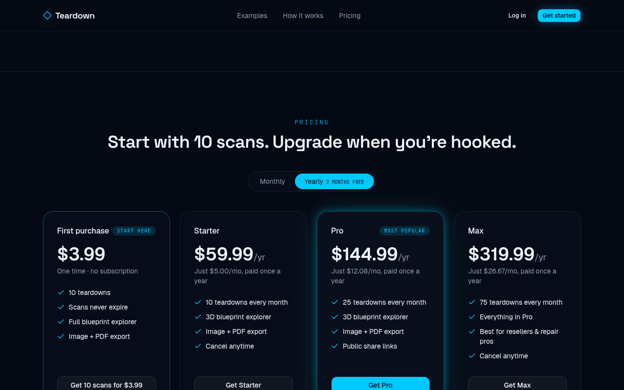
Try it: Open teardownai.app/#pricing and note the monthly Pro and Max prices. Switch to Yearly and compare $144.99 and $319.99 with ten monthly payments ($129.90 and $299.90).
The hero example behind "not guessed" is labeled as estimated
Visitors who open the home page's showcase engine find a guessed parts list right under a claim that results are grounded in real manuals.
The home page hero says "Grounded in real manuals, not guessed" next to the BMW engine blueprint, and that blueprint carries no estimate label. Its full teardown opens with "Estimated, no exact match found", every part is tagged "estimated", and the notes include "Turbocharger count and configuration are unknown." and "Fuel type, injector design and operating pressure are unknown." for a named BMW 328i N20 engine. A buyer checks this example at the understand step, just before the $3.99 first purchase, and it contradicts the accuracy promise.
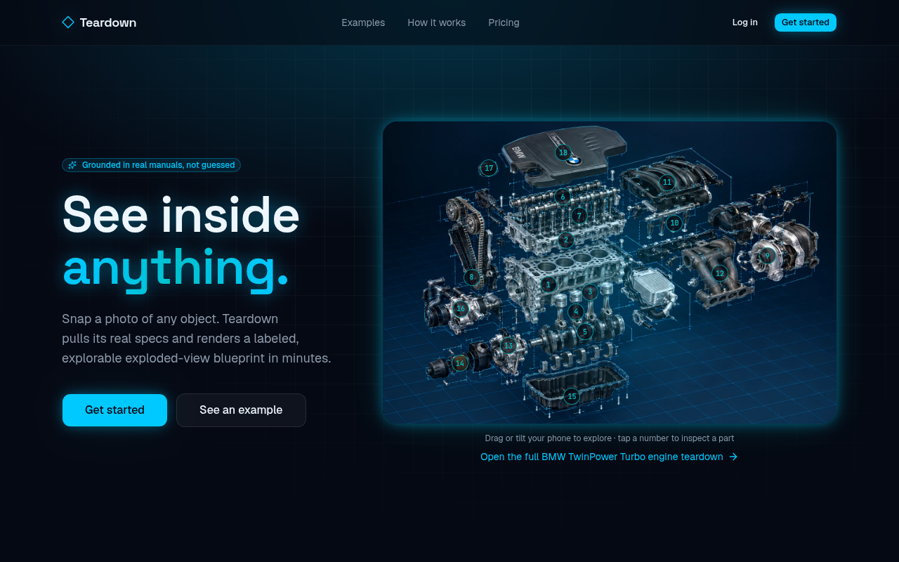
Try it: Open the home page and note the "Grounded in real manuals, not guessed" badge. Click "Open the full BMW TwinPower Turbo engine teardown" and read the "Estimated, no exact match found" badge and the part notes.
Clicking Get Pro opens a signup page that offers only the $3.99 pack
Visitors who choose Starter, Pro, Max or a scan pack reach a signup page that never mentions their plan and offers a different, no-subscription deal instead.
Every buy button in the pricing section points to the same plain /signup link, including Get Pro at $12.99/mo. That page says "Create your account · first 10 scans for $3.99, no subscription." and says nothing about the plan that was chosen. A buyer who meets this at signup can't tell whether they will get Pro or get pushed into the $3.99 pack first.
Try it: Open the home page pricing section and click Get Pro. Check that /signup opens with no plan in the URL and only the "first 10 scans for $3.99, no subscription" line.
Part markers on the phone example overlap and are hard to tap
Phone visitors trying the live example on the home page can tap the wrong part, and some part numbers sit almost fully hidden under others.
On a phone, the numbered part buttons in the home page example blueprints sit on top of each other. Part 1 "Engine block" has 2.8px of safe tap space against its neighbours, where 24px is the minimum. In the selector example, marker 6 sits under 10, marker 7 under 9, and 13 overlaps 14. The page asks visitors to "tap a number to inspect a part", so these overlaps hit the interactive demo that phone buyers use to decide what the product does.
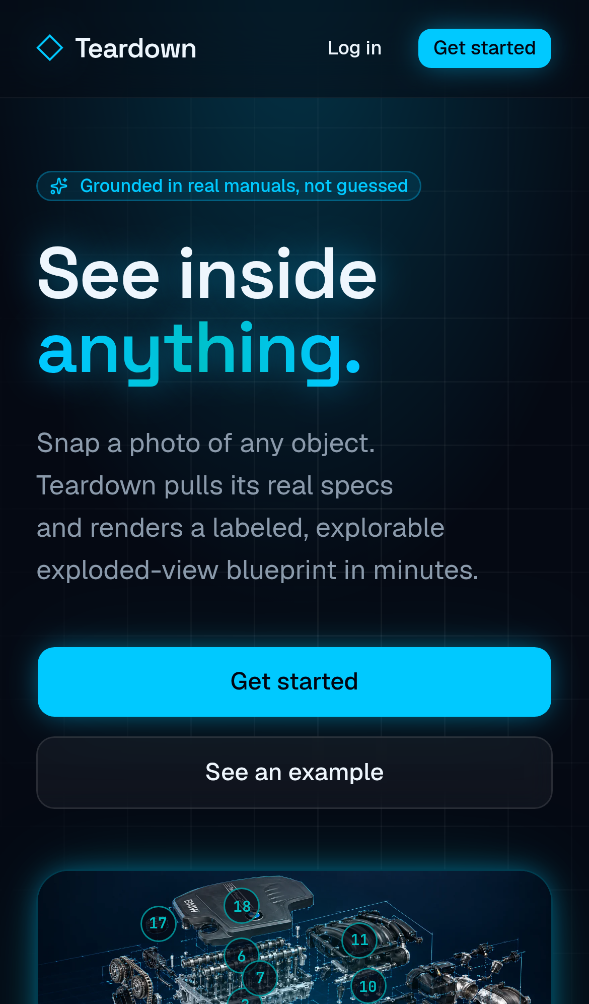
Try it: Open / on a 390px wide phone, scroll to the example blueprints, and try to tap parts 6 and 7 in the second example. The neighbouring markers get the tap instead.
The signup form fields carry no autocomplete hints
On /signup, none of the Name, Email and Password inputs has an autocomplete attribute. Without "name", "email" and "new-password", browsers and password managers have to guess what each field is for when a buyer creates an account. The form still works, and the field types give browsers a partial hint.
The home page response lacks a Cross-Origin-Resource-Policy header
The response from https://teardownai.app/ is missing Cross-Origin-Resource-Policy.
Privacy policy links rely on color alone to stand out
On /privacy, the "Settings" link and the [email protected] link use color #00c9ff against surrounding text at #8b9aab. That is a contrast of 1.47:1 where 3:1 is required, and the links have no underline. Readers with low color perception may not see that these are links.
Probie fixes this for you.
Stop customers hitting the same friction. Connect your codebase and Probie reproduces these failures, tests the fix, and opens a pull request for your review.
Sign up and get this fixedFree inspection
What should Probie inspect next?
Enter a project URL. There is nothing to install.
Probie checks every issue twice, respects robots.txt, and backs off at bot challenges.
Enter an address and we will email the report card link.