We found 3 issuescosting you truston stridehq.xyz.
Watch the inspection.
We navigate your site the way customers would. Idle time is skipped.
How the composite score works
The overall score is a weighted average of the categories: Getting the product 40%, Trust before buying 20%, Mobile 15%, Speed 15%, and Polish and audit 10%. It is never more than 10 points above the Getting the product score, because a product a visitor cannot get cannot score well on anything else, and never more than 25 points above the weakest category, so one badly broken area is not averaged away. Any issue in the main list caps it at 89, so a score above 90 means nothing worth fixing was found.
Each category starts at 100 and stays there when nothing was found in it, whether or not the inspection got that far. Each distinct verified finding deducts 60 points for a serious problem on the path from arriving to paying, 40 for another serious problem, 30, 15 or 8 by high, medium or low severity otherwise, and 4 for an audit finding. Each additional finding below the list takes 2 more points off the overall score, up to 10. Scores stop at zero and round to whole numbers. The formula is fixed and versioned, so the same saved evidence always receives the same score.
Full Journey claims everything in Senior+ but has lower limits
Parents weighing the $249 Full Journey plan against the $149/yr Senior+ plan cannot tell which AI limits they would actually be paying for.
On /pricing, the $249 "Best Value" Full Journey card says "Everything in Senior+" and then lists "150 AI messages & 15 essay reviews/mo". The Senior+ card lists "250 AI messages & 25 essay reviews/mo", and the Compare plans table gives Full Journey the lower limits too. A buyer meets this at the pricing step, just as they choose the most expensive plan.
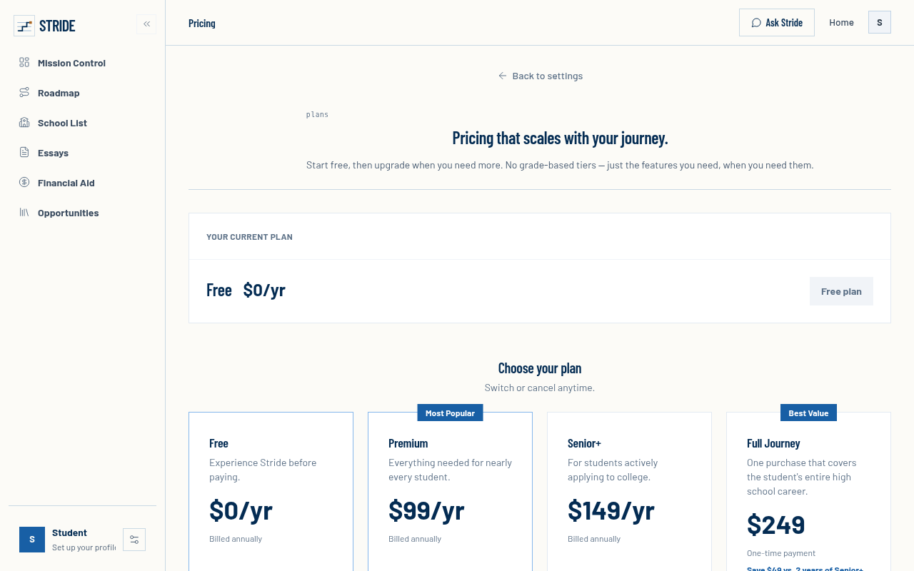
Try it: Open /pricing and compare the feature lists on the Senior+ and Full Journey cards. Then check the AI messages and essay review rows in the Compare plans table.
Choose Premium sends new visitors to a sign-in card with no sign-up link
When a logged-out visitor clicks "Choose Premium" on /pricing, they land on /sign-in?redirect_url=%2Fpricing. That card says "Welcome back / Continue your Stride roadmap." and offers only Continue with Google, an email field and Continue, with no "Sign up" or "Create account" link. Buyers meet this at the upgrade step, and the redirect goes back to /pricing, so the plan they picked is not carried forward.
Try it: In a private window, open /pricing and click Choose Premium. Look for a sign-up link on the "Welcome back" card: there is none.
The "See a sample week" button shows no sample week
Students and parents who want to see an example plan before creating an account get generic feature copy instead.
The home page hero button "See a sample week" links to /#features. On a phone it scrolls to "Everything important, one timeline." and three short feature cards, and no example week or demo appears there. Visitors meet this at the step where they decide whether Stride is worth an account, and the button does not show the sample its label promises.
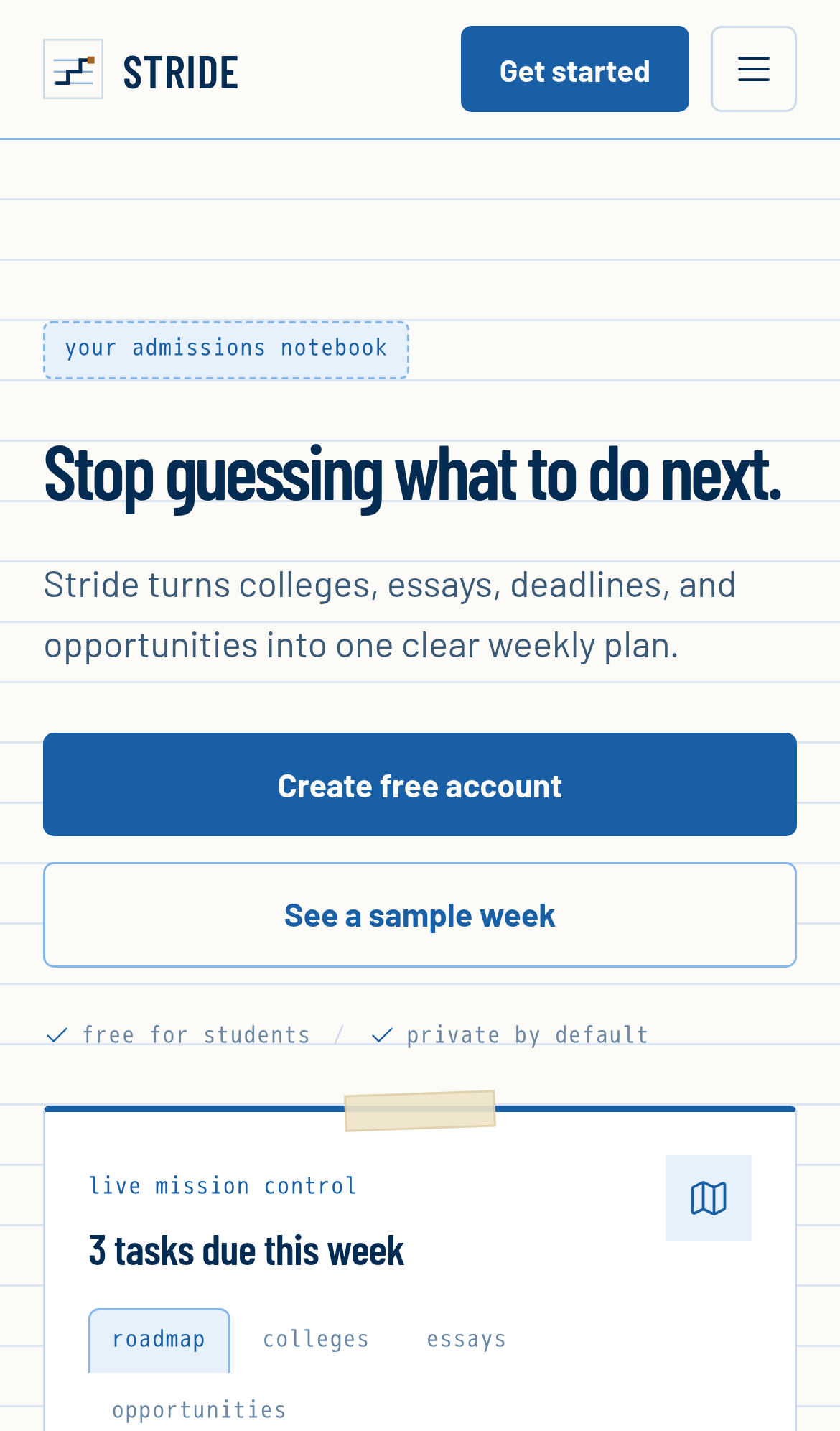
Try it: Open https://stridehq.xyz/ on a phone and tap "See a sample week" under the headline. The page lands on the "what you get" feature cards, and no sample week appears.
The pricing page reuses the home page title
The home page and /pricing use the same document title: "Stride, A calmer college admissions workspace for students & counselors". Search results and browser tabs therefore show nothing that marks the pricing page as the place to compare plans.
The home and pricing pages share one meta description
The routes / and /pricing use the same meta description, which begins "Stride turns schools, essays, deadlines, and opportunities into one clear weekly plan". So a search result for the pricing page shows no plan or price information. Visitors on the project itself are not affected.
The home page has no canonical URL tag
The home page head at / has no link rel="canonical" element. The title, description, Open Graph tags, icon and preview image are all present and load correctly, so browser identity and link previews still work.
The sign-in fields carry no autocomplete hints
On /sign-in, the email field (#identifier-field) and the password field (#password-field) have no autocomplete attribute, so neither is marked as username or current-password. The email field does set inputMode to email, so phone keyboards still show the email layout. Returning students can still log in, but browsers and password managers get no explicit hint about these fields.
The home page is served without CSP or CORP headers
The response from https://stridehq.xyz/ is missing Content-Security-Policy and Cross-Origin-Resource-Policy.
Header tabs and preview tabs fall below required text contrast
On / and /pricing, the "Why Stride" and "Pricing" header tabs are 11px #5a7794 text on #f4f1e9, which measures 4.13:1 contrast. WCAG AA requires 4.5:1. The "Opportunities" preview tab is at 3.73:1 (#6b87a3 on white).
Probie fixes this for you.
Stop customers hitting the same friction. Connect your codebase and Probie reproduces these failures, tests the fix, and opens a pull request for your review.
Sign up and get this fixedFree inspection
What should Probie inspect next?
Enter a project URL. There is nothing to install.
Probie checks every issue twice, respects robots.txt, and backs off at bot challenges.
Enter an address and we will email the report card link.