We found 1 issuecosting you visitorson 3anddoneapp.com.
Watch the inspection.
We navigate your site the way customers would. Idle time is skipped.
How the composite score works
The overall score is a weighted average of the categories: Getting the product 40%, Trust before buying 20%, Mobile 15%, Speed 15%, and Polish and audit 10%. It is never more than 10 points above the Getting the product score, because a product a visitor cannot get cannot score well on anything else, and never more than 25 points above the weakest category, so one badly broken area is not averaged away. Any issue in the main list caps it at 89, so a score above 90 means nothing worth fixing was found.
Each category starts at 100 and stays there when nothing was found in it, whether or not the inspection got that far. Each distinct verified finding deducts 60 points for a serious problem on the path from arriving to paying, 40 for another serious problem, 30, 15 or 8 by high, medium or low severity otherwise, and 4 for an audit finding. Each additional finding below the list takes 2 more points off the overall score, up to 10. Scores stop at zero and round to whole numbers. The formula is fixed and versioned, so the same saved evidence always receives the same score.
The 'start the trial' button took 2.5 seconds to respond
Interaction to Next Paint measured 2.53 seconds, in a redBus case study, reducing interactions from roughly 870 to 900 milliseconds to 350 to 370 milliseconds was part of INP work associated with a 7% increase in sales.
On /signup, the 'start the trial' button took 2528 ms to paint any response after a click. Google rates anything over 500 ms as poor, and the delay did not show up on every load. A buyer meets this at the pay step, and the button can seem broken while nothing changes on screen.
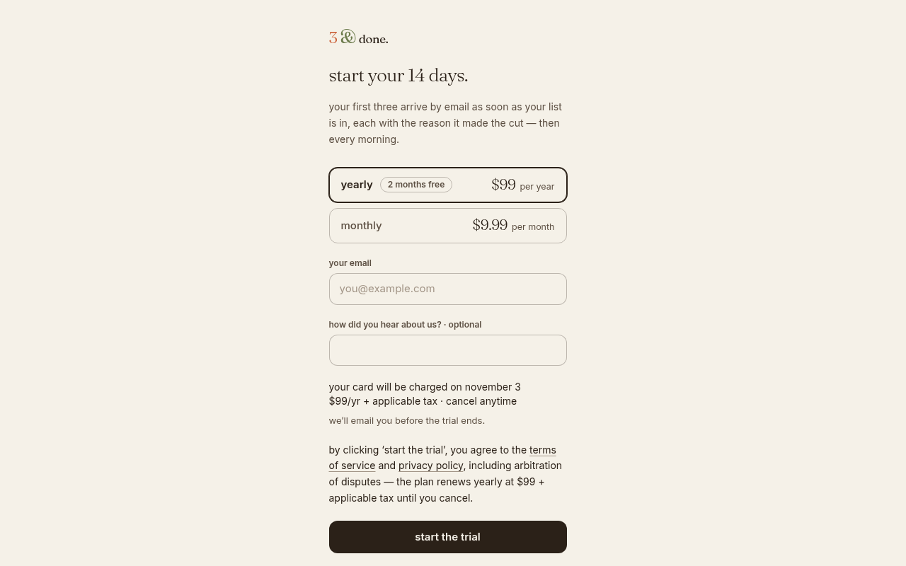
Try it: Open /signup on desktop with Chrome DevTools Performance recording, enter an email, click 'start the trial', and check how long it takes to the first paint after the click.
The "or speak it" button on /try is below the minimum tap height
On the /try demo at phone width, the voice input button inside the task field measures 83.4px by 19.5px. That is under the 24px minimum, and the button does not have enough clear space around it to qualify for the spacing exception. A tap that lands slightly off the button focuses the text field instead of starting voice input.
The home page is missing five security response headers
The response from https://3anddoneapp.com/ is missing Content-Security-Policy, CSP frame-ancestors or X-Frame-Options, X-Content-Type-Options: nosniff, Referrer-Policy, and Cross-Origin-Resource-Policy.
The home page demo button text falls short of contrast minimums
On the home page, the "show me my three" button uses #fdf8f2 text on #c8562d, a contrast of 4.12:1 where WCAG AA requires 4.5:1 for 14px text. The "tomorrow · 7:00 am" label in the sample email is at 2.56:1. The same rule also fails on /try, /press, /signin, /signup and /home.
Probie fixes this for you.
Stop customers hitting the same friction. Connect your codebase and Probie reproduces these failures, tests the fix, and opens a pull request for your review.
Sign up and get this fixedFree inspection
What should Probie inspect next?
Enter a project URL. There is nothing to install.
Probie checks every issue twice, respects robots.txt, and backs off at bot challenges.
Enter an address and we will email the report card link.