We found 3 issuescosting you saleson nexus-ui.com.
The free template download fails with a "session has ended" error.
Watch the inspection.
We navigate your site the way customers would. Idle time is skipped.
How the composite score works
The overall score is a weighted average of the categories: Getting the product 40%, Trust before buying 20%, Mobile 15%, Speed 15%, and Polish and audit 10%. It is never more than 10 points above the Getting the product score, because a product a visitor cannot get cannot score well on anything else, and never more than 25 points above the weakest category, so one badly broken area is not averaged away. Any issue in the main list caps it at 89, so a score above 90 means nothing worth fixing was found.
Each category starts at 100 and stays there when nothing was found in it, whether or not the inspection got that far. Each distinct verified finding deducts 60 points for a serious problem on the path from arriving to paying, 40 for another serious problem, 30, 15 or 8 by high, medium or low severity otherwise, and 4 for an audit finding. Each additional finding below the list takes 2 more points off the overall score, up to 10. Scores stop at zero and round to whole numbers. The formula is fixed and versioned, so the same saved evidence always receives the same score.
The free template download fails with a "session has ended" error
New visitors who click Download on a template marked Free get no zip and no link to sign in or create an account.
On /templates/launchfolio-portfolio, the card marked "Free" says "Take the source". Clicking "Download source (.zip)" while signed out returns a 401, nothing downloads, and the card shows "Your session has ended. Sign in again, then download." with no sign-in link or button. Getting the free template is a buyer's first step with the product, and visitors who have never had an account meet an error about an expired session instead of a prompt to create one.
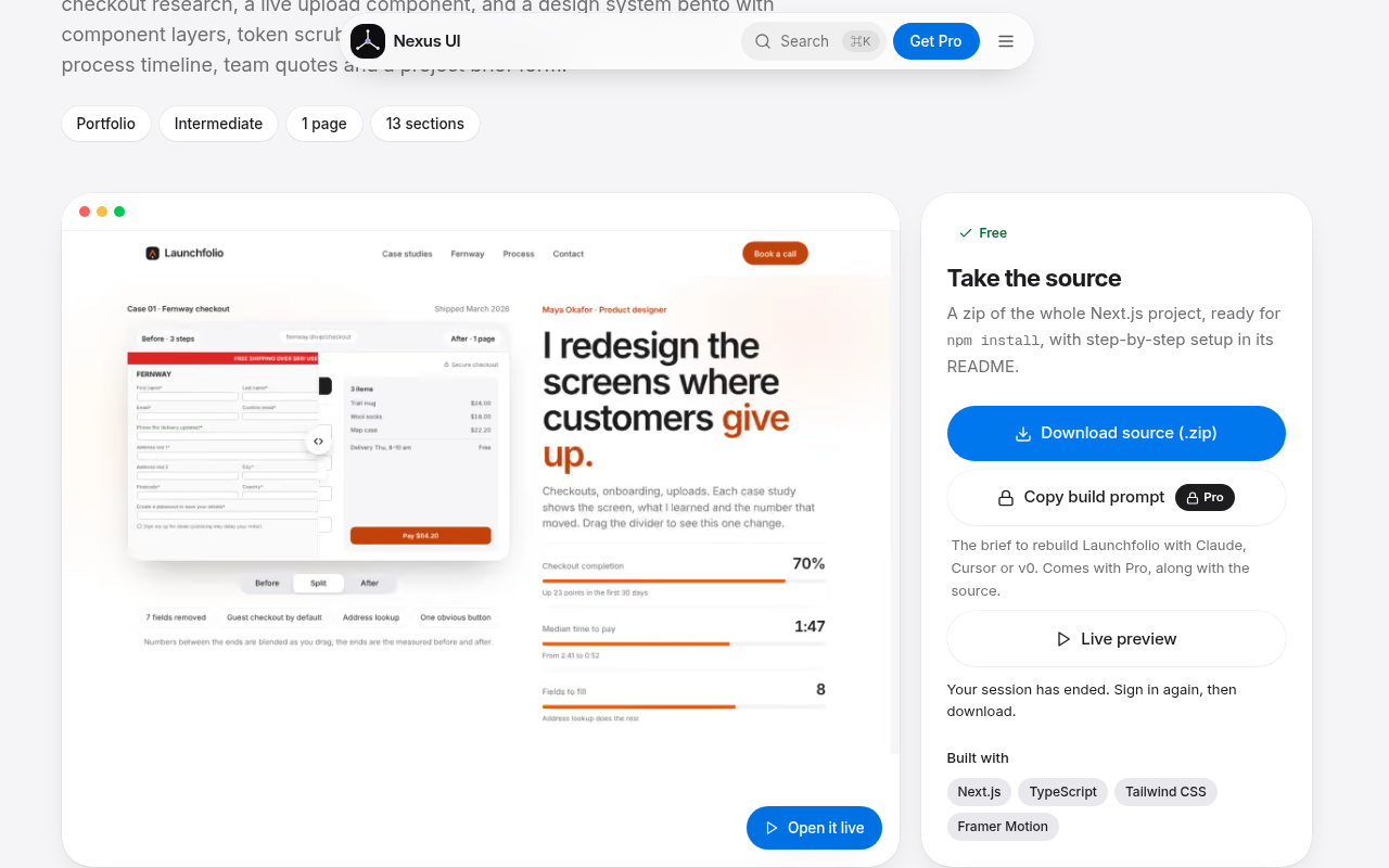
Try it: In a private window, open /templates/launchfolio-portfolio and click "Download source (.zip)". You get no zip, the "Your session has ended" text appears, and the console shows a 401.
The pricing headline says pay once, but Pro renews every year
Buyers who go with the recommended Pro plan because the headline says "Pay once" are signing up for a yearly renewal they were not told about.
The /pricing headline reads "Free to start. Pay once for everything." The banner right above it says "$49.99 a year, or $79.99 once", and the Pro card marked Recommended is "$49.99 per year" and "renewed yearly". A buyer comparing plans at the pricing step gets two different answers about how the main plan bills, while the home page states it correctly as "Pay yearly, or pay once."
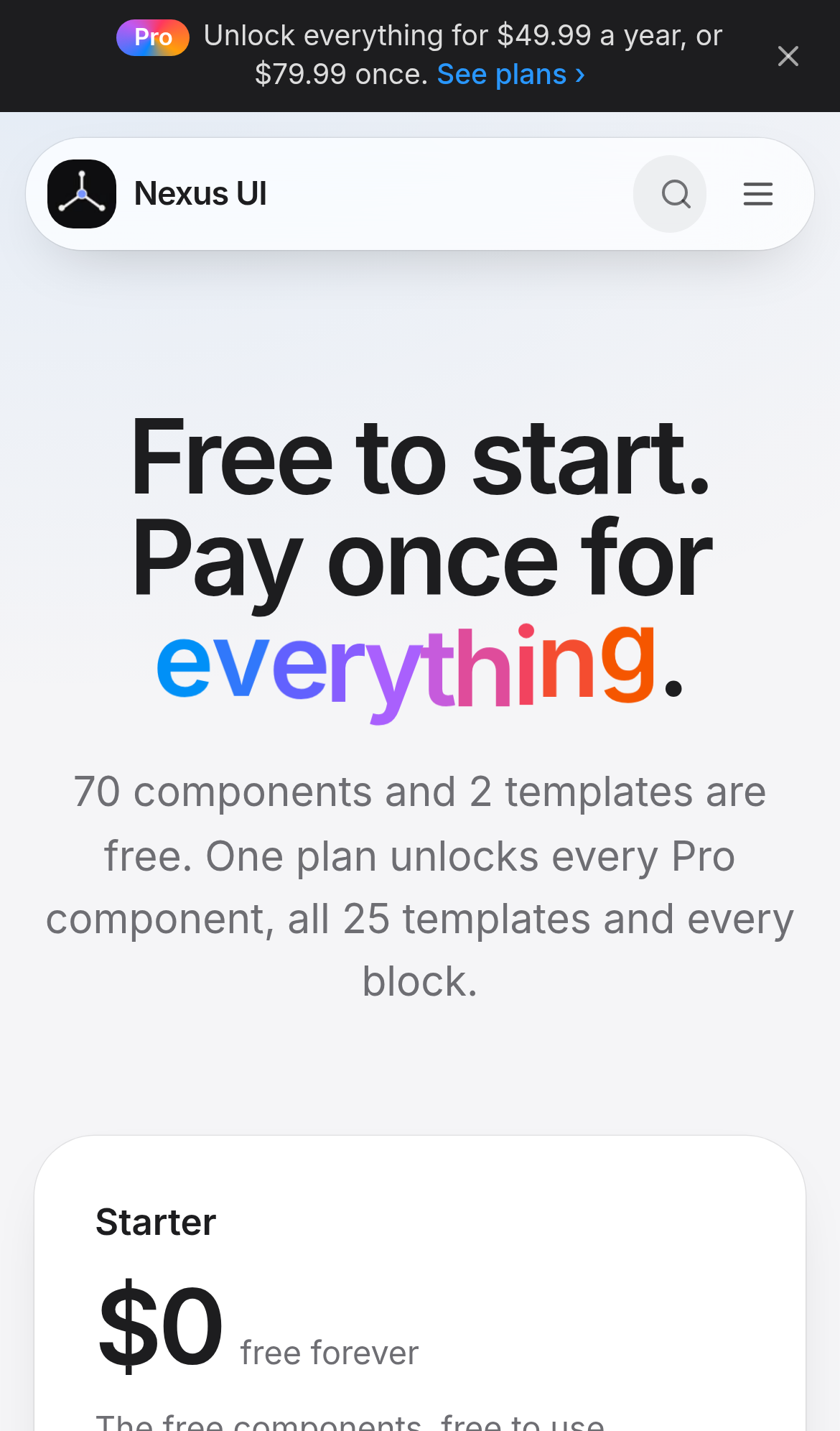
Try it: Open /pricing and read the headline. Then scroll to the Recommended Pro card and compare it with "$49.99 per year, renewed yearly".
The Drift Gallery preview is mostly blank on phones
Phone visitors judging whether the Pro blocks are worth buying see this gallery block as a small clipped cluster in an otherwise empty panel.
On a phone, the Drift Gallery card on /blocks shows its artwork mosaic as a small cluster in the top-left corner of the preview. The cluster's top row is cut off under the New badge, and the rest of the panel is empty down to the "Ten artists, no edges." caption. This is a Pro block, so a buyer meets it while deciding whether Pro is worth paying for.
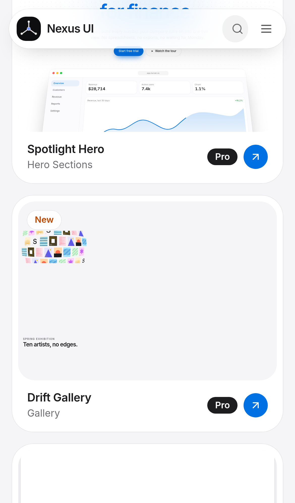
Try it: Open /blocks at a 390px wide phone viewport and scroll to the Drift Gallery card. The mosaic sits clipped in the top-left corner and most of the preview is blank.
A home page button took 584ms to respond on desktop
On the home page, a rounded dark pill button (button.bg-foreground.rounded-full.pg-glass) took 584ms to show a response after a pointer click on desktop. Google rates Interaction to Next Paint above 500ms as poor. The button is on the page where visitors first find out what Nexus UI is, but the delay was only slightly past the threshold and did not repeat on a second load.
The home page is missing a Cross-Origin-Resource-Policy header
The response from https://www.nexus-ui.com/ is missing Cross-Origin-Resource-Policy.
Block previews on /blocks hide buttons from screen readers but not the keyboard
On /blocks, the preview frame in each block card has aria-hidden="true" but still contains focusable demo controls, such as the preview's "Start free trial" buttons. When keyboard users press Tab, focus can land on these hidden controls, and screen readers announce nothing for them.
The home page "Write to us" link relies on color alone
On the home page, the "Write to us" link to /contact shows no underline until hover. Its blue (#0066cc) has only 1.09:1 contrast against the surrounding grey text (#6e6e73), and the minimum is 3:1. Visitors who cannot see the color difference get no other cue that the text is a link.
Probie fixes this for you.
Stop customers hitting the same friction. Connect your codebase and Probie reproduces these failures, tests the fix, and opens a pull request for your review.
Sign up and get this fixedFree inspection
What should Probie inspect next?
Enter a project URL. There is nothing to install.
Probie checks every issue twice, respects robots.txt, and backs off at bot challenges.
Enter an address and we will email the report card link.