We found 1 issuecosting you phone customerson pindeleter.com.
Watch the inspection.
We navigate your site the way customers would. Idle time is skipped.
How the composite score works
The overall score is a weighted average of the categories: Getting the product 40%, Trust before buying 20%, Mobile 15%, Speed 15%, and Polish and audit 10%. It is never more than 10 points above the Getting the product score, because a product a visitor cannot get cannot score well on anything else, and never more than 25 points above the weakest category, so one badly broken area is not averaged away. Any issue in the main list caps it at 89, so a score above 90 means nothing worth fixing was found.
Each category starts at 100 and stays there when nothing was found in it, whether or not the inspection got that far. Each distinct verified finding deducts 60 points for a serious problem on the path from arriving to paying, 40 for another serious problem, 30, 15 or 8 by high, medium or low severity otherwise, and 4 for an audit finding. Each additional finding below the list takes 2 more points off the overall score, up to 10. Scores stop at zero and round to whole numbers. The formula is fixed and versioned, so the same saved evidence always receives the same score.
The phone pricing page scrolls sideways at the plan table
Phone visitors comparing plans before upgrading get a pricing page that drifts sideways under their thumb.
On a 390px phone screen, /pricing measures 528px wide, so the whole page scrolls horizontally. The cause is the plan comparison table, which has a 560px minimum width and pushes past its scroll container. Buyers meet this on the pricing step, while they compare Free, Pro and Unlimited before tapping Upgrade.
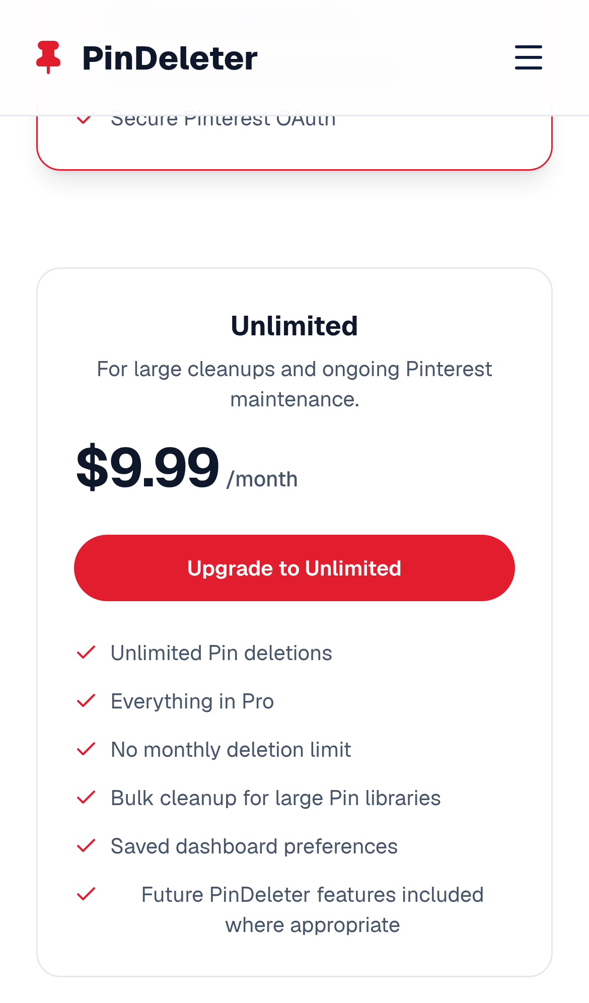
Try it: Open /pricing on a phone or at a 390px wide viewport, scroll down to the comparison table, and swipe left: the whole page moves sideways.
The home page is missing three security response headers
The response from https://pindeleter.com/ is missing Strict-Transport-Security, Content-Security-Policy, and Cross-Origin-Resource-Policy.
Two home page red text elements sit just below WCAG AA contrast
On the home page, the red hero badge text (#e60023 on #fdecef) measures 4.19:1, and the "see pricing" link (#e11d2e on #f8f8fa) measures 4.48:1. WCAG AA requires 4.5:1 for text this size. Both stay readable, so the shortfall is small.
Probie fixes this for you.
Stop customers hitting the same friction. Connect your codebase and Probie reproduces these failures, tests the fix, and opens a pull request for your review.
Sign up and get this fixedFree inspection
What should Probie inspect next?
Enter a project URL. There is nothing to install.
Probie checks every issue twice, respects robots.txt, and backs off at bot challenges.
Enter an address and we will email the report card link.