We found 1 issuecosting you phone customerson tilzix.com.
Watch the inspection.
We navigate your site the way customers would. Idle time is skipped.
How the composite score works
The overall score is a weighted average of the categories: Getting the product 40%, Trust before buying 20%, Mobile 15%, Speed 15%, and Polish and audit 10%. It is never more than 10 points above the Getting the product score, because a product a visitor cannot get cannot score well on anything else, and never more than 25 points above the weakest category, so one badly broken area is not averaged away. Any issue in the main list caps it at 89, so a score above 90 means nothing worth fixing was found.
Each category starts at 100 and stays there when nothing was found in it, whether or not the inspection got that far. Each distinct verified finding deducts 60 points for a serious problem on the path from arriving to paying, 40 for another serious problem, 30, 15 or 8 by high, medium or low severity otherwise, and 4 for an audit finding. Each additional finding below the list takes 2 more points off the overall score, up to 10. Scores stop at zero and round to whole numbers. The formula is fixed and versioned, so the same saved evidence always receives the same score.
The phone password reset form jumps while the page loads
Returning buyers on a phone who are locked out of their credits find the email field and button moving as they try to use them.
On /forgot-password on a phone, the block holding the email field, human check and Send reset link button shifts while the page finishes loading. Cumulative layout shift measures 0.393, and Google's poor band starts at 0.25. Buyers who come here to get back to their paid credits can find the field moving under their finger.
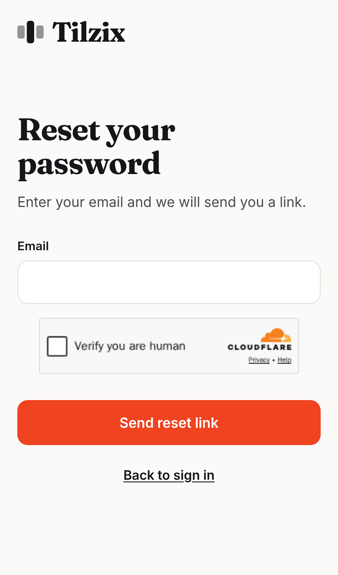
Try it: Open /forgot-password in Chrome DevTools at a 390px phone width with network throttling on. Watch the vertically centered form block move when the Cloudflare check widget appears, or read CLS in the Performance panel.
Phone keyboard focus on the purpose chips is hidden by the sticky start bar
On /create in a phone layout, the sticky bar at the bottom holds the Cloudflare check and the "Tick the box above to start" button. It sits on top of the "Fashion & people" and "Products" chips while they have focus. Every measured point inside both chips hit the sticky bar instead of the chip, so the focused option on the optional step 2 of the free trial is hidden.
The home page response has no Cross-Origin-Resource-Policy header
The response from https://tilzix.com/ is missing Cross-Origin-Resource-Policy.
The orange call-to-action buttons fall below the 4.5:1 contrast minimum
White text on the #F0431F orange of the "Try it free" and "Create my carousel" buttons measures 3.79:1, and WCAG AA requires 4.5:1 for text at this size and weight. The same orange appears on the home page, /create, /login and other routes, so the buttons a visitor uses to start a carousel are below the standard everywhere they appear.
Probie fixes this for you.
Stop customers hitting the same friction. Connect your codebase and Probie reproduces these failures, tests the fix, and opens a pull request for your review.
Sign up and get this fixedFree inspection
What should Probie inspect next?
Enter a project URL. There is nothing to install.
Probie checks every issue twice, respects robots.txt, and backs off at bot challenges.
Enter an address and we will email the report card link.