We found 5 issueson kartinsightspro.appworth fixing.
Watch the inspection.
We navigate your site the way customers would. Idle time is skipped.
Three security response headers are missing
The response from https://kartinsightspro.app/ is missing Strict-Transport-Security, Content-Security-Policy, and Cross-Origin-Resource-Policy.
Try it: Run curl -sI https://kartinsightspro.app/ and check for Strict-Transport-Security, Content-Security-Policy, and Cross-Origin-Resource-Policy in the response headers.
The billing period toggle declares a tablist with no tabs
On the home page, the pricing billing switch at .lp-billing-toggle carries role="tablist" and aria-label="Billing period", but its children are plain label elements with no role="tab". axe-core flags this as aria-required-children at critical impact (WCAG 2.0 A, 1.3.1) with the summary "Required ARIA child role not present: tab". A tablist without tabs is exposed to assistive technology as an empty container, so the monthly and annual options are not announced as selectable tabs.
Try it: Open / and run axe-core, or inspect the .lp-billing-toggle element in devtools and check the accessibility tree for the Monthly and Annual controls.
The primary call to action fails contrast requirements
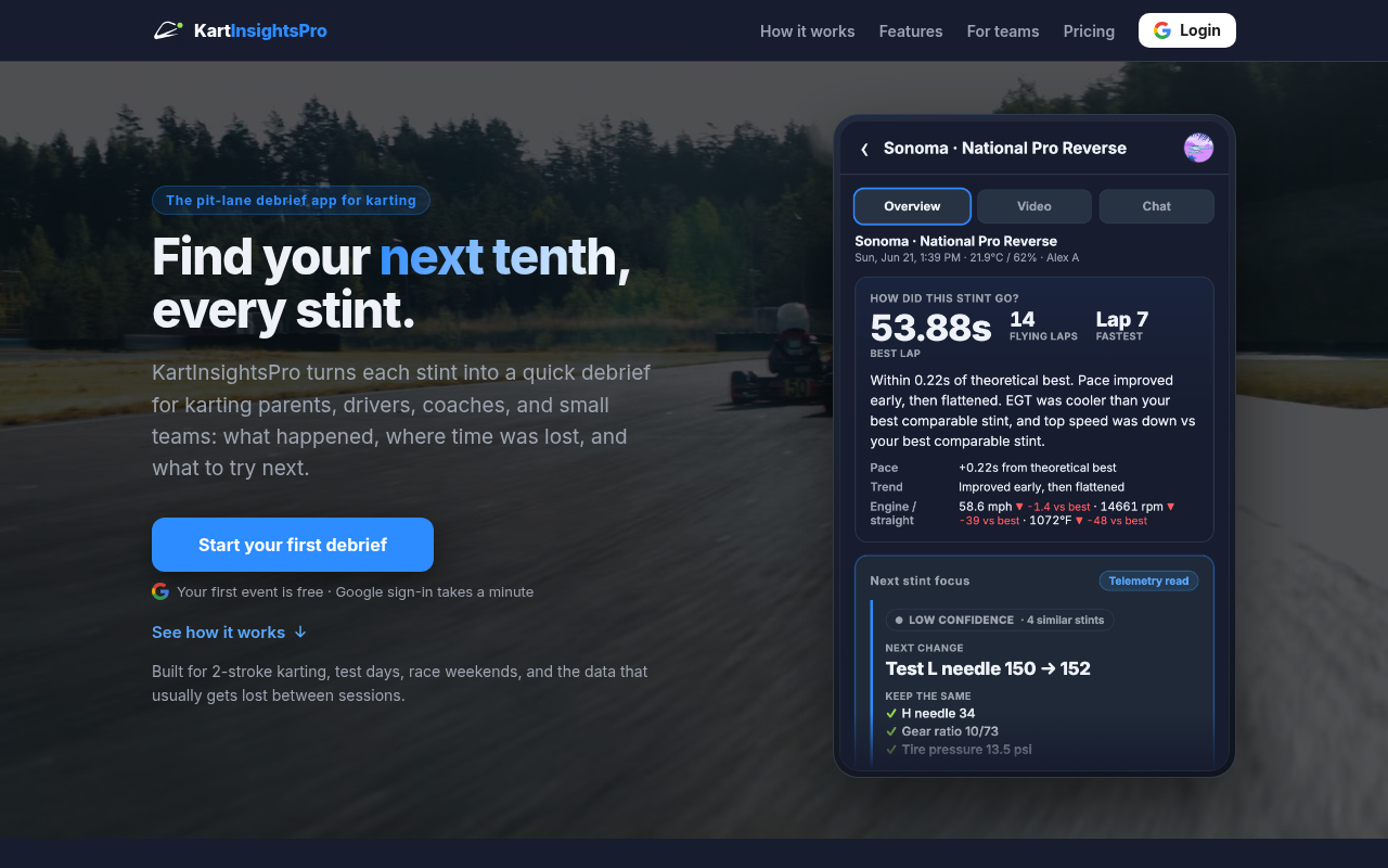
On the home page, the "Start your first debrief" button renders white bold 16px text on #2d8cff, a contrast ratio of 3.32:1 against the 4.5:1 required by WCAG 2 AA. The same pairing repeats on the pricing card version of that button, and the "Start here" price badge sits at 3.63:1 with #2d8cff text on #213753. axe-core classes the color-contrast rule failure as serious across all three nodes.
Try it: Open / on desktop and sample the "Start your first debrief" button's text and background colors, or run axe-core on the page and read the color-contrast result.
Inline legal links are color-only and low contrast
On /privacy and /terms, inline links inside body text and in the legal footer are distinguished from surrounding text by color alone, with no underline or other non-color styling. axe-core flags the rule link-in-text-block at impact level serious: the "Terms of Service" link in body copy measures 2.18:1 against its surrounding text (#5aa9ff on #eef2f8), and the footer "Terms" and "Home" links measure 1.03:1 (#5aa9ff on #9ca3af), against a 3:1 minimum. Readers who cannot perceive the color difference have no cue that these are links.
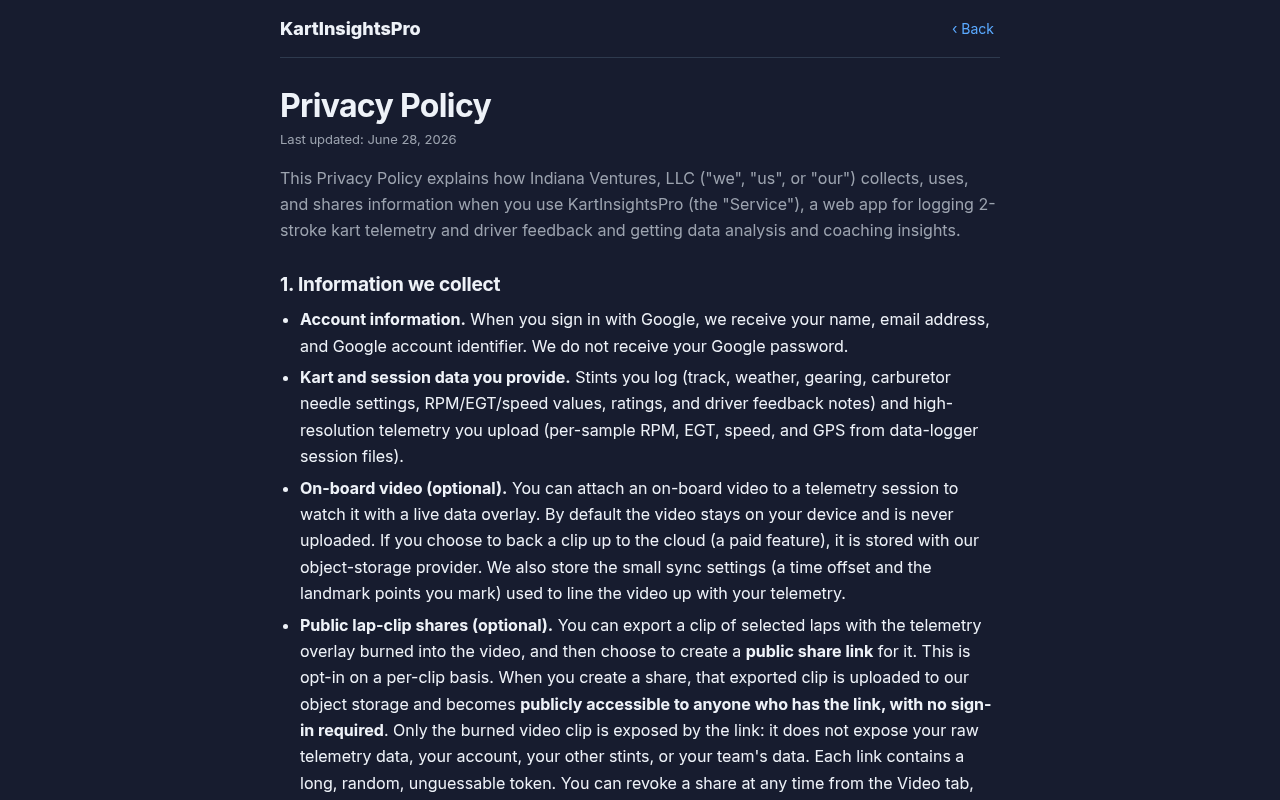
Try it: Open /privacy in Chrome, run axe DevTools or check the link-in-text-block rule, and view the page in grayscale to see that the inline "Terms of Service" and footer links carry no underline.
Chart legend labels are unreadable on the dark card
In the phone mockup in the "Every stint becomes a debrief" section on /, the legend row under the "Turn breakdown" chart renders in a near-background dark tone on the dark card. Only the three colored legend dots are distinguishable at 1280x800; the text beside each dot has almost no separation from the card fill and cannot be read at normal size. The rest of the mockup, including the "Turn breakdown" heading and the numbered corner markers, renders at full contrast.
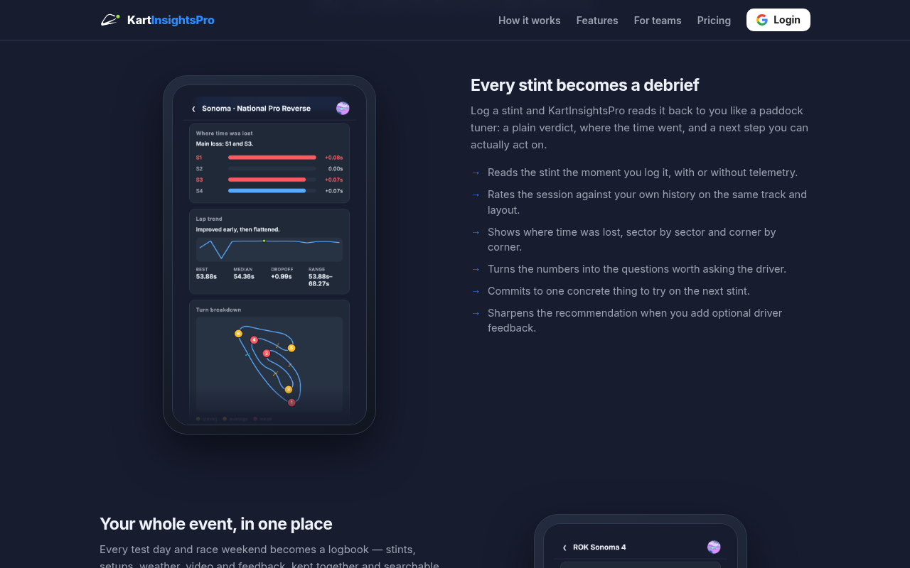
Try it: Open / on desktop, scroll to the "Every stint becomes a debrief" section, and look at the legend row directly under the "Turn breakdown" chart inside the phone mockup.
A rough edge in the layout
The helper line beneath the primary CTA wraps a single orphaned word onto its own second line.
Probie fixes this for you.
This report came from one visit. When installed on your project, Probie watches real sessions, reproduces failures, and opens tested fixes as pull requests.
Sign up and get this fixedFree inspection
What should Probie inspect next?
Enter a project URL. There is nothing to install.
Probie checks every issue twice, respects robots.txt, and backs off at bot challenges.