We found 5 issueson shinkansen.financeworth fixing.
Watch the inspection.
We navigate your site the way customers would. Idle time is skipped.
The BCP logo is cut off at the right screen edge
On /treasury at a 390px viewport, the BCP logo in the "Confían en nosotros" logo strip runs past the right edge of the screen. The trailing chevron of the mark is sliced at the viewport boundary, and the strip's left logo, BANCO BICE, sits shifted so the row is not centered. The logo row is wider than the viewport, so the content overflows horizontally.
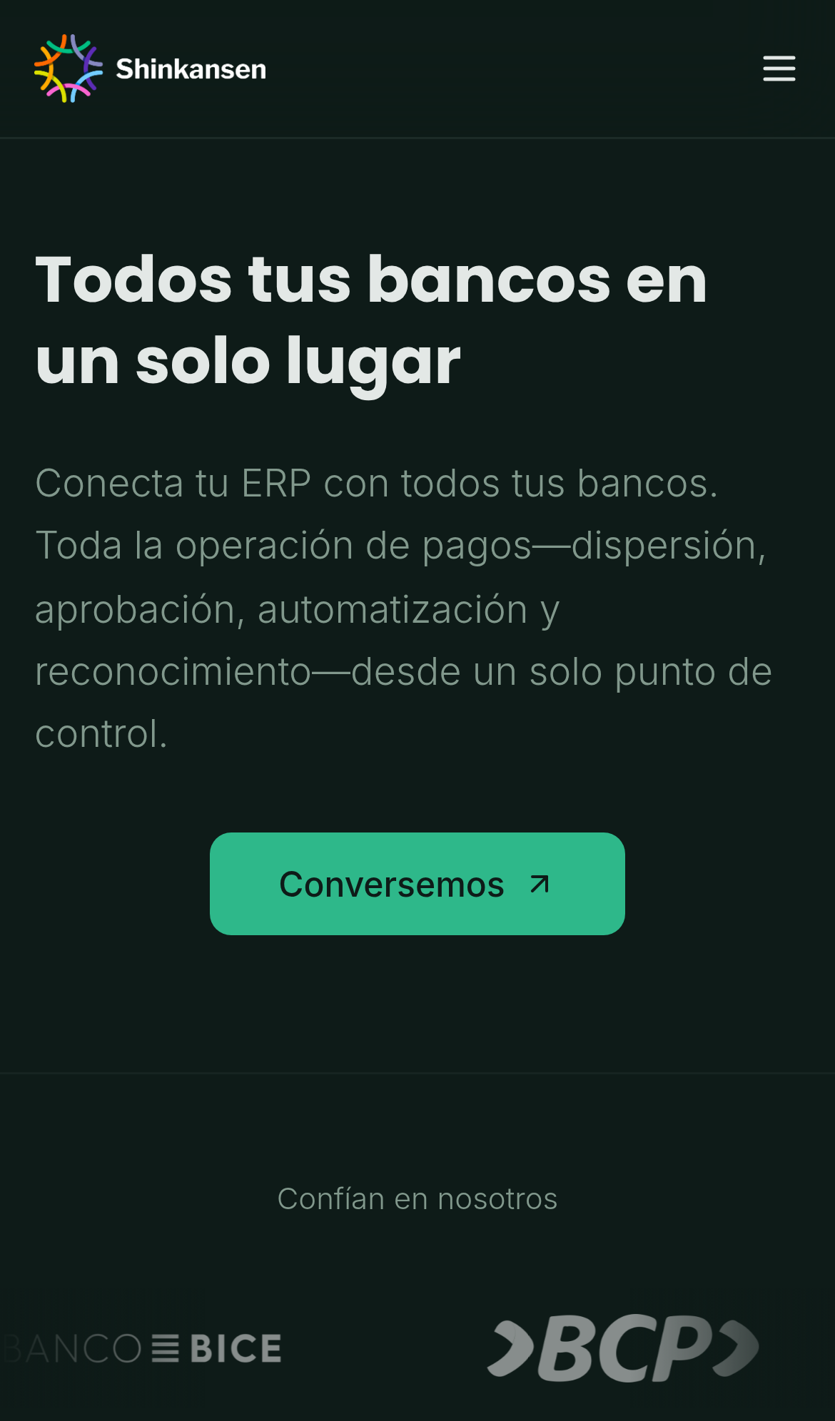
Try it: Open /treasury on a phone or a 390px wide window, scroll to the "Confían en nosotros" logo strip, and look at the right edge of the BCP logo.
Three security response headers are missing
The response from https://shinkansen.finance/ is missing Content-Security-Policy, CSP frame-ancestors or X-Frame-Options, and Cross-Origin-Resource-Policy.
Try it: Run curl -sI https://shinkansen.finance/ and check for Content-Security-Policy, X-Frame-Options, and Cross-Origin-Resource-Policy in the response headers.
Carousel step buttons have no accessible name
The step indicator buttons in the "Somos la infraestructura end-to-end" section on / are empty elements with no accessible name. Each is a `button` with only layout classes (`w-10 h-1 rounded-full ...`), no inner text, no aria-label, no aria-labelledby, and no title attribute, so axe-core fails them under the button-name rule at critical impact (WCAG 2.1 A, 4.1.2). Screen reader and keyboard users reach the controls but get no indication of what step each one selects.
Try it: Open / on desktop, scroll to the end-to-end infrastructure diagram, and tab to the four thin pill controls above it; they announce only "button" with no name.
File labels in the before graphic fail contrast
In the "DE... situación actual" graphic on /inversiones, the 7px monospace file labels inside the stacked cards fall below the WCAG AA 4.5:1 threshold. The "banco1.cl" label is at 3.15:1 (#4271ad on #152339), "cartola.pdf" at 3.07:1 (#a64d4c on #2c1614), and "planilla.xlsx" at 4.17:1. The same failure appears on /seguros and /lending, and at that size the labels are effectively unreadable on screen.
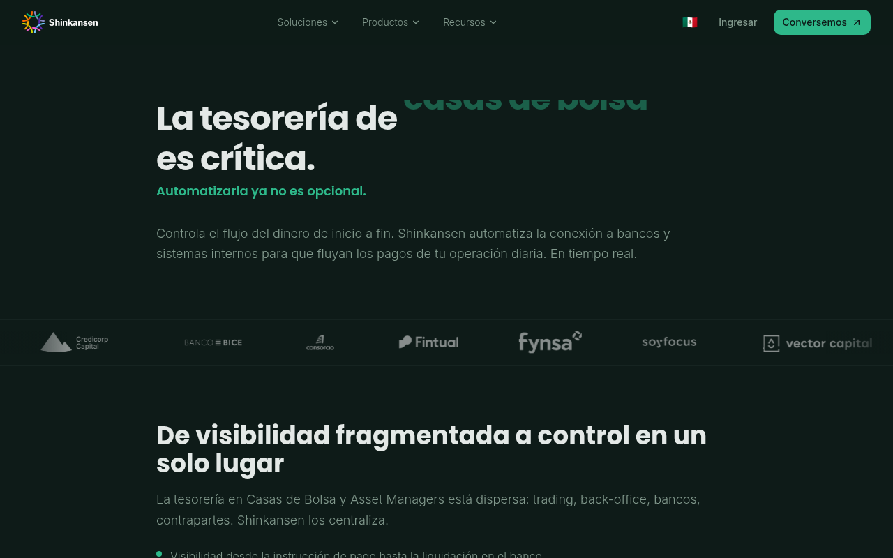
Try it: Open /inversiones, scroll to the "DE... situación actual" graphic, and try to read the small file names such as banco1.cl and cartola.pdf on the stacked cards.
The third projection card is cut off on mobile
On /seguros at a 390px viewport, the projection summary row shows three cards but the third one runs past the right edge of its container and is cropped after about 30px. Its dashed green border is sliced vertically and its labels render as "SA", "PR" and a lone "M", so the projected balance is unreadable. The first two cards, "ÚLTIMO SALDO" and "POR PAGAR", fit inside the container, and there is no visible way to reach the rest of the third card.
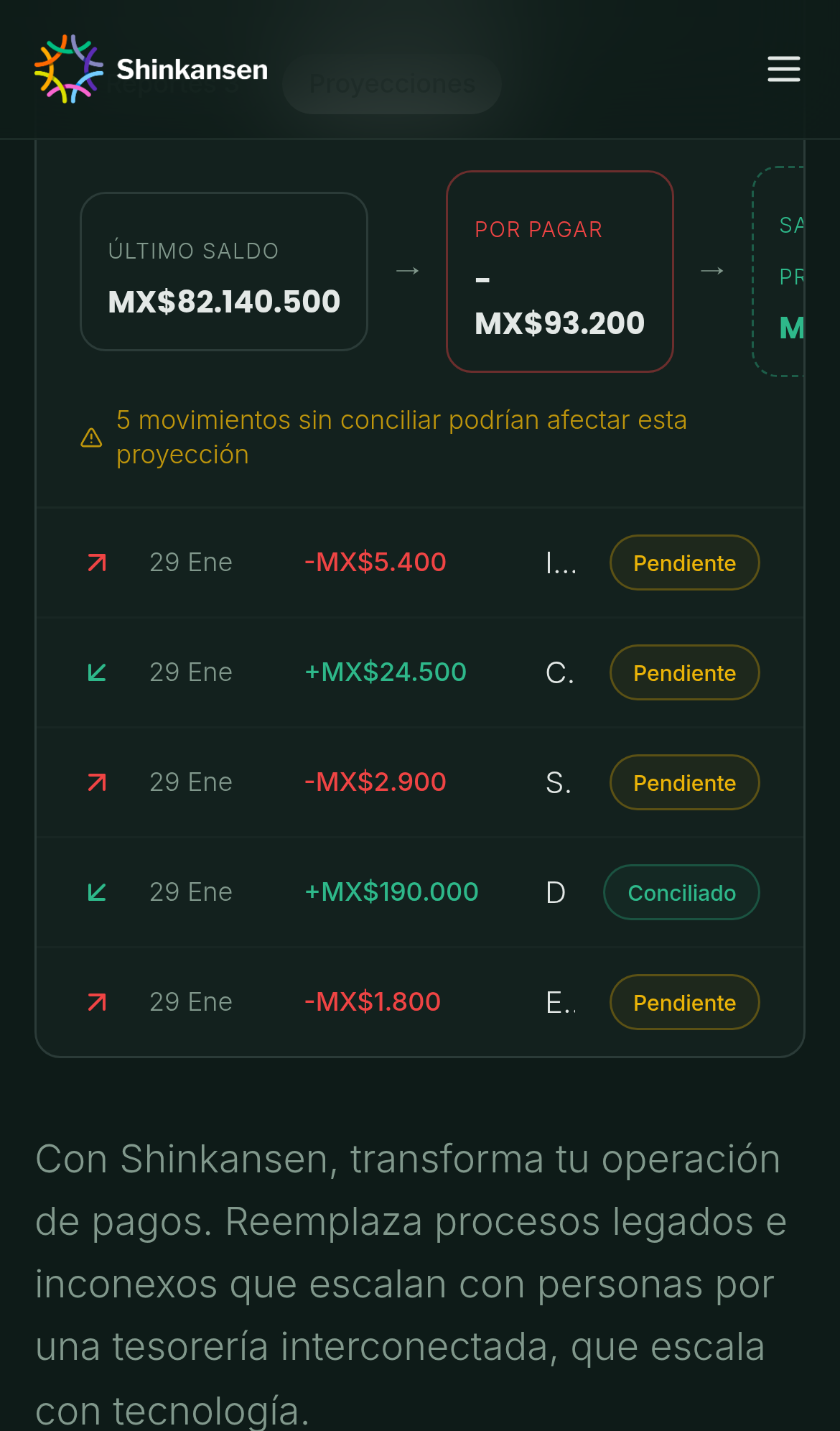
Try it: Open /seguros on a 390px wide mobile viewport and scroll to the projection summary row; the third dashed card is clipped at the container's right edge.
A rough edge in the layout
The fourth feature card is horizontally offset from the first column of the grid above it, its left edge sitting about 160px right of the first card's left edge.
A rough edge in the layout
The hero block is left aligned while the primary call to action button below it is centered in the viewport, breaking alignment with the heading and paragraph above.
Probie fixes this for you.
This report came from one visit. When installed on your project, Probie watches real sessions, reproduces failures, and opens tested fixes as pull requests.
Sign up and get this fixedFree inspection
What should Probie inspect next?
Enter a project URL. There is nothing to install.
Probie checks every issue twice, respects robots.txt, and backs off at bot challenges.