We found 2 issuescosting you truston pagecritic.app.
Watch the inspection.
We navigate your site the way customers would. Idle time is skipped.
How the composite score works
The overall score is a weighted average of the categories: Getting the product 40%, Trust before buying 20%, Mobile 15%, Speed 15%, and Polish and audit 10%. It is never more than 10 points above the Getting the product score, because a product a visitor cannot get cannot score well on anything else, and never more than 25 points above the weakest category, so one badly broken area is not averaged away. Any issue in the main list caps it at 89, so a score above 90 means nothing worth fixing was found.
Each category starts at 100 and stays there when nothing was found in it, whether or not the inspection got that far. Each distinct verified finding deducts 60 points for a serious problem on the path from arriving to paying, 40 for another serious problem, 30, 15 or 8 by high, medium or low severity otherwise, and 4 for an audit finding. Each additional finding below the list takes 2 more points off the overall score, up to 10. Scores stop at zero and round to whole numbers. The formula is fixed and versioned, so the same saved evidence always receives the same score.
Spanish audits return the verdict and top problems in English
Spanish-speaking founders get the free result they use to judge the USD 5 report in a language the Spanish FAQ said they would not need.
The Spanish FAQ on /es/ answers "¿El informe está en español?" with "Sí. Toda auditoría iniciada desde esta página se escribe en español." A tally.so audit started from that page came back with Spanish labels such as "tally.so obtuvo 84 de 100", but the verdict under them and the three problems under "Lo que la frena" are English sentences. This is the free result a buyer reads right before the "Ver los 8 con soluciones: USD 5" offer, so the language promise breaks at the point where they decide whether to pay.
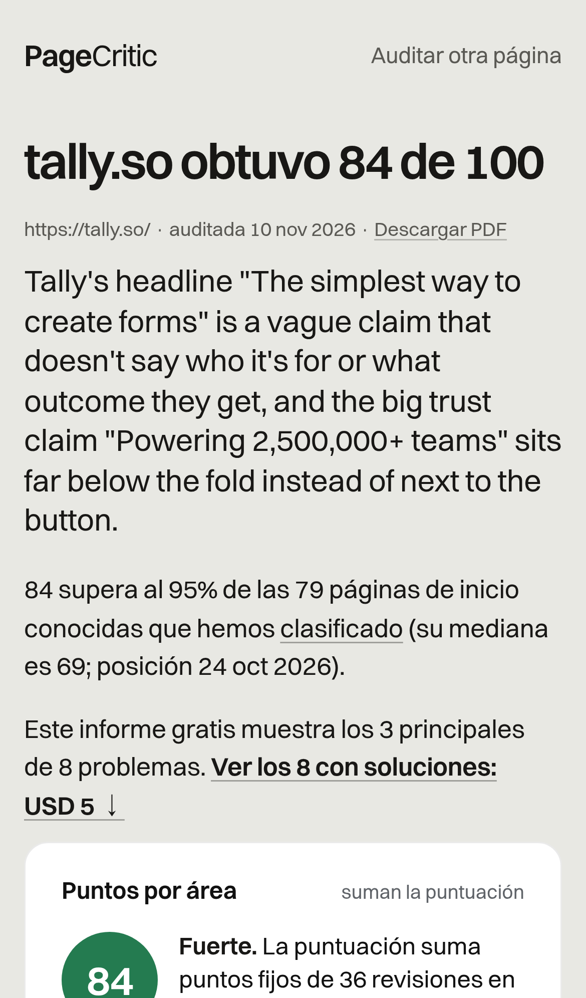
Try it: Open https://pagecritic.app/es/, audit a URL that has not been audited before, and read the verdict under the score and the items under "Lo que la frena".
The English and Spanish home pages score plausible.io differently
Founders who compare the English and Spanish pages, or share a sample report across languages, see one page scored two ways on the same day, so the score they are asked to pay for looks arbitrary.
On the English home page, the plausible.io sample card reads "Audited 9 Nov 2026" with a score of 87, Clarity 60 and Value prop 87. The card at /es/ reads "Auditado el 9 nov 2026" with 88, Claridad 70 and Propuesta de valor 80. The full reports behind the cards are separate audits with Clarity 12/20 and 14/20, and the "pages you know" scores also differ: Zendesk 79 and 77, Yale School of Art 45 and 43. These sample reports are what the $5 purchase rests on, and here the same page gets different scores and different problems depending on the language.
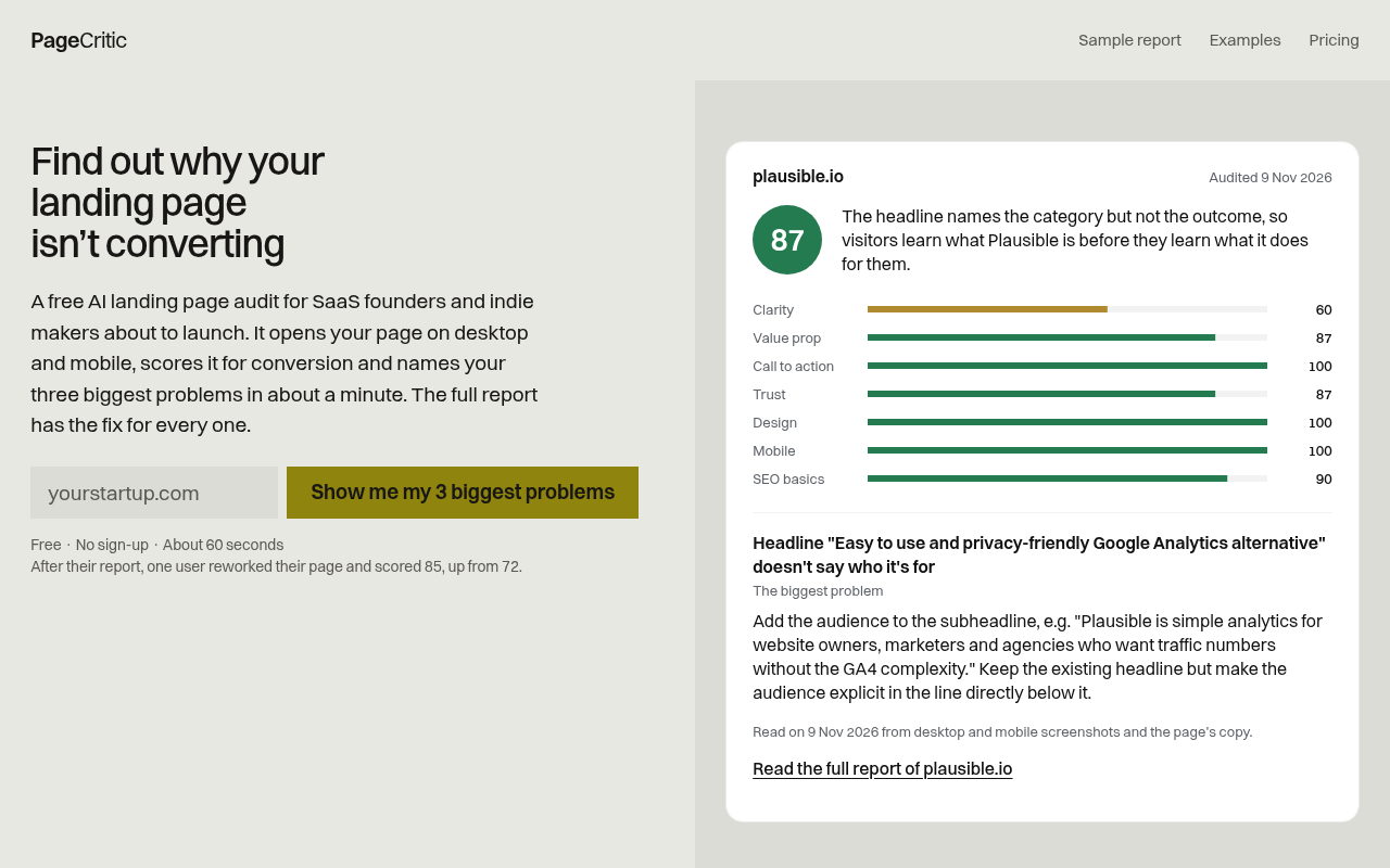
Try it: Open https://pagecritic.app/ and https://pagecritic.app/es/ side by side and compare the plausible.io card scores (87 vs 88). Then open both "full report" links and compare the Clarity scores (12/20 vs 14/20).
Footer links on the phone home page are below the 24px tap size
On the phone home page and /es/, the footer links "[email protected]", "Terms" and "Português" are each 18.9px tall. Each has less than 24px of clear space around it, from 18.2px to 22.8px. These links sit outside the audit and checkout steps.
The audit URL field shows phones a plain text keyboard
On the home page, the "Your page URL" field (input#u in form #f) is type "text" and has no inputmode, although it does set autocomplete "url". Phones therefore show a general text keyboard instead of the URL keyboard that puts "." and "/" within easy reach. This is the field visitors use to start the free audit, so the extra typing effort is small but sits on the main path.
The home page omits the Cross-Origin-Resource-Policy header
The response from https://pagecritic.app/ is missing Cross-Origin-Resource-Policy.
Sample report names in the home page list fall below contrast minimums
The sample report list on / and /es/ fades each company name in grey on a #e8e8e3 background. The names are large and still visible, so this affects legibility for low-vision visitors and does not block anyone.
Probie fixes this for you.
Stop customers hitting the same friction. Connect your codebase and Probie reproduces these failures, tests the fix, and opens a pull request for your review.
Sign up and get this fixedFree inspection
What should Probie inspect next?
Enter a project URL. There is nothing to install.
Probie checks every issue twice, respects robots.txt, and backs off at bot challenges.
Enter an address and we will email the report card link.