We found 6 issueson radius.toworth fixing.
Watch the inspection.
We navigate your site the way customers would. Idle time is skipped.
Member avatar links are too small to tap on mobile
On the mobile home page and /feed, the overlapping member avatar links in the "Samuel R. and 40 others joined Radius" row are 20px by 20px, below the 24px by 24px minimum required by WCAG 2.5.8, and they overlap each other. axe-core reports target-size (serious) against a[aria-label="Fred M."], a[aria-label="Christopher B."] and a[aria-label="Nathan J."], with safe clickable space measured at 8px and 0px diameter instead of at least 24px. Each avatar links to a separate profile route, so a tap near an edge lands on a neighbouring member.
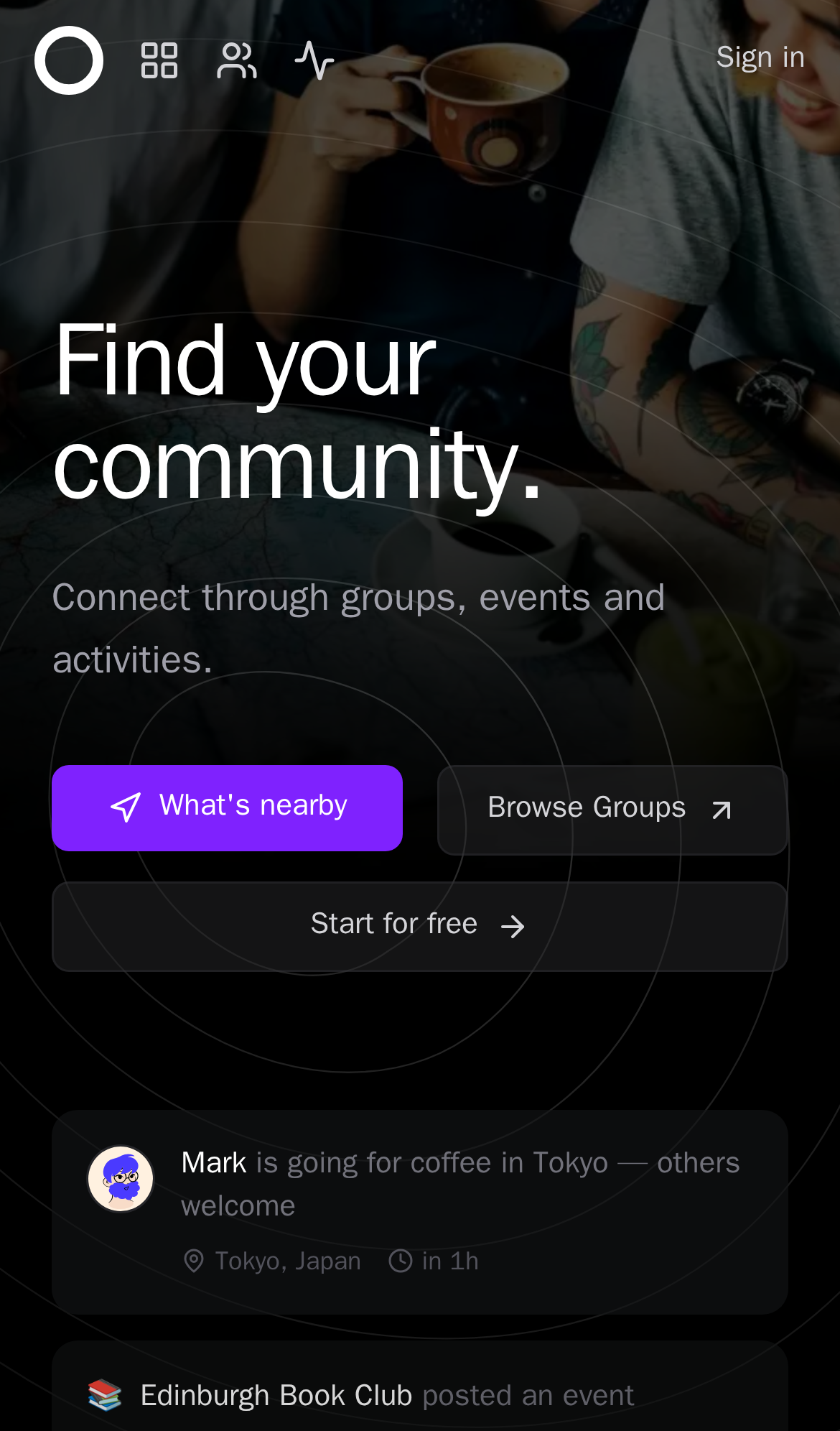
Try it: Open / on a phone, scroll to the "Samuel R. and 40 others joined Radius" row, and try tapping a single avatar in the overlapping stack.
The Toronto Ruby logo ships 328 KB for a 48 px icon
On /groups, the Toronto Ruby group logo is served at its full 1024x1024 intrinsic size and 336,259 bytes, then rendered into a 48x48 box at device pixel ratio 1. That is roughly 21 times the pixels actually painted, and the file is by far the heaviest asset on the listing page, where every other avatar and logo is a few kilobytes. The image is also marked loading="lazy" while sitting in the first card above the fold.
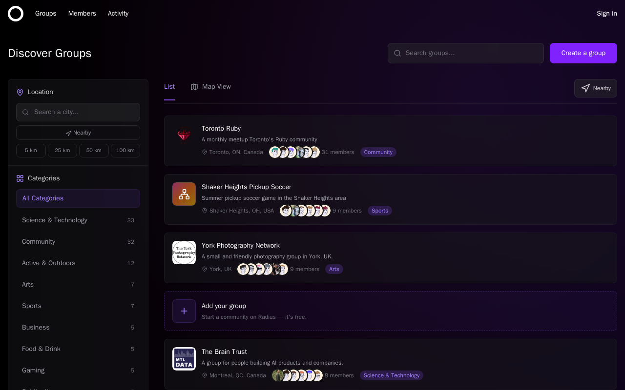
Try it: Open /groups on desktop with DevTools Network filtered to images and check the size of toronto-ruby-logo-transparent.png against its 48x48 rendered box.
Two security response headers are missing
The response from https://radius.to/ is missing Content-Security-Policy and Cross-Origin-Resource-Policy.
Try it: Run curl -sI https://radius.to/ and look for Content-Security-Policy and Cross-Origin-Resource-Policy in the response headers.
Low contrast text fails the AA threshold on several pages
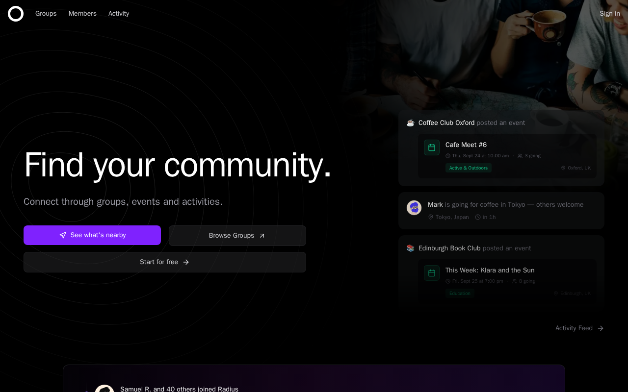
Several pieces of small text on radius.to render below the WCAG AA contrast minimum. The "Activity Feed" link on the home page sits at 4.35:1 (#71717b on #000000, 14px), and the form labels "What best describes you?" and "Choose an interest" sit at 3.84:1 (#71717b on #131316, 14px), against a required 4.5:1. The same color-contrast failure appears on /, /groups and /members.
Try it: Open radius.to, scroll to the "Activity Feed" link at the right of the hero, and sample its text color with a contrast checker against the black background.
The member list panel cannot be scrolled by keyboard
On /members the member list panel is a scrollable container that keyboard users cannot reach or scroll. axe-core flags the element `<div aria-live="polite" class="flex-1 min-h-0 overflow-y-auto scrollbar-dark" data-beta-members-map-target="memberList">` under the rule scrollable-region-focusable at impact level serious, mapped to WCAG 2.1.1 and 2.1.3. The container has overflow-y-auto with content taller than its box, but it is neither focusable itself nor contains focusable content, so the list of members below the visible rows is only available with a pointer. Three similar findings on the same route were suppressed.
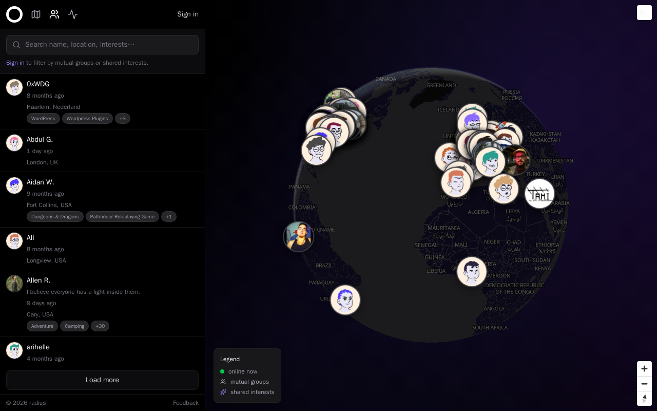
Try it: Open /members on desktop, press Tab repeatedly, and try to scroll the left member list with the arrow keys without touching the mouse.
The last member row is clipped by the Load more panel
On /members at a 390px-wide viewport, the final member row in the list is cut off by the footer panel that holds the "Load more" button. The row's name line renders in full, but the timestamp line directly under it is sliced horizontally, showing only the top half of the characters, and the location line and interest tags that other rows carry are not visible at all. Rows above it, such as "Abdul G.", render name, timestamp and location with full height.
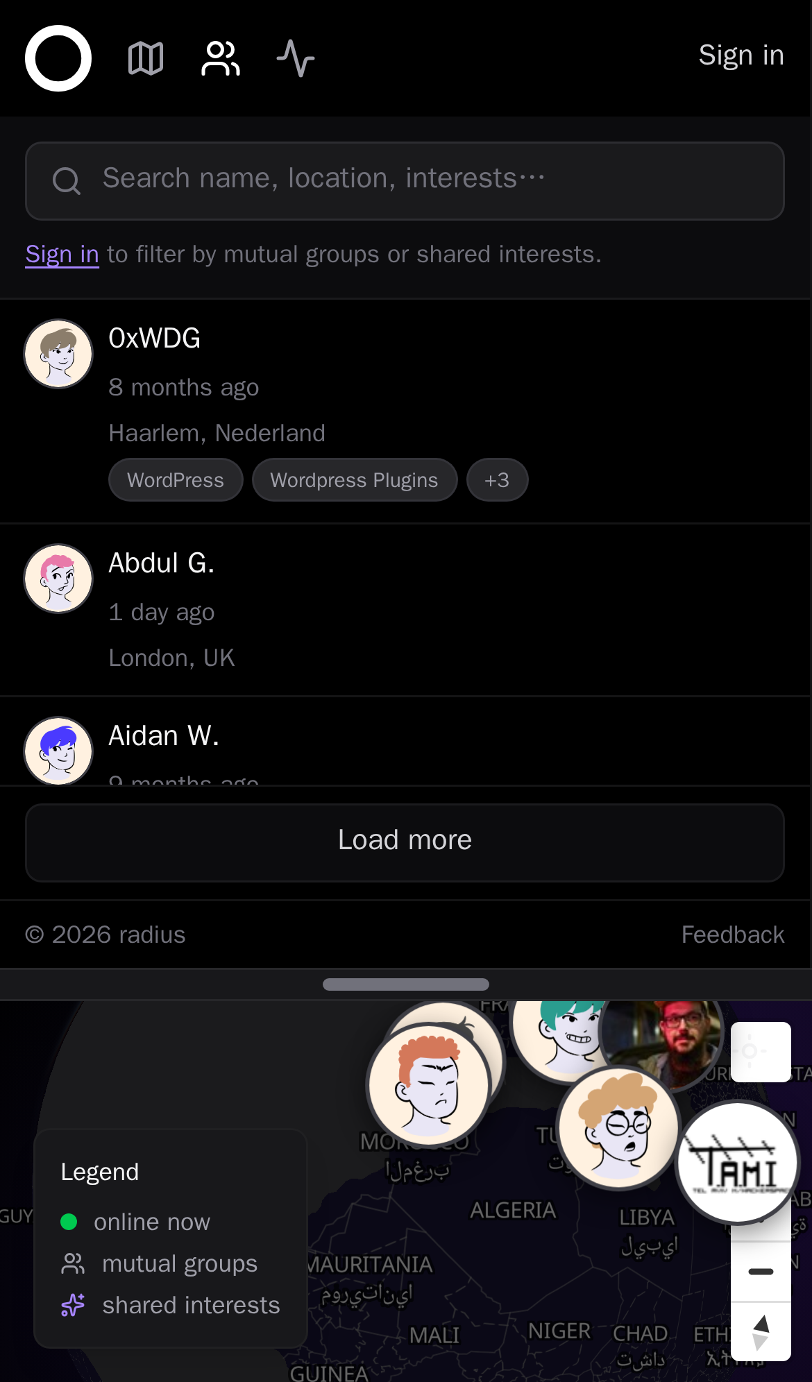
Try it: Open /members on a phone-width viewport and look at the last row above the "Load more" button: its timestamp line is sliced in half by the panel edge.
The "What" text sits awkwardly
The "What's nearby" and "Browse Groups" buttons in the hero CTA row have different heights and vertical centers, with the purple button top edge sitting about 8px above and its bottom edge about 25px
A rough edge in the layout
The location and timestamp metadata line in the Bitcoin Meetup activity card runs together with no separator or space between the location text and the relative time text.
A rough edge in the layout
The footer link columns are unevenly distributed, with Product, Company and Explore packed at the left and Resources pushed to the far right edge, leaving a wide gap between the third and fourth colum
A rough edge in the layout
The location and timestamp metadata line in the tami activity card runs together with no separator or space between the location text and the relative time text.
A rough edge in the layout
The hero call to action buttons are inconsistently sized and aligned: the first row holds two buttons of unequal width and the third button on the second row spans a different width, breaking the butt
Probie fixes this for you.
This report came from one visit. When installed on your project, Probie watches real sessions, reproduces failures, and opens tested fixes as pull requests.
Sign up and get this fixedFree inspection
What should Probie inspect next?
Enter a project URL. There is nothing to install.
Probie checks every issue twice, respects robots.txt, and backs off at bot challenges.
Enter an address and we will email the report card link.