Watch the inspection.
We navigate your site the way customers would. Idle time is skipped.
How the composite score works
The overall score is a weighted average: Visual 18.75%, Accessibility 25%, Buttons and links 31.25%, Under the hood 12.5%, and Mobile 12.5%. Unassessed categories are excluded and the remaining weights are normalized.
Product categories start at 100. Each distinct verified finding deducts 30 points for a reproduced flow defect, or 18 for critical, 12 for high, 7 for medium, and 3 for low stored detector severity. Scores stop at zero and round to whole numbers. All verified findings count, including those beyond the displayed list. The formula is fixed and versioned, so the same saved evidence always receives the same score.
The Account Suspended heading is too faint to read
On /cgi-sys/suspendedpage.cgi the "Account Suspended" heading in the span.status-reason renders at #cccccc on #ffffff, a contrast ratio of 1.6:1 against the 3:1 minimum required for large text at WCAG 2.1 AA (axe-core rule color-contrast, impact serious). The text is 63px and sits at the top of the page as the primary status message, and it reads as a washed-out grey in the rendered page. The body copy below it on the dark panel is unaffected.
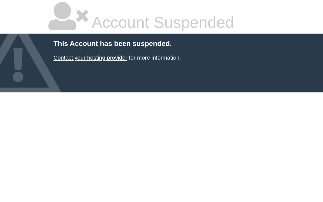
Try it: Open /cgi-sys/suspendedpage.cgi on desktop and check the grey "Account Suspended" heading with a contrast picker: foreground #cccccc on white is 1.6:1.
The Account Suspended heading is too light to read
On /cgi-sys/suspendedpage.cgi at mobile width, the top "Account Suspended" heading and its adjacent icon render in a very light gray on a white background. It is the largest text on the page, yet the foreground sits close to the background tone, so the wordmark is barely distinguishable. The body panel below it uses white text on dark navy and reads clearly by comparison.

Try it: Open /cgi-sys/suspendedpage.cgi on a phone and look at the "Account Suspended" heading at the very top of the page.
The suspended page heading is barely readable
On /cgi-sys/suspendedpage.cgi the main heading is set in a very light gray on a white background, so the largest text on the screen is close to invisible. The body text below it, on the dark band, renders at full contrast, which makes the heading the weakest element on the page. This is the first thing a visitor sees when the account is suspended.
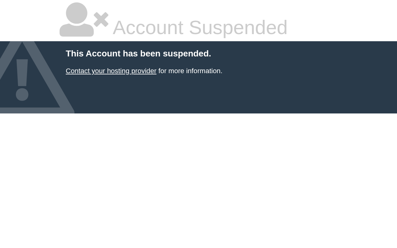
Try it: Open /cgi-sys/suspendedpage.cgi on desktop and look at the top heading against the white background.
Probie fixes this for you.
This report came from one visit. When installed on your project, Probie watches real sessions, reproduces failures, and opens tested fixes as pull requests.
Sign up and get this fixedFree inspection
What should Probie inspect next?
Enter a project URL. There is nothing to install.
Probie checks every issue twice, respects robots.txt, and backs off at bot challenges.
Enter an address and we will email the report card link.