We found 6 issueson postraid.comworth fixing.
Watch the inspection.
We navigate your site the way customers would. Idle time is skipped.
How the composite score works
The overall score is a weighted average: Visual 18.75%, Accessibility 25%, Buttons and links 31.25%, Under the hood 12.5%, and Mobile 12.5%. Unassessed categories are excluded and the remaining weights are normalized.
Product categories start at 100. Each distinct verified finding deducts 30 points for a reproduced flow defect, or 18 for critical, 12 for high, 7 for medium, and 3 for low stored detector severity. Scores stop at zero and round to whole numbers. All verified findings count, including those beyond the displayed list. The formula is fixed and versioned, so the same saved evidence always receives the same score.
The Industries nav pill is clipped off the mobile screen
On /for at a 390px wide viewport, the secondary nav row (Tools, Compare, Alternatives, Industries) is wider than the screen. The black "Industries" pill starts near the right edge and runs past it, so its label is cut mid-word and the pill's right end and any items after it are off screen. The row is the active-page indicator for this route, and it is the only nav item a phone visitor cannot read.

Try it: Open /for on a phone or a 390px wide browser window and look at the nav row under the header: the Industries pill is cut off at the right edge.
The header nav row is cut off on mobile
On /record-product-demo at a 390px wide viewport, the header navigation row runs past the right edge of the screen. "Tools", "Compare" and "Alternatives" fit, but the fourth item is truncated mid-word at the viewport boundary and any items after it are not reachable without horizontal scrolling. The row has no visible scroll affordance or wrap, so those navigation destinations are effectively hidden on a phone.
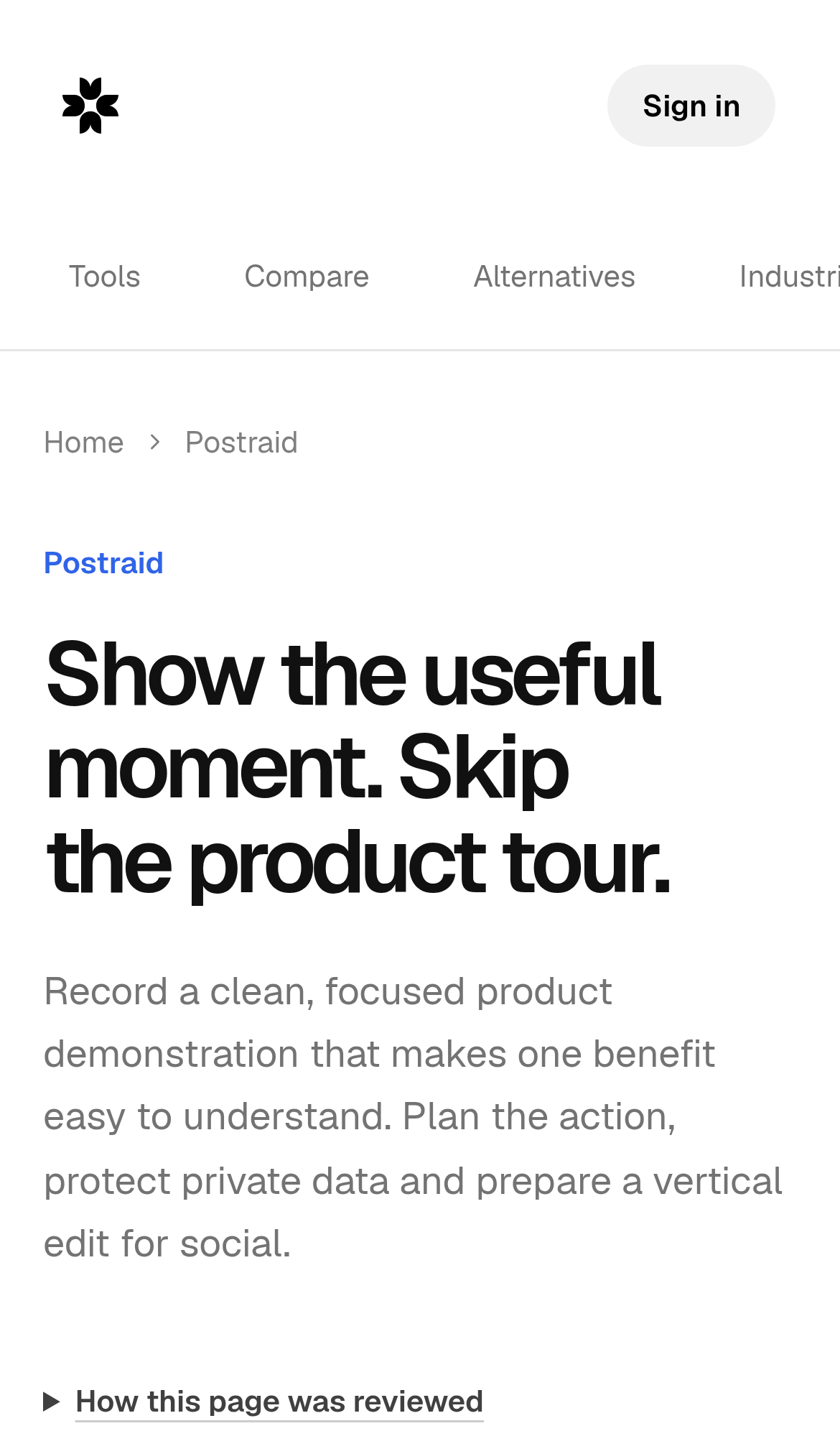
Try it: Open /record-product-demo on a phone or a 390px wide browser window and look at the header nav row: the fourth link is sliced at the right edge.
The tools nav row is cut off at the right edge on mobile
On /tools/ugc-ads at a 390px wide viewport, the secondary navigation row below the header runs past the right edge of the screen. "Tools", "Compare" and "Alternatives" fit, but the next item is sliced mid word at the viewport boundary with no wrap and no visible scroll affordance, so there is nothing to indicate more nav items exist beyond it. The same clipping appears at the top of the page on a fresh load.
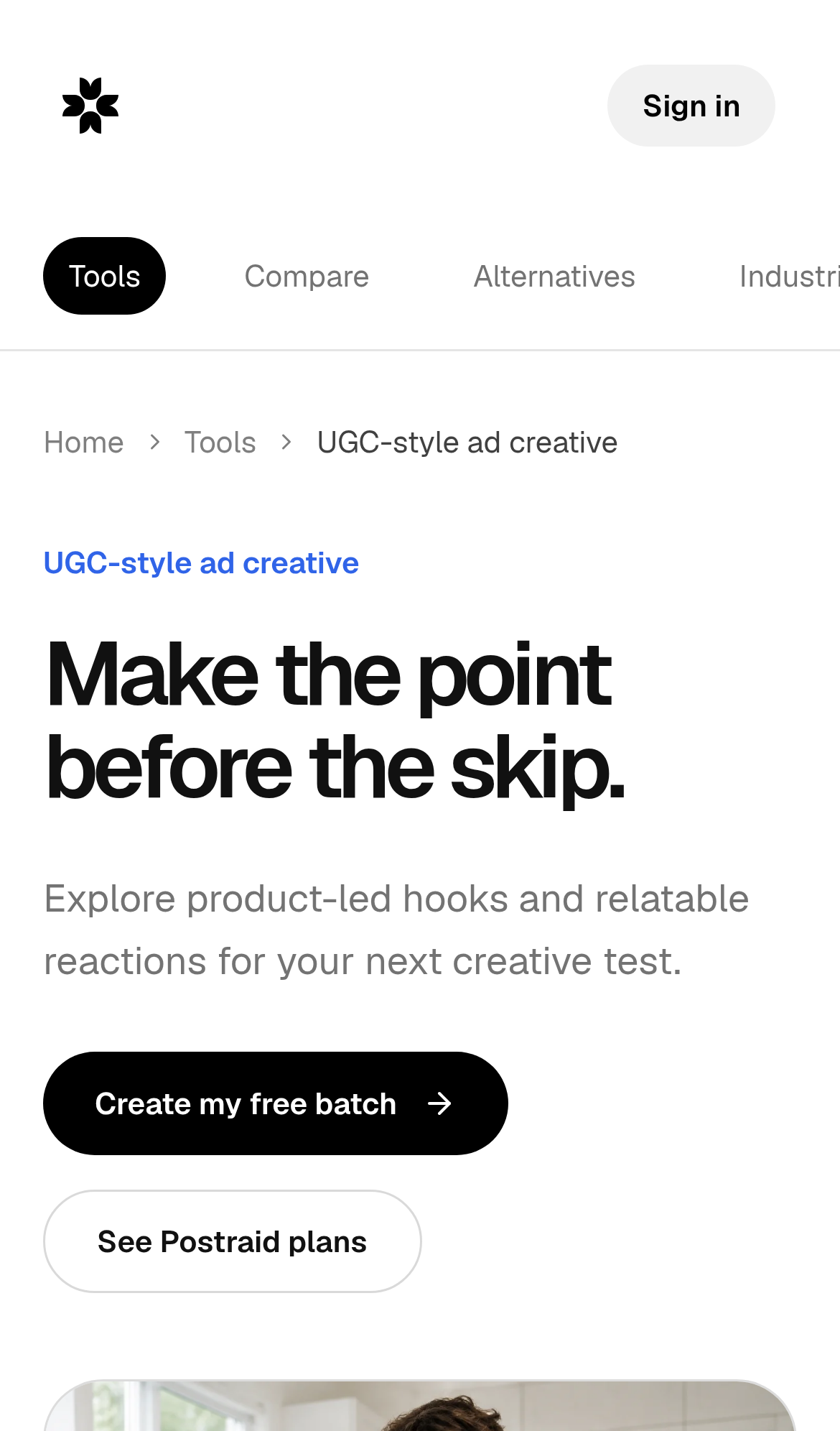
Try it: Open /tools/ugc-ads on a phone or a 390px wide browser window and look at the nav row under the header: the item after "Alternatives" is cut in half at the right edge.
Six security response headers are missing
The response from https://www.postraid.com/ is missing Strict-Transport-Security, Content-Security-Policy, CSP frame-ancestors or X-Frame-Options, X-Content-Type-Options: nosniff, Referrer-Policy, and Cross-Origin-Resource-Policy.

Try it: Run curl -sI https://www.postraid.com/ and check the response for Strict-Transport-Security, Content-Security-Policy, X-Frame-Options, X-Content-Type-Options, Referrer-Policy, and Cross-Origin-Resource-Policy.
Format labels on the home page use a prohibited ARIA attribute
On the home page, the format labels in the sample batch library carry an aria-label on a plain span with no role, which ARIA does not permit, so the label is not guaranteed to reach assistive technology. axe-core flags this as aria-prohibited-attr at serious impact against WCAG 2.1 A (4.1.2). The failing nodes are .feature-library-post:nth-child(1) > .feature-format[aria-label="Videos"], the equivalent span labelled "Carousels", and the one labelled "Memes".
Try it: Open / and inspect the .feature-format spans in the sample batch library, or run axe-core on the page and look at the aria-prohibited-attr rule.
Grey body text on the contact page fails contrast
On /contact, several text elements fall below the WCAG AA contrast minimum of 4.5:1. The "Email us" eyebrow above the address renders at #999999 on #ffffff for a ratio of 2.84, and the supporting lines "We answer within one business day, usually sooner." and the paragraph starting "Support goes faster when the first email already has the details." render at #808080 on #ffffff for a ratio of 3.94. The same color-contrast failure appears on /record-product-demo, /tools and /alternatives.
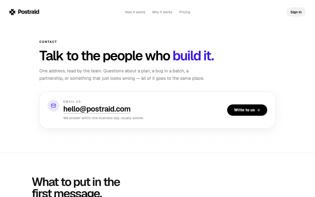
Try it: Open /contact and run axe-core or Lighthouse accessibility, then inspect the "Email us" label and the grey supporting paragraphs under the email address.
A rough edge in the layout
The Explore row in the middle card of the second row sits about 26px higher than the Explore rows in the sibling cards to its left and right, breaking the baseline alignment of the repeated card foote
A rough edge in the layout
The Explore rows in the top row of cards sit at three different vertical positions (y=164, y=190, y=242) while the cards share a common bottom edge, breaking the baseline alignment of the repeated car
Probie fixes this for you.
This report came from one visit. When installed on your project, Probie watches real sessions, reproduces failures, and opens tested fixes as pull requests.
Sign up and get this fixedFree inspection
What should Probie inspect next?
Enter a project URL. There is nothing to install.
Probie checks every issue twice, respects robots.txt, and backs off at bot challenges.
Enter an address and we will email the report card link.