We found 5 issueson pypi.orgworth fixing.
Watch the inspection.
We navigate your site the way customers would. Idle time is skipped.
How the composite score works
The overall score is a weighted average: Visual 18.75%, Accessibility 25%, Buttons and links 31.25%, Under the hood 12.5%, and Mobile 12.5%. Unassessed categories are excluded and the remaining weights are normalized.
Product categories start at 100. Each distinct verified finding deducts 30 points for a reproduced flow defect, or 18 for critical, 12 for high, 7 for medium, and 3 for low stored detector severity. Scores stop at zero and round to whole numbers. All verified findings count, including those beyond the displayed list. The formula is fixed and versioned, so the same saved evidence always receives the same score.
The organization account line runs off the hero edges
On the home page at a 390px wide viewport, the hero line "Publishing as a team? Use an organization account" renders edge to edge with no side gutter. The text starts at x=0 and the underlined "organization account" link reaches the right viewport boundary, where the trailing period and external-link glyph present elsewhere in the copy are not visible. Every other block in the hero, including the search field and the body copy below, keeps a left and right margin, so this one line sits outside the container padding.
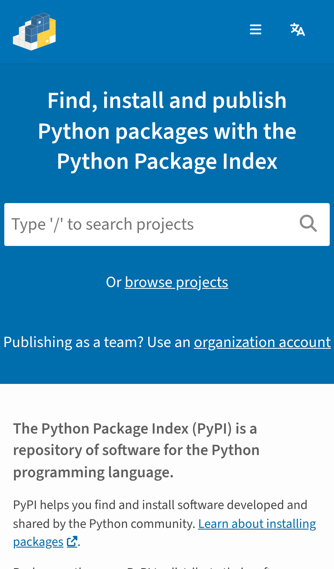
Try it: Open pypi.org on a 390px wide phone viewport and look at the "Publishing as a team?" line under the search box: it touches both screen edges while the rest of the hero is inset.
Help page question links are too small to tap
On the mobile viewport, the table of contents links on /help/ fail the WCAG 2.5.8 target-size requirement. The anchor a[href$="#packages"] ("What's a package, project, or release?") measures 248.8px by 22px, and the safe clickable space around it has a diameter of 22.8px instead of the required 24px, because the list items sit tightly stacked. The neighbouring entries a[href$="#installing"] and a[href$="#publishing"] are at the same 22px height with the same spacing. The same pattern appears on /stats/ and /sitemap/.
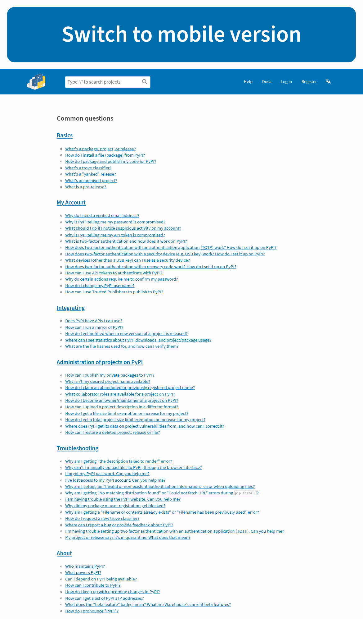
Try it: Open /help/ on a phone and try to tap one of the "Common questions" links in the list at the top; the rows are 22px tall with 22.8px of clickable spacing.
NVIDIA's sponsor tier differs between the footer and /sponsors/
NVIDIA is listed under two different sponsorship tiers. The sponsor list in the footer reads "NVIDIA Visionary sponsor", while the body of /sponsors/ reads "NVIDIA is a sustainability sponsor of the Python Software Foundation." The surrounding entries line up in both places, with Bloomberg, Hudson River Trading and Meta as visionary sponsors and Microsoft alongside NVIDIA, so the two surfaces describe the same sponsor at the same moment with conflicting tiers.
Try it: Open /sponsors/ and find the NVIDIA entry, then compare its tier wording with the NVIDIA entry in the sponsor list in the page footer.
The homepage omits the Cross-Origin-Resource-Policy header
The response from https://pypi.org/ is missing Cross-Origin-Resource-Policy.
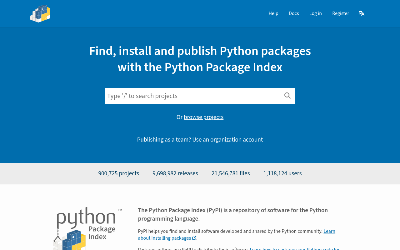
Try it: Run curl -sI https://pypi.org/ and check for a Cross-Origin-Resource-Policy line in the response headers.
Footer and sponsor text fall below contrast minimums
On the home page footer, the "Developed and maintained by the Python Software Foundation" tagline renders at #cce2f0 on #0070b2, a contrast ratio of 3.96:1 at 14.4px, below the 4.5:1 required for normal text. The "Visionary sponsor" labels under each sponsor logo render at #8f8f8f on #fdfdfd, a ratio of 3.17:1 at 12.8px. The axe-core color-contrast rule flags these at serious impact, and the same footer appears on /help/, /organizations/, /stats/, /trademarks/ and /sponsors/.
Try it: Open pypi.org, scroll to the footer, and sample the tagline text against its blue background and the grey "Visionary sponsor" labels against white with a contrast checker.
A rough edge in the layout
The sponsor logo in the first card of the bottom row sits off center, pushed right of the card's horizontal center while sibling cards center their logos.
A rough edge in the layout
The top blue banner button renders at an oversized scale, with text roughly 3x the size of any other heading and a 178px tall block occupying the top of the mobile viewport.
Probie fixes this for you.
This report came from one visit. When installed on your project, Probie watches real sessions, reproduces failures, and opens tested fixes as pull requests.
Sign up and get this fixedFree inspection
What should Probie inspect next?
Enter a project URL. There is nothing to install.
Probie checks every issue twice, respects robots.txt, and backs off at bot challenges.
Enter an address and we will email the report card link.