We found 3 issueson upplaunch.comworth fixing.
Watch the inspection.
We navigate your site the way customers would. Idle time is skipped.
How the composite score works
The overall score is a weighted average: Visual 18.75%, Accessibility 25%, Buttons and links 31.25%, Under the hood 12.5%, and Mobile 12.5%. Unassessed categories are excluded and the remaining weights are normalized.
Product categories start at 100. Each distinct verified finding deducts 30 points for a reproduced flow defect, or 18 for critical, 12 for high, 7 for medium, and 3 for low stored detector severity. Scores stop at zero and round to whole numbers. All verified findings count, including those beyond the displayed list. The formula is fixed and versioned, so the same saved evidence always receives the same score.
Five security response headers are missing
The response from https://www.upplaunch.com/ is missing Content-Security-Policy, CSP frame-ancestors or X-Frame-Options, X-Content-Type-Options: nosniff, Referrer-Policy, and Cross-Origin-Resource-Policy.
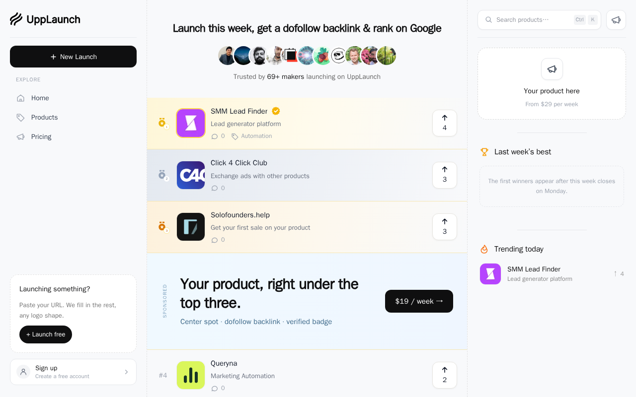
Try it: Run curl -I https://www.upplaunch.com/ and check the response for Content-Security-Policy, X-Frame-Options, X-Content-Type-Options, Referrer-Policy, and Cross-Origin-Resource-Policy.
Sidebar text fails minimum color contrast
Several text elements on the project fall below the WCAG AA contrast minimum of 4.5:1. The sidebar "EXPLORE" heading renders #9ca3af on #f8f9fb at 2.41:1, the "Create a free account" line under the sign-up entry renders #9ca3af on #ffffff at 2.53:1, and the launch prompt copy renders #777777 on #ffffff at 4.47:1. All three are small text at 11px to 13px, and axe-core classes the rule failure as serious on /, /pricing, and /terms.
Try it: Open / on desktop and sample the sidebar "EXPLORE" label and the "Create a free account" subtitle with a contrast checker against their backgrounds.
The second ranked product's logo is clipped in its tile
On the mobile home page, the logo artwork in the Click 4 Click Club row of the ranking list is rendered wider than its rounded tile. The last glyph of the logo runs into the right edge of the tile and is cut in half by the rounded corner mask, while the first and third rows show their logos fully inside their frames. The artwork appears to be scaled to fill the tile height rather than fitted to its box.
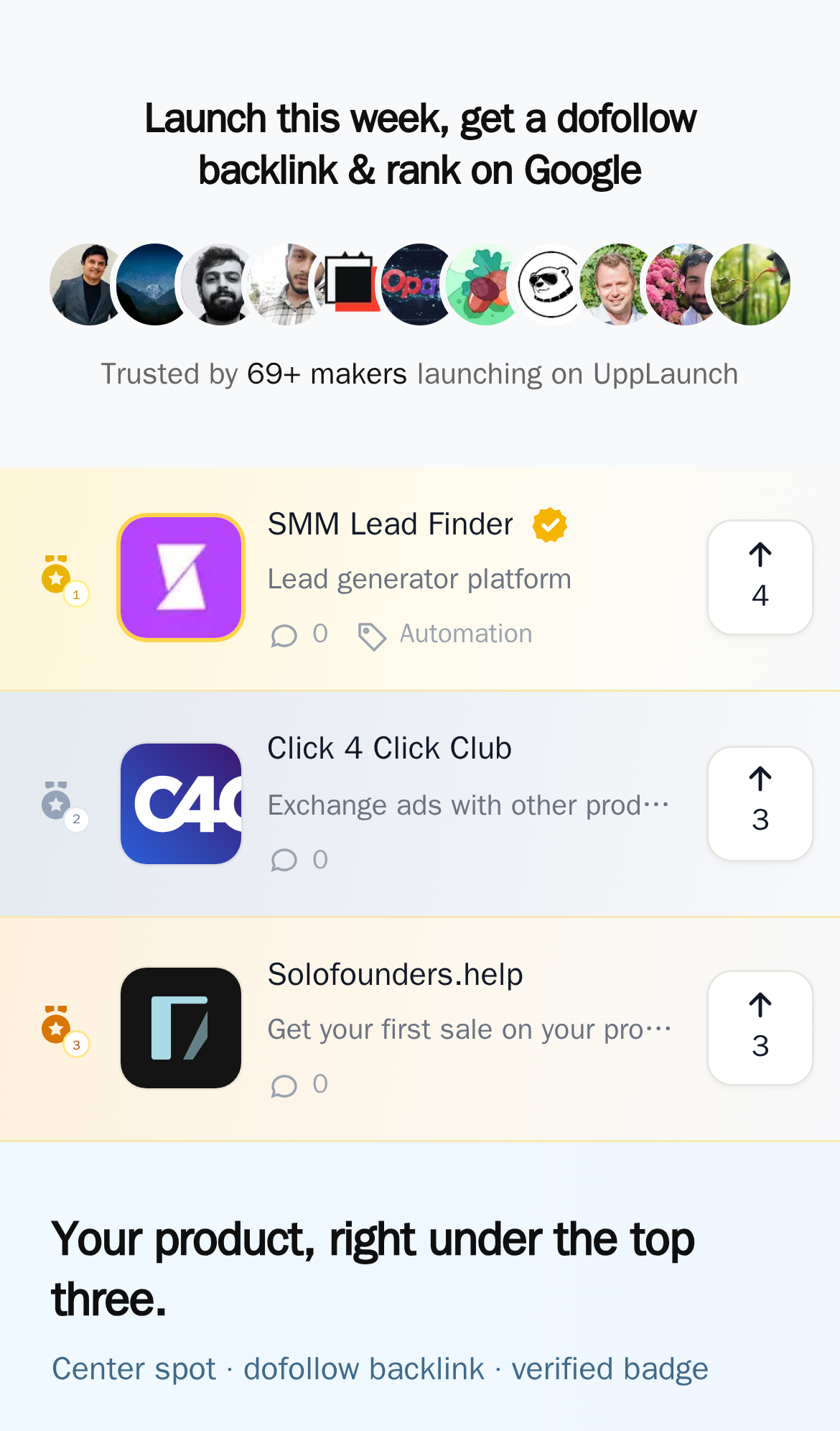
Try it: Open the home page at a 390px wide viewport and look at the second entry in the ranking list: the logo in the rounded tile is cut off at the right edge.
Probie fixes this for you.
This report came from one visit. When installed on your project, Probie watches real sessions, reproduces failures, and opens tested fixes as pull requests.
Sign up and get this fixedFree inspection
What should Probie inspect next?
Enter a project URL. There is nothing to install.
Probie checks every issue twice, respects robots.txt, and backs off at bot challenges.
Enter an address and we will email the report card link.