We found 6 issueson skillry.devworth fixing.
Watch the inspection.
We navigate your site the way customers would. Idle time is skipped.
How the composite score works
The overall score is a weighted average: Visual 18.75%, Accessibility 25%, Buttons and links 31.25%, Under the hood 12.5%, and Mobile 12.5%. Unassessed categories are excluded and the remaining weights are normalized.
Product categories start at 100. Each distinct verified finding deducts 30 points for a reproduced flow defect, or 18 for critical, 12 for high, 7 for medium, and 3 for low stored detector severity. Scores stop at zero and round to whole numbers. All verified findings count, including those beyond the displayed list. The formula is fixed and versioned, so the same saved evidence always receives the same score.
The skills listing takes eight seconds to paint
On /skills at desktop width, Largest Contentful Paint lands at 7,976 ms, about twice the 4,000 ms mark Google classes as poor. The route renders a 382-item grid of media-heavy skill cards, and many tiles are still blank gradients well down the page. The same timing came back on a second load.
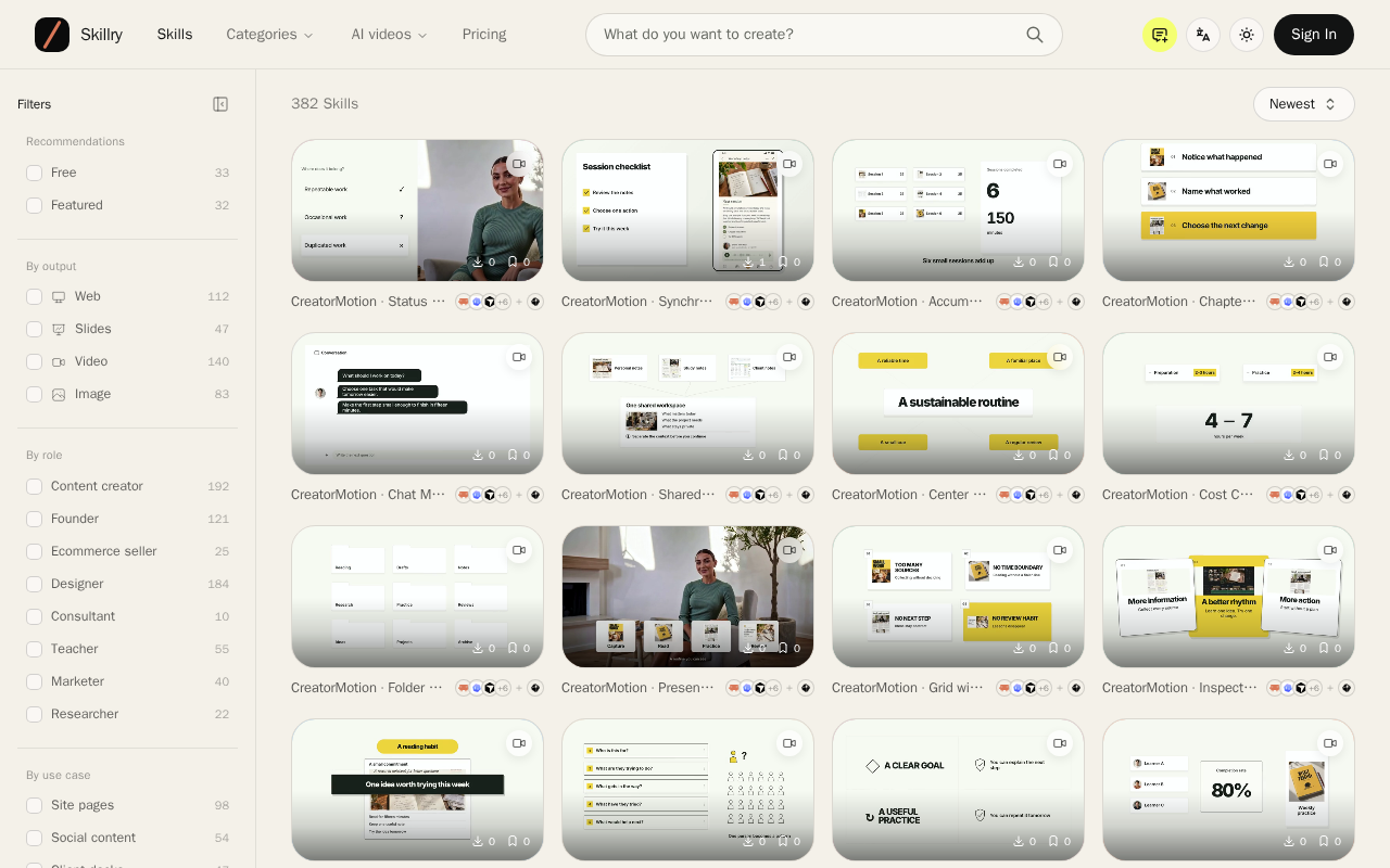
Try it: Open /skills on desktop with DevTools Performance or a PerformanceObserver on largest-contentful-paint and read the LCP time.
The skills listing paints its main content in 6.3s on mobile
On /skills at a mobile viewport, Largest Contentful Paint measures 6.3s, well past the 4s mark Google classes as poor. The route renders a grid of large preview images for 382 skills, and the main content area stays unpainted for several seconds after navigation. The same measurement came back on a second fresh load.
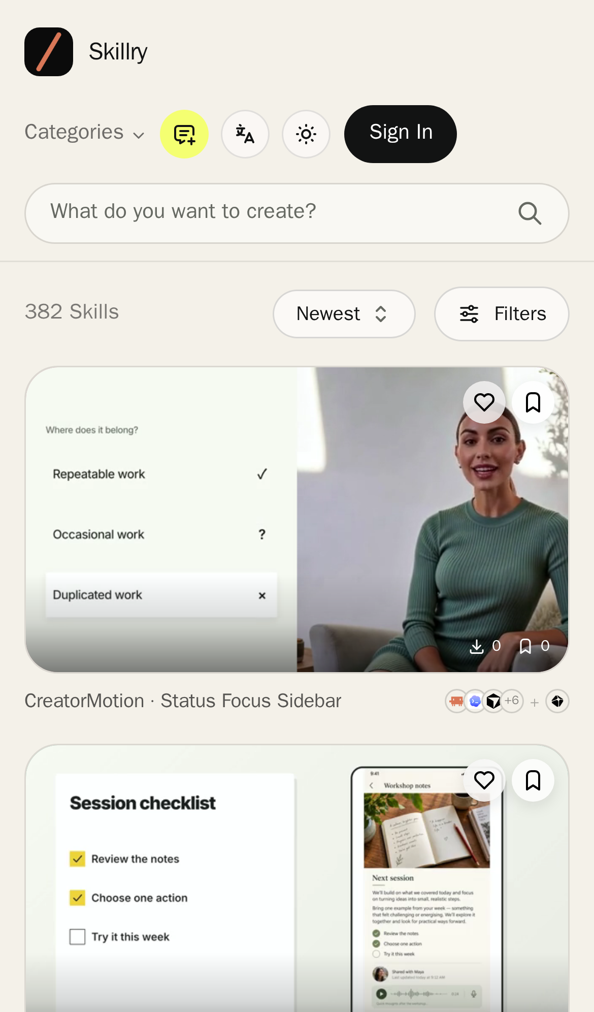
Try it: Open /skills on a mobile device or a throttled mobile emulation in DevTools and record a performance trace; check the LCP marker, which lands around 6.3s.
The MIT License text is cut off on mobile
On /third-party-notices at a 390px viewport, the dark MIT License code block clips every line at its right edge. Lines end mid-word ("free o", "associated docu", "in the Software without restriction,", "and to permi"), and the text does not wrap to the next line, so the licence body cannot be read on a phone. The panel itself ends inside the viewport with page background to its right, so the hidden text is not reachable by scrolling the page sideways.
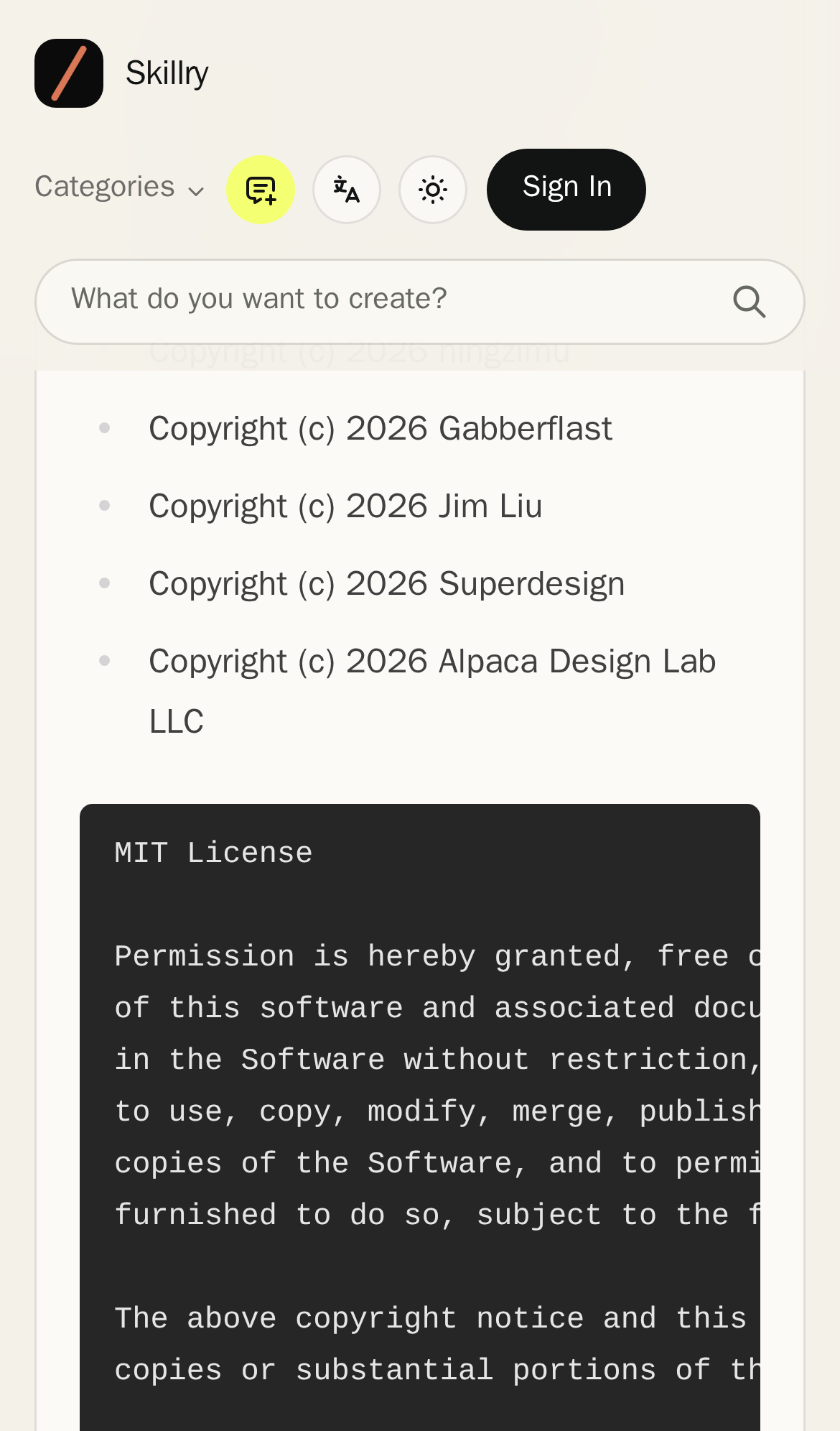
Try it: Open /third-party-notices on a phone or a 390px-wide browser window and scroll to the MIT License block; the monospace lines end mid-word at the panel's right edge.
Six security response headers are missing
The response from https://skillry.dev/ is missing Strict-Transport-Security, Content-Security-Policy, CSP frame-ancestors or X-Frame-Options, X-Content-Type-Options: nosniff, Referrer-Policy, and Cross-Origin-Resource-Policy.
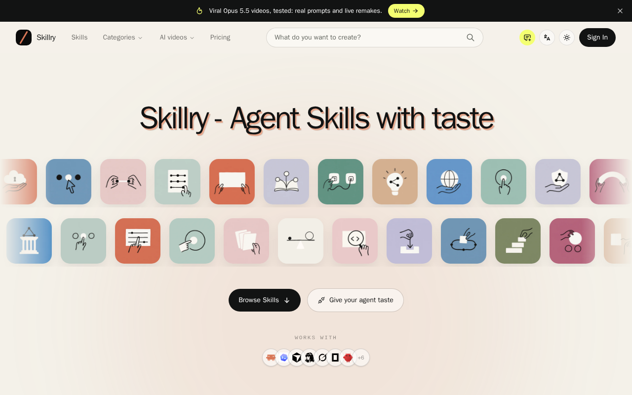
Try it: Run curl -sSI https://skillry.dev/ and check the response headers for Strict-Transport-Security, Content-Security-Policy, X-Frame-Options, X-Content-Type-Options, Referrer-Policy, and Cross-Origin-Resource-Policy.
Low contrast text fails WCAG AA on several pages
Several text elements on the project fall below the WCAG AA contrast minimum of 4.5:1. The "Works with" label on the home page renders at 2.77:1 (#918983 on #f1e5da, 11px), and the "View all skills" links next to each shelf are similarly faint grey on a near-white background. The same color-contrast failures appear across /, /skills, /terms, /privacy, /blog, /guides, /pricing and other routes, so they come from shared utility classes rather than one page.
Try it: Open the home page and look at the "WORKS WITH" caption above the tool icons and the "View all skills" links beside each shelf heading; both sit well under a 4.5:1 ratio against their backgrounds.
The first guide card renders with no content
On /guides, the first card in the "Choose a guide" grid is a solid dark block carrying only the "01" index. No eyebrow, heading, or summary text renders inside it across the full visible height of the card. The neighbouring card shows "02", the eyebrow "READY TO INSTALL", the title "How to Install a Claude Skill (and Where the Files Actually Go)", and a three line summary, so the grid template itself is filling correctly for the second entry. The empty card occupies the most prominent slot of the guide list at desktop width.
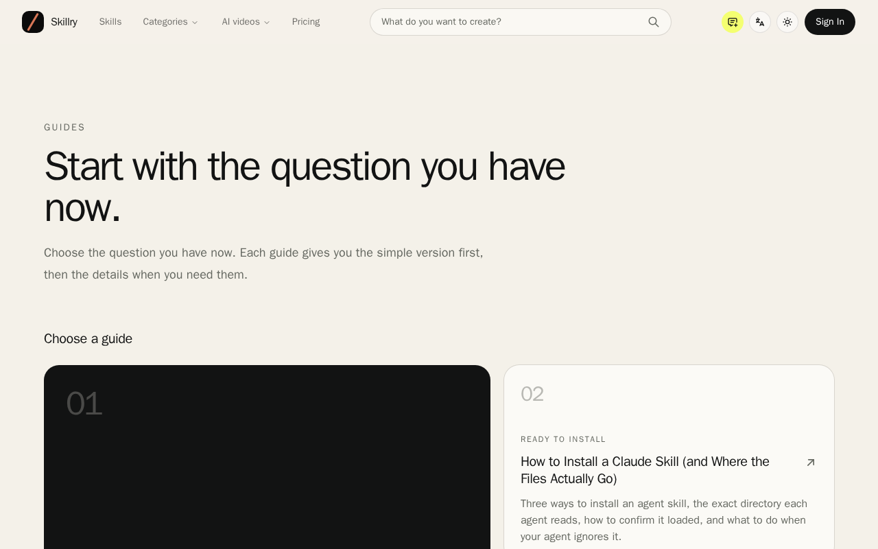
Try it: Open /guides on a 1280px desktop viewport and look at the first card in the "Choose a guide" grid: it is a dark block with only "01" and no title or description.
A rough edge in the layout
The Yearly plan card is horizontally offset from the monthly card above it, with its right border extending past the monthly card's right edge and nearly touching the viewport edge while its left edge
Probie fixes this for you.
This report came from one visit. When installed on your project, Probie watches real sessions, reproduces failures, and opens tested fixes as pull requests.
Sign up and get this fixedFree inspection
What should Probie inspect next?
Enter a project URL. There is nothing to install.
Probie checks every issue twice, respects robots.txt, and backs off at bot challenges.
Enter an address and we will email the report card link.