We found 5 issueson opencomputer.devworth fixing.
Watch the inspection.
We navigate your site the way customers would. Idle time is skipped.
How the composite score works
The overall score is a weighted average: Visual 18.75%, Accessibility 25%, Buttons and links 31.25%, Under the hood 12.5%, and Mobile 12.5%. Unassessed categories are excluded and the remaining weights are normalized.
Product categories start at 100. Each distinct verified finding deducts 30 points for a reproduced flow defect, or 18 for critical, 12 for high, 7 for medium, and 3 for low stored detector severity. Scores stop at zero and round to whole numbers. All verified findings count, including those beyond the displayed list. The formula is fixed and versioned, so the same saved evidence always receives the same score.
Six security response headers are missing
The response from https://opencomputer.dev/ is missing Strict-Transport-Security, Content-Security-Policy, CSP frame-ancestors or X-Frame-Options, X-Content-Type-Options: nosniff, Referrer-Policy, and Cross-Origin-Resource-Policy.
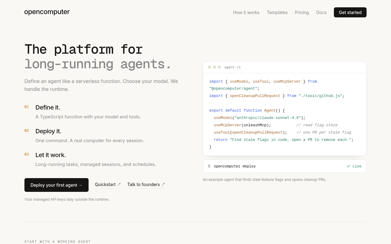
Try it: Run curl -sI https://opencomputer.dev/ and check the response for Strict-Transport-Security, Content-Security-Policy, X-Frame-Options, X-Content-Type-Options, Referrer-Policy, and Cross-Origin-Resource-Policy.
The header navigation links are too low contrast
The primary navigation links in the header ("How it works", "Templates", "Pricing") render as #878787 text on the #faf8f5 background at 14px, a contrast ratio of 3.38:1 against the 4.5:1 required by WCAG 2.1 AA for normal text. The same muted link colour fails on /agentcore-alternative/, /claude-managed-agents-alternative/, /openai-agents-api-alternative/, /inspect/, /blog/, /guides/, /clawputer/ and /partners/. axe-core flags this under the color-contrast rule at serious impact.
Try it: Open the home page and sample the header nav link colour (#878787) against the page background (#faf8f5) in any contrast checker; it reads 3.38:1.
The Loom video frame has no accessible name
On /partners/, the embedded Loom video iframe under "See it in action" has no accessible name: no title attribute, no aria-label, and no aria-labelledby. axe-core flags this as frame-title at impact level serious, failing WCAG 2.1 A (4.1.2). Screen reader users reaching the demo embed get no indication of what the frame contains.
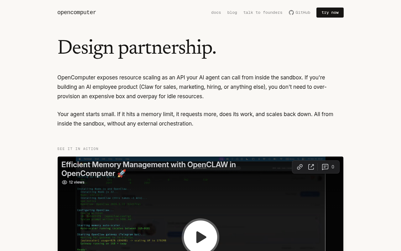
Try it: Open /partners/ and inspect the Loom embed iframe in DevTools; confirm there is no title, aria-label, or aria-labelledby attribute.
Blog list summaries are too light to read
On /blog/ the post summary paragraphs and the author/date bylines inside each card render in a pale warm gray on the near white card background, so the text is washed out and hard to read at normal viewing distance. The post headings directly above them are dark and crisp, which makes the difference in the same card obvious. The effect is present on every card in the list, including "I built an email agent to triage bogus security reports" and "Build a background coding agent that works while you sleep".
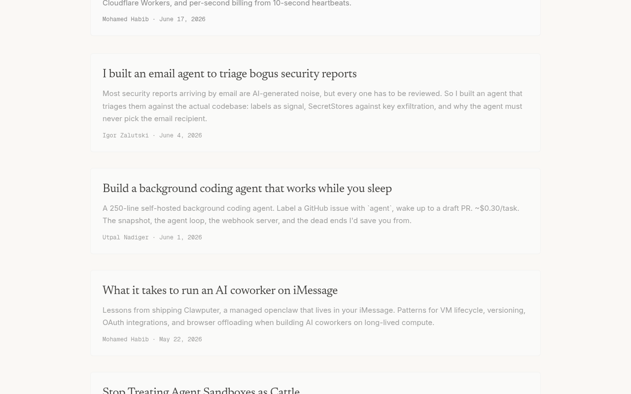
Try it: Open /blog/ on a desktop browser and read the summary line and byline under any post title; compare them with the title above.
The partner card description text is too faint to read
On /partners/ at mobile width, the description paragraph inside the "80% off future compute" card renders in a pale gray on the near-white card background. At retina rendering the glyph strokes barely separate from the panel, so the sentence about design partners getting 80% off future usage is much harder to read than the surrounding body copy, which renders in near black. The card heading directly above it is noticeably darker, which makes the paragraph look washed out by comparison.
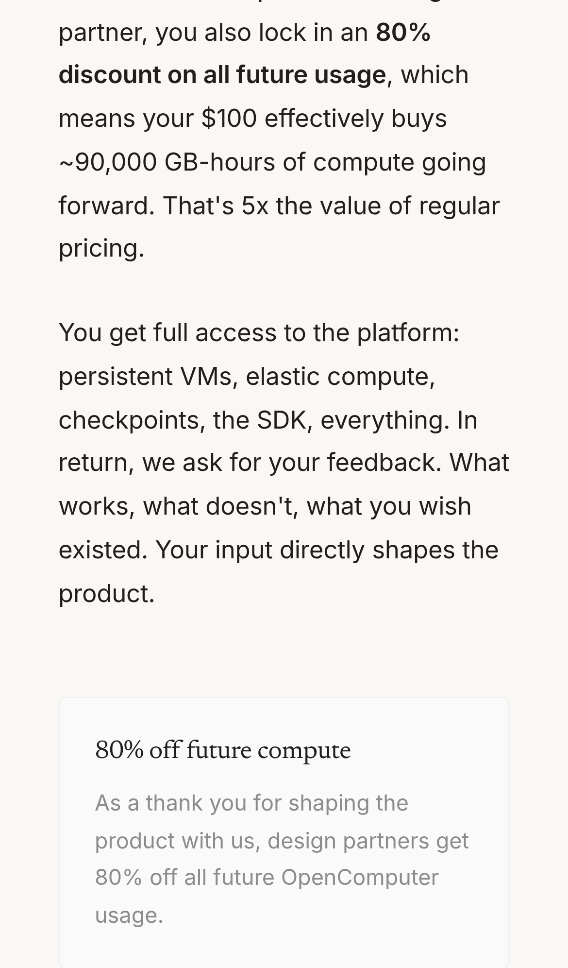
Try it: Open /partners/ on a phone, scroll to the "80% off future compute" card, and compare its paragraph text against the body copy above it.
The "s " text sits awkwardly
The first card's "Deploy the template" link and its caption sit about 19px lower than the equivalent links in the two sibling cards of the same row, breaking the baseline alignment across the row.
A rough edge in the layout
The first card's action link and its note sit about 20px lower than the equivalent link and note in the two sibling cards of the same row, breaking the row's baseline alignment.
A rough edge in the layout
The status text beside the play button is squeezed into a narrow column that wraps into eight very short lines, including single-word lines, while the area under the button stays empty.
A rough edge in the layout
The opencomputer panel's feature list wraps its final word onto a second line by itself, leaving an orphaned centered line under the inline separated list.
A rough edge in the layout
The right-aligned eyebrow label beside the section heading wraps a single word onto its own second line, leaving an orphan.
Probie fixes this for you.
This report came from one visit. When installed on your project, Probie watches real sessions, reproduces failures, and opens tested fixes as pull requests.
Sign up and get this fixedFree inspection
What should Probie inspect next?
Enter a project URL. There is nothing to install.
Probie checks every issue twice, respects robots.txt, and backs off at bot challenges.
Enter an address and we will email the report card link.