We found 2 issueson reasonlayer.comworth fixing.
Watch the inspection.
We navigate your site the way customers would. Idle time is skipped.
Primary buttons and blue body text fail contrast
Several text elements on reasonlayer.com fall below the WCAG AA contrast minimum of 4.5:1, and axe-core classes the failure as serious. The "Get started for free" button renders white text on #6b91dd at 3.12:1, the comparison line "Agents + your team + existing tools" renders #6b91dd on #fffbfe at 3.04:1, and the "Palus Finance" logo wordmark renders #858585 on white at 3.69:1. The same rule fails on /, /pricing, /docs, /faq and /blog.
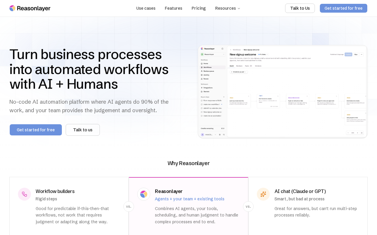
Try it: Open the home page, sample the white label on the blue "Get started for free" button and the blue subtitle under "Reasonlayer" with a contrast checker, and compare against 4.5:1.
A tall empty band splits the mobile pricing page
On /pricing at mobile width, a blank band about 518 device pixels tall (roughly 173 css px) sits between the bottom of the last pricing card ending with the "Talk to us" button and the top of the "Put your first process into production." call to action card. The band spans the full viewport width and contains no rendered content, no heading, and no artwork, so at a 390x664 viewport a large share of the screen is empty white while scrolling between the two sections. The same gap is present at scroll offset 1328 across repeated loads.
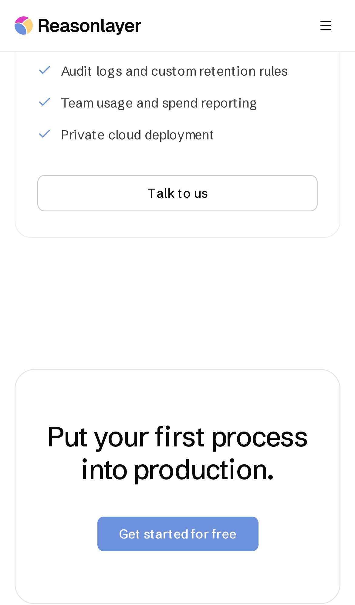
Try it: Open /pricing on a phone-sized viewport and scroll to the end of the pricing cards, then look at the gap before the "Put your first process into production." card.
A rough edge in the layout
The LinkedIn social icon in the footer renders as a filled dark square badge while the adjacent X icon is a bare glyph, making the two siblings visually inconsistent.
A rough edge in the layout
The X and LinkedIn social icons in the footer are styled inconsistently: the X mark is a bare glyph while the LinkedIn mark sits in a filled rounded square, and the two render at different visual size
Probie fixes this for you.
This report came from one visit. When installed on your project, Probie watches real sessions, reproduces failures, and opens tested fixes as pull requests.
Sign up and get this fixedFree inspection
What should Probie inspect next?
Enter a project URL. There is nothing to install.
Probie checks every issue twice, respects robots.txt, and backs off at bot challenges.