We found 6 issueson getartcraft.comworth fixing.
Watch the inspection.
We navigate your site the way customers would. Idle time is skipped.
How the composite score works
The overall score is a weighted average: Visual 18.75%, Accessibility 25%, Buttons and links 31.25%, Under the hood 12.5%, and Mobile 12.5%. Unassessed categories are excluded and the remaining weights are normalized.
Product categories start at 100. Each distinct verified finding deducts 30 points for a reproduced flow defect, or 18 for critical, 12 for high, 7 for medium, and 3 for low stored detector severity. Scores stop at zero and round to whole numbers. All verified findings count, including those beyond the displayed list. The formula is fixed and versioned, so the same saved evidence always receives the same score.
The home page scrolls sideways on mobile
On the home page at a 390px mobile viewport, the document scrollWidth measures 494px, so the page scrolls horizontally. The overflow traces to a marquee row inside main (main#main > div.marquee > ul.marquee-track > li.hud-label), whose item extends to x=227 with a width of 218px, past the 390px viewport edge. Content and the header line up to the viewport edge, so the extra 104px of scrollable width is off-screen.
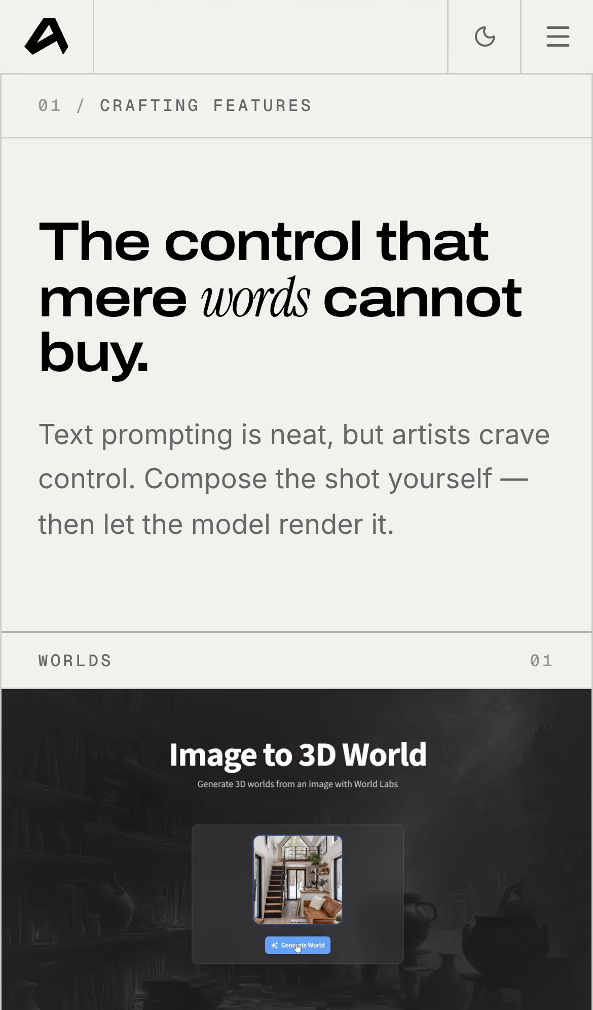
Try it: Open getartcraft.com on a phone or a 390px wide emulated viewport and swipe left on the home page; the content slides sideways by about 100px.
The FAQ header promises 8 guides but lists 4
The /faq page header reads "01/FAQ 8 GUIDES Frequently asked questions. Deep-dive guides and answers about ArtCraft." The guide list that follows under "02/GUIDES READ IN ORDER OR JUMP AROUND" stops at item 04, "Edit Image, Inpaint and Replace", which is immediately followed by the footer text "The open-source studio for controllable AI image and video." The stated count and the rendered list disagree by four entries.
Try it: Open /faq and compare the "8 GUIDES" label in the header with the numbered list below it, which ends at 04 before the footer.
Four security response headers are missing
The response from https://getartcraft.com/ is missing Content-Security-Policy, CSP frame-ancestors or X-Frame-Options, Referrer-Policy, and Cross-Origin-Resource-Policy.
Try it: Run curl -sI https://getartcraft.com/ and check for Content-Security-Policy, X-Frame-Options, Referrer-Policy, and Cross-Origin-Resource-Policy in the response headers.
Small grey labels fall below the contrast minimum
Small uppercase labels styled with the text-faint class render at a contrast ratio of 2.72 against the page background (#939392 on #f2f1ee, 11px, normal weight), below the 4.5:1 minimum that WCAG 2 AA requires for text at that size. Affected content includes the "Free to start · No subscription" line, the footer "Product" navigation heading, and the mailto link [email protected]. The same pattern fails on /, /pricing, /download, /tutorials, /news, and /faq. In the rendered page these strings read as pale grey against an off-white background.
Try it: Open the home page and run axe-core or Lighthouse accessibility, or inspect any .text-faint label and compare #939392 on #f2f1ee against the 4.5:1 threshold.
Hero meta text sits on top of a dark thumbnail
On the mobile home page, the three gray meta lines under the hero buttons ("OPEN SOURCE ON GITHUB", "MACOS · WINDOWS · WEB", "NO SUBSCRIPTION REQUIRED") render directly over one of the floating thumbnail images. Where the glyphs cross the dark artwork, the medium gray type falls close to the image tone and the words lose legibility, while the same lines read clearly over the light background to the left. The overlap is in the same place on repeat loads, and the thumbnail behind the text differs between loads, so the contrast varies with whichever image lands there.
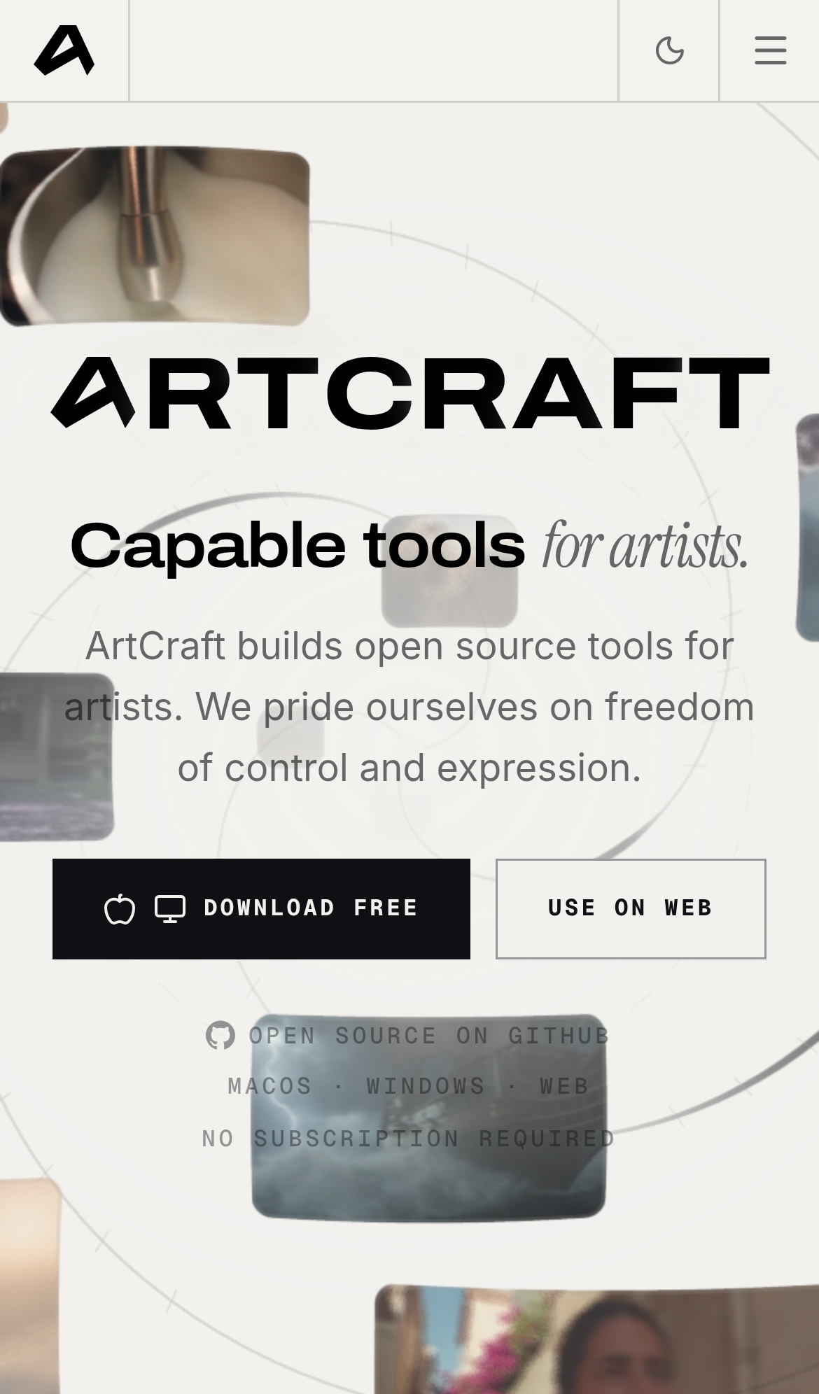
Try it: Open getartcraft.com on a phone and look at the three small gray lines below the Download Free button; a floating thumbnail renders behind them.
Hero trust text is unreadable over the ship artwork
On the mobile home page, the gray trust lines under the download buttons sit on top of a dark ship image that drifts behind them. Over the image, the right half of "NO SUBSCRIPTION REQUIRED" and parts of "OPEN SOURCE ON GITHUB" and "MACOS · WINDOWS · WEB" drop to near the brightness of the artwork, so the letters are hard to separate from the background. The left portion of each line, which falls on the light background, stays legible, which makes the contrast break obvious mid-line.
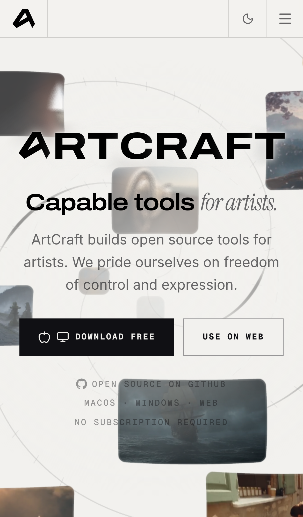
Try it: Open getartcraft.com on a phone and look at the three gray lines below the Download Free button where the dark ship image passes behind them.
The "Capable tools for artists." text sits awkwardly
A floating decorative thumbnail sits directly behind the hero subheadline, cutting through the lettering of "Capable tools for artists." and reducing its legibility.
Probie fixes this for you.
This report came from one visit. When installed on your project, Probie watches real sessions, reproduces failures, and opens tested fixes as pull requests.
Sign up and get this fixedFree inspection
What should Probie inspect next?
Enter a project URL. There is nothing to install.
Probie checks every issue twice, respects robots.txt, and backs off at bot challenges.
Enter an address and we will email the report card link.