We found 5 issueson berth-black.vercel.appworth fixing.
Watch the inspection.
We navigate your site the way customers would. Idle time is skipped.
How the composite score works
The overall score is a weighted average: Visual 18.75%, Accessibility 25%, Buttons and links 31.25%, Under the hood 12.5%, and Mobile 12.5%. Unassessed categories are excluded and the remaining weights are normalized.
Product categories start at 100. Each distinct verified finding deducts 30 points for a reproduced flow defect, or 18 for critical, 12 for high, 7 for medium, and 3 for low stored detector severity. Scores stop at zero and round to whole numbers. All verified findings count, including those beyond the displayed list. The formula is fixed and versioned, so the same saved evidence always receives the same score.
Phone visitors cannot read the demo dashboard
Visitors who open the demo on a phone see a sidebar filling the whole screen while the task board is pushed off the right edge, so card titles, agent details, and action buttons are cut mid-word: "Fix checkout w", "Claude Code · ch", "Build the QA de". The bottom status bar text also wraps and collides. Anyone trying the demo from a phone cannot read what the product does or interact with the board, which is the main thing /demo/ exists to show.
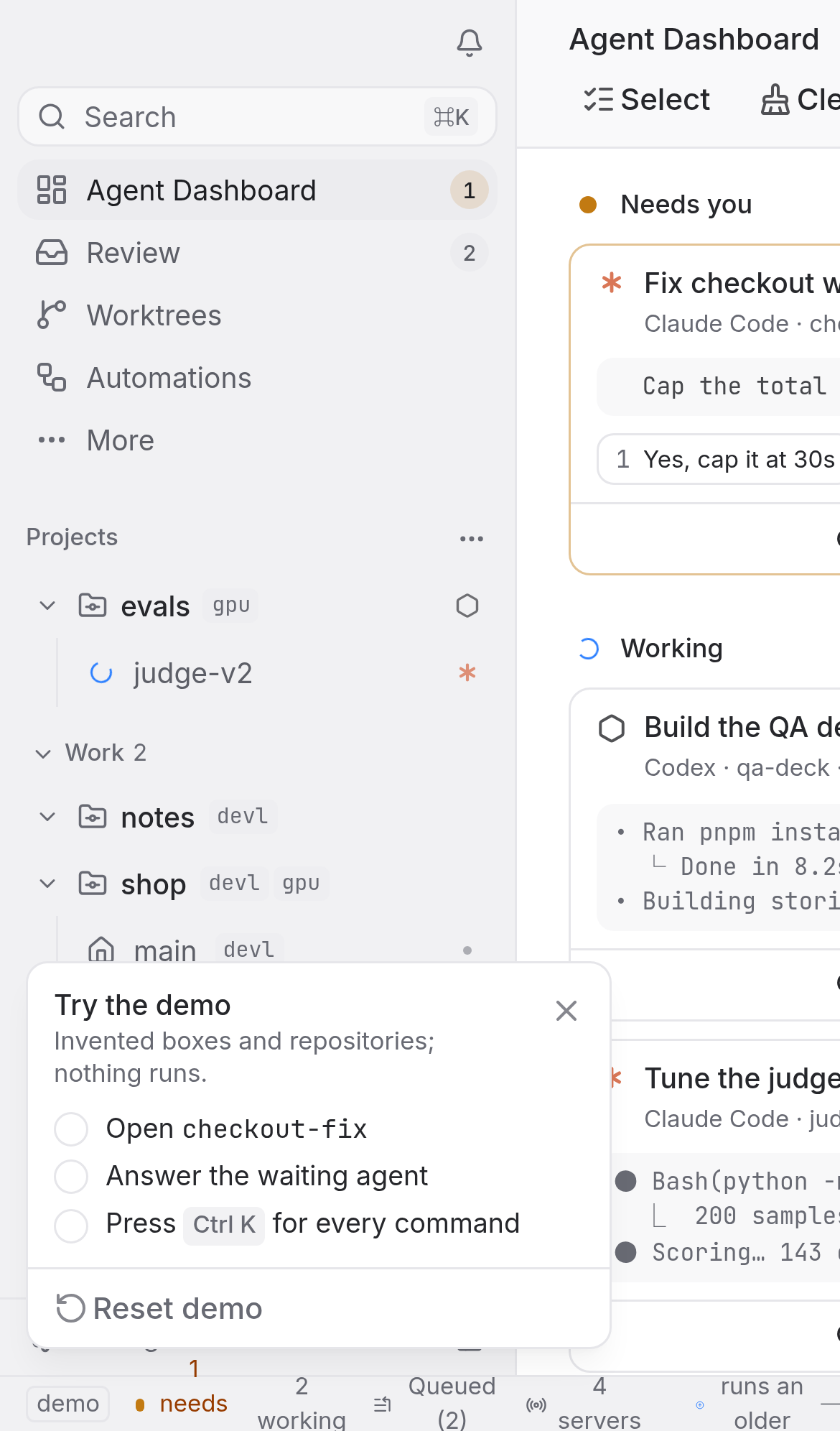
Try it: Open /demo/ on a phone or a 390px wide browser window and look at the right side of the screen: the board column is clipped mid-word and the sidebar takes the full width.
Five response header protections are missing
The response from https://berth-black.vercel.app/ is missing Content-Security-Policy, CSP frame-ancestors or X-Frame-Options, X-Content-Type-Options: nosniff, Referrer-Policy, and Cross-Origin-Resource-Policy.
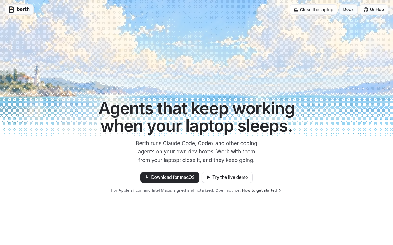
Try it: Run curl -I https://berth-black.vercel.app/ and check for Content-Security-Policy, X-Frame-Options, X-Content-Type-Options, Referrer-Policy, and Cross-Origin-Resource-Policy in the response headers.
Low vision visitors cannot read task details on the demo
Visitors exploring the demo dashboard rely on the small grey labels under each task to tell which repository and branch an agent is working on, and that text is too faint for people with low vision to read. On /demo/ the branch labels such as " · me/checkout-fix" and " · me/qa-deck" sit at a contrast ratio of 2.92 against white, and the "1 more worktree" label at 3.26, where WCAG 2 AA requires 4.5:1 for text this size. The information is still present, but part of the audience cannot take it in while deciding whether the product fits their workflow.
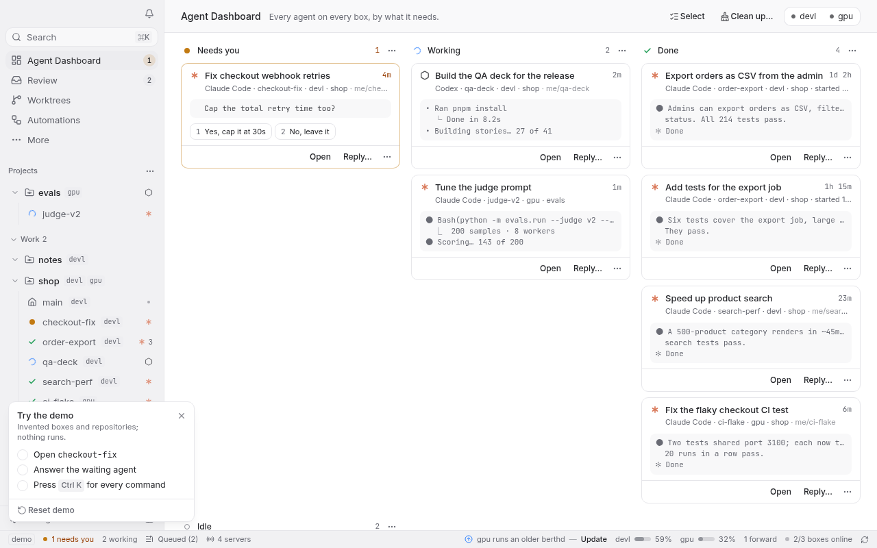
Try it: Open /demo/ and run an axe-core or Lighthouse accessibility scan, or sample the colour of the branch label text under a task card: #95979d on #ffffff at 11px.
Screen reader users hit confusing sidebar navigation
Visitors who browse the demo with a screen reader or keyboard need the sidebar to move them between projects and worktrees, and nested controls make that navigation report and behave unpredictably. On /demo/, sidebar menu buttons such as #base-ui-_r_c6_ contain another focusable control inside them, which axe-core flags as the nested-interactive violation at serious impact against WCAG 2.1 A (4.1.2). The same failure appears on several sidebar entries, so the affected items run the length of the project list.
Try it: Open /demo/ on desktop, run axe-core (or the Lighthouse accessibility audit) and look at the nested-interactive rule, then tab through the sidebar menu buttons and watch focus land on controls inside the buttons.
Phone visitors see a cut off product screenshot
The product mockup that shows visitors how Berth actually works is cut off on phones, so the "Watch it work" section sells the product with a half rendered picture. On the home page at mobile width, the mockup's left sidebar runs past the panel edge: row labels and icons are sliced mid character, showing fragments like "vl" and "ou", and the right side of the panel is cropped as well. Visitors judging whether the product is worth trying are looking at a broken image of it.
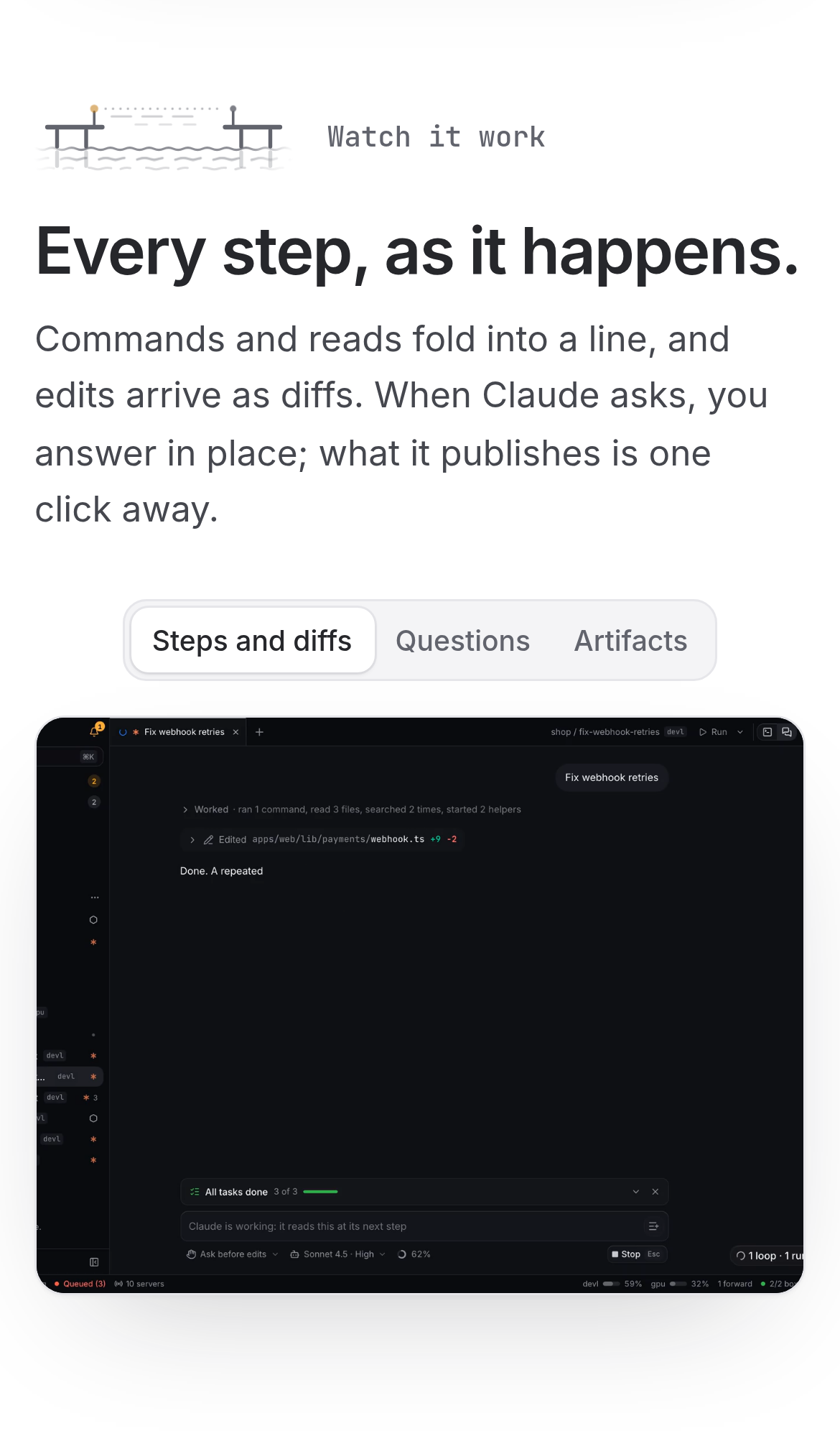
Try it: Open the home page on a phone sized viewport and scroll to the "Watch it work" section, then look at the left and right edges of the app mockup.
Probie fixes this for you.
This report came from one visit. When installed on your project, Probie watches real sessions, reproduces failures, and opens tested fixes as pull requests.
Sign up and get this fixedFree inspection
What should Probie inspect next?
Enter a project URL. There is nothing to install.
Probie checks every issue twice, respects robots.txt, and backs off at bot challenges.
Enter an address and we will email the report card link.