We found 6 issueson astrohelm.appworth fixing.
Watch the inspection.
We navigate your site the way customers would. Idle time is skipped.
How the composite score works
The overall score is a weighted average: Visual 18.75%, Accessibility 25%, Buttons and links 31.25%, Under the hood 12.5%, and Mobile 12.5%. Unassessed categories are excluded and the remaining weights are normalized.
Product categories start at 100. Each distinct verified finding deducts 30 points for a reproduced flow defect, or 18 for critical, 12 for high, 7 for medium, and 3 for low stored detector severity. Scores stop at zero and round to whole numbers. All verified findings count, including those beyond the displayed list. The formula is fixed and versioned, so the same saved evidence always receives the same score.
Docs give two different star counts for plate solving
Someone setting up a telescope in the dark needs one clear answer about when plate solving will work. The quick start guide at /docs/getting-started/quick-start/ says plate solving works best with at least 6 stars visible, while the plate solving page at /docs/features/plate-solving/ says AstroHelm requires at least 8 visible stars to produce a reliable solution and that fewer triggers a "Not Enough Stars" result. A user who follows the quick start number will think the app is failing when it is behaving as documented elsewhere.
Try it: Open /docs/getting-started/quick-start/ and read the Tip about star count, then open /docs/features/plate-solving/ and read the "Not Enough Stars" section.
Hero image makes first impression load slowly
The first thing visitors see on the home page of astrohelm.app is the app screenshot beside the headline, and it arrives as a 1,029 KB WebP file. The source image is 1536x2752 pixels while it only ever renders at 536x960 at a device pixel ratio of 1, so nearly all of those bytes are discarded on display. It also carries loading="lazy" even though it sits in the opening view, which delays the start of its download at the exact moment the project is making its case for the app.
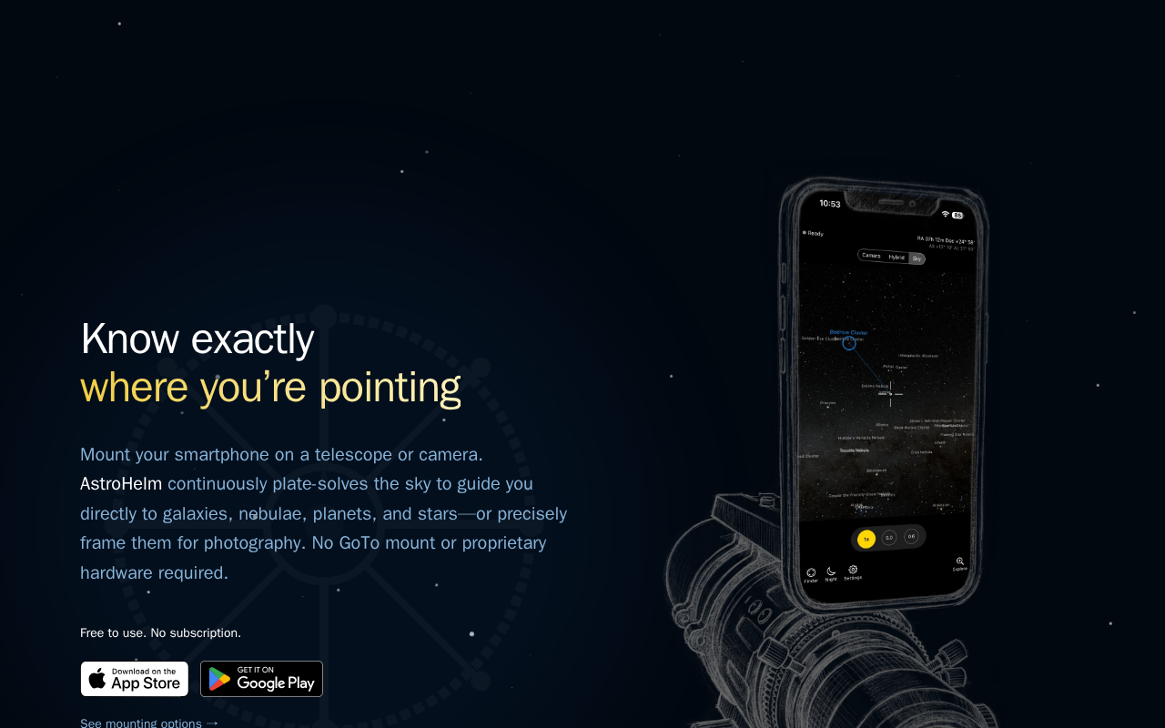
Try it: Open https://astrohelm.app/ on desktop with DevTools Network open and look at _astro/hero.4aq-D_io_wr2Dp.webp: roughly 1 MB transferred for an image painted at 536x960, with loading="lazy" on an above-the-fold element.
Shared links show no preview image for the app
Astronomers who share the AstroHelm link in messages or social posts see a bare text card with no app imagery, which makes the link easy to scroll past when someone is deciding whether the app is worth installing. The home page head declares an Open Graph title and description but no og:image and no twitter:card type, so preview surfaces have no artwork or card format to use. The page also declares no canonical URL, so duplicate address variants of the home page can be indexed separately.
Try it: Load https://astrohelm.app/ and view source, then search the head for "og:image", "twitter:card", and rel="canonical".
Missing security headers weaken browser protections
The response from https://astrohelm.app/ is missing Strict-Transport-Security, Content-Security-Policy, CSP frame-ancestors or X-Frame-Options, and Cross-Origin-Resource-Policy.
Try it: Run curl -I https://astrohelm.app/ and check the response headers for Strict-Transport-Security, Content-Security-Policy, X-Frame-Options, and Cross-Origin-Resource-Policy.
Safety warning in the docs is nearly unreadable
Readers following the mounting instructions can barely read the Caution box that warns them their pointing will be off, because the white body text sits on a pale yellow panel at a contrast of 1.18 to 1 where 4.5 to 1 is required. The search field placeholder on the same pages is at 2.19 to 1. The same color-contrast failures repeat across the documentation, including /docs/, /docs/getting-started/quick-start/, and /docs/support/, so people with low vision or on a bright screen lose the guidance that keeps their setup working.
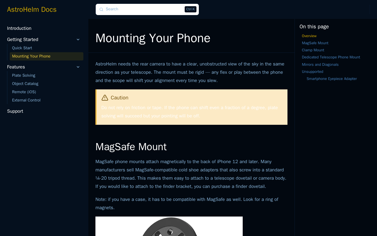
Try it: Open /docs/getting-started/mounting/ and read the yellow Caution box: the body text is white on pale yellow. Run axe-core on the page to see the color-contrast failures.
Phone readers cannot read the mounting warning
Visitors setting up their telescope mount on a phone hit a Caution box whose warning text is effectively invisible, so they can miss the advice that keeps their pointing accurate. On /docs/getting-started/mounting/ the callout paragraph beginning "Do not rely on friction or tape" renders in near white on the light cream callout background, while the "Caution" heading directly above it is dark brown and perfectly legible. The warning is the one part of the section that most needs to be read.
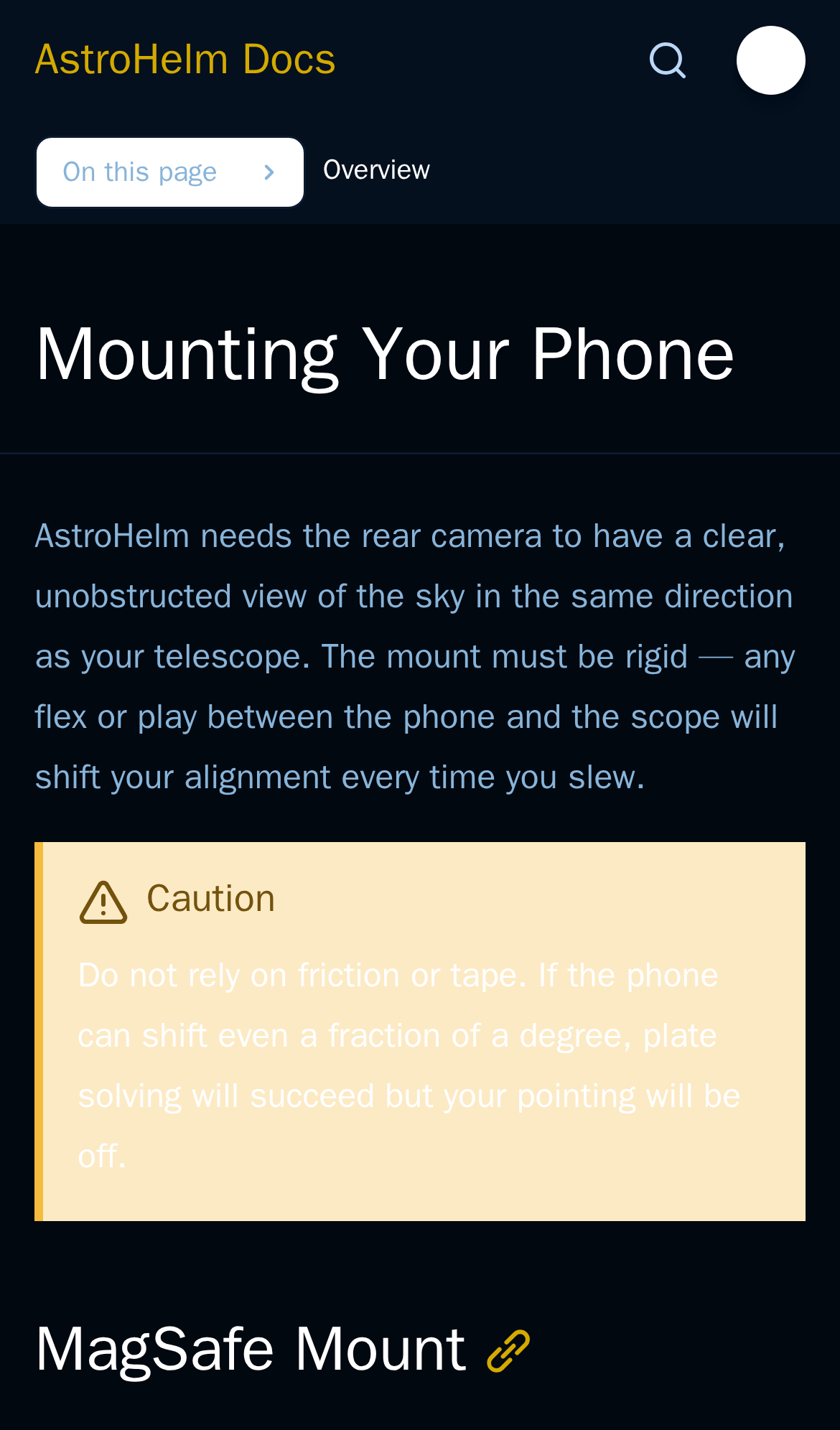
Try it: Open /docs/getting-started/mounting/ on a phone and look at the Caution callout under the intro paragraph: the body text is white on cream.
A rough edge in the layout
The two support cards place their header icons at different vertical offsets, with the mail icon sitting higher than the star icon so the card content does not align across siblings.
Probie fixes this for you.
This report came from one visit. When installed on your project, Probie watches real sessions, reproduces failures, and opens tested fixes as pull requests.
Sign up and get this fixedFree inspection
What should Probie inspect next?
Enter a project URL. There is nothing to install.
Probie checks every issue twice, respects robots.txt, and backs off at bot challenges.
Enter an address and we will email the report card link.