We found 5 issueson qodex.aiworth fixing.
Watch the inspection.
We navigate your site the way customers would. Idle time is skipped.
How the composite score works
The overall score is a weighted average: Visual 18.75%, Accessibility 25%, Buttons and links 31.25%, Under the hood 12.5%, and Mobile 12.5%. Unassessed categories are excluded and the remaining weights are normalized.
Product categories start at 100. Each distinct verified finding deducts 30 points for a reproduced flow defect, or 18 for critical, 12 for high, 7 for medium, and 3 for low stored detector severity. Scores stop at zero and round to whole numbers. All verified findings count, including those beyond the displayed list. The formula is fixed and versioned, so the same saved evidence always receives the same score.
Five response header protections are missing on the home page
The response from https://qodex.ai/ is missing Content-Security-Policy, CSP frame-ancestors or X-Frame-Options, X-Content-Type-Options: nosniff, Referrer-Policy, and Cross-Origin-Resource-Policy.
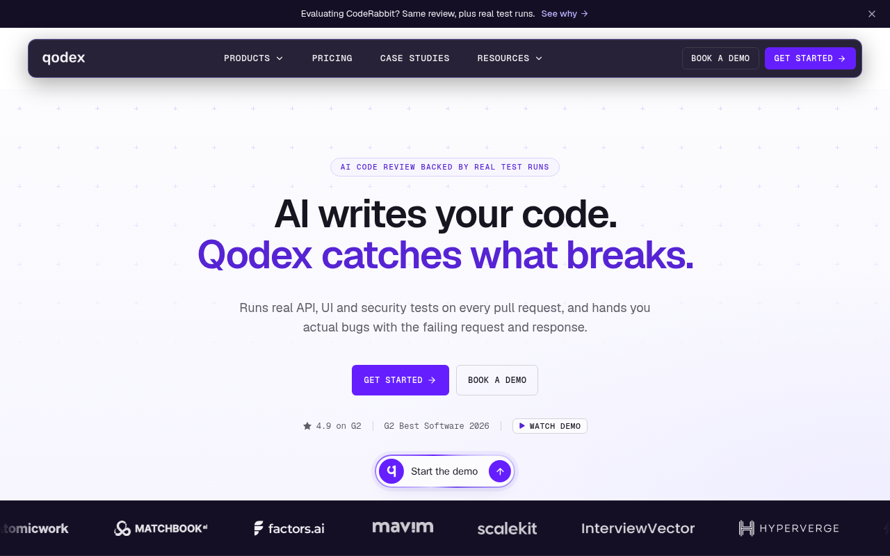
Try it: Run curl -I https://qodex.ai/ and check the response headers for Content-Security-Policy, X-Frame-Options, X-Content-Type-Options, Referrer-Policy, and Cross-Origin-Resource-Policy.
Low vision visitors cannot read demo panel labels
Visitors with low vision lose the small supporting labels in the product demo panel on the home page and on /book-a-demo, so details like "14 files", "commented just now", and the "bot" tag are hard to read while they judge what the product does. Those labels render in #6b6b6b on a #0f0f0f background at 9.5px to 12px, a contrast ratio of 3.59 to 1 where 4.5 to 1 is required for text that size. Eight further elements fail the same contrast check on these routes.
Try it: Open the home page, run axe-core or Lighthouse accessibility, and inspect the .epr-files and .epr-card-when labels: foreground #6b6b6b on #0f0f0f measures 3.59:1.
Phone visitors see the featured post image cut off
Phone visitors landing on the blog meet a featured post whose cover image spills past both sides of its card, so the logo and the article title in the artwork are sliced off on the left and the request and checks panel is cut at the right card edge. The image sits at a fixed width wider than the card instead of scaling to it, which is the first impression of the project's writing on a phone. The headline promise of the featured article is unreadable in the artwork before anyone scrolls.
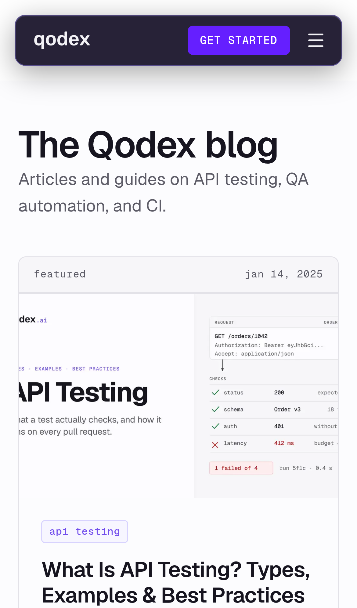
Try it: Open /blog on a phone or a 390px wide browser window and look at the featured card: the cover image is clipped at both card edges.
Terms page text runs into the screen edge
Visitors checking the legal terms before signing up read a page whose text is jammed against the left side of the screen. On /terms, the breadcrumb, the "Terms of Service" heading, every paragraph, and the bullet list all begin at x=0 with no margin, while the right side of the same column keeps normal space, so the heading's first letter touches the window border. The lopsided column makes an agreement page look unfinished at the moment a customer is deciding whether to trust the product.
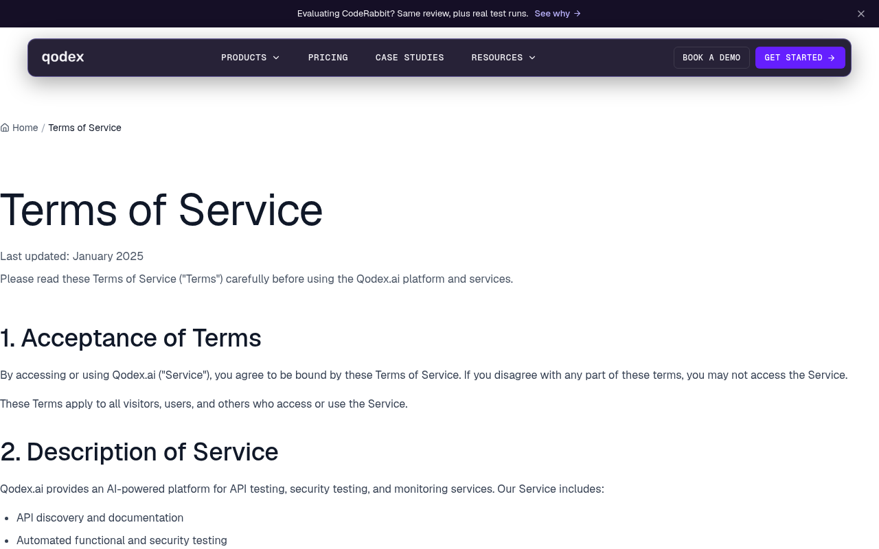
Try it: Open /terms on a 1280px wide desktop window and look at the left edge: the breadcrumb, heading, paragraphs, and bullets all start flush at x=0.
Privacy policy text runs edge to edge and is hard to read
Visitors checking how their data is handled meet a wall of text with no margins, which makes the policy hard to scan and looks unfinished next to the rest of the project. On /privacy the breadcrumb, the "Privacy" heading, the body paragraphs, and the bullet list all begin flush against the left edge of the window at x=0, and the intro paragraph stretches all the way to the right edge with the word "platform" touching the border. The inset header bar above it keeps normal side spacing, so the content column clearly lost its container padding.
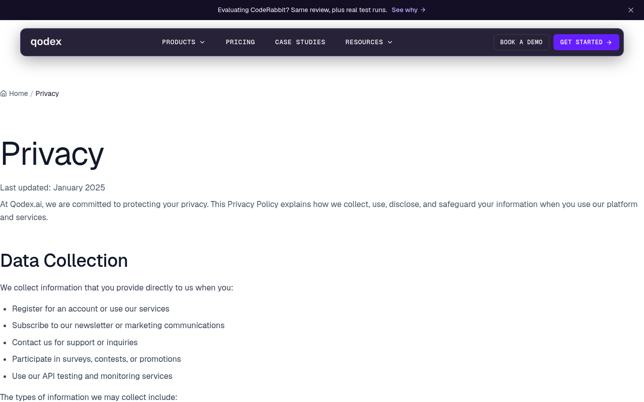
Try it: Open /privacy on a desktop browser at a wide window and look at the left and right edges: the heading, paragraphs, and bullets touch both edges with no gutter.
The "Startup" text sits awkwardly
The three pricing card headings are not aligned: "Startup" in the middle card sits roughly 42px lower than "Individual" and "Scale" because only the middle card carries a badge above its title, so pri
The "Automation Testing" text sits awkwardly
The active "Automation Testing" tab chip in the pricing toggle group overhangs the left edge of its container border and sits flush against its top and bottom, unlike the inset spacing of the other tw
Probie fixes this for you.
This report came from one visit. When installed on your project, Probie watches real sessions, reproduces failures, and opens tested fixes as pull requests.
Sign up and get this fixedFree inspection
What should Probie inspect next?
Enter a project URL. There is nothing to install.
Probie checks every issue twice, respects robots.txt, and backs off at bot challenges.
Enter an address and we will email the report card link.