We found 5 issueson convt.appworth fixing.
Watch the inspection.
We navigate your site the way customers would. Idle time is skipped.
How the composite score works
The overall score is a weighted average: Visual 18.75%, Accessibility 25%, Buttons and links 31.25%, Under the hood 12.5%, and Mobile 12.5%. Unassessed categories are excluded and the remaining weights are normalized.
Product categories start at 100. Each distinct verified finding deducts 30 points for a serious issue, including a reproduced flow defect or material pricing contradiction, or 18 for critical, 12 for high, 7 for medium, and 3 for low stored detector severity. Scores stop at zero and round to whole numbers. All verified findings count, including those beyond the displayed list. The formula is fixed and versioned, so the same saved evidence always receives the same score.
Phone visitors have to fight the page to read your content
Visitors who want to verify a download before installing it cannot see the checksums on a phone. On /download, the SHA-256 lines for the macOS, Windows, and Linux builds run straight past the right edge of their cards and off the screen instead of wrapping, and the Homebrew command is cut off the same way. The card borders themselves extend beyond the viewport, so the page scrolls sideways and the verification step a security-minded user came for is unusable.
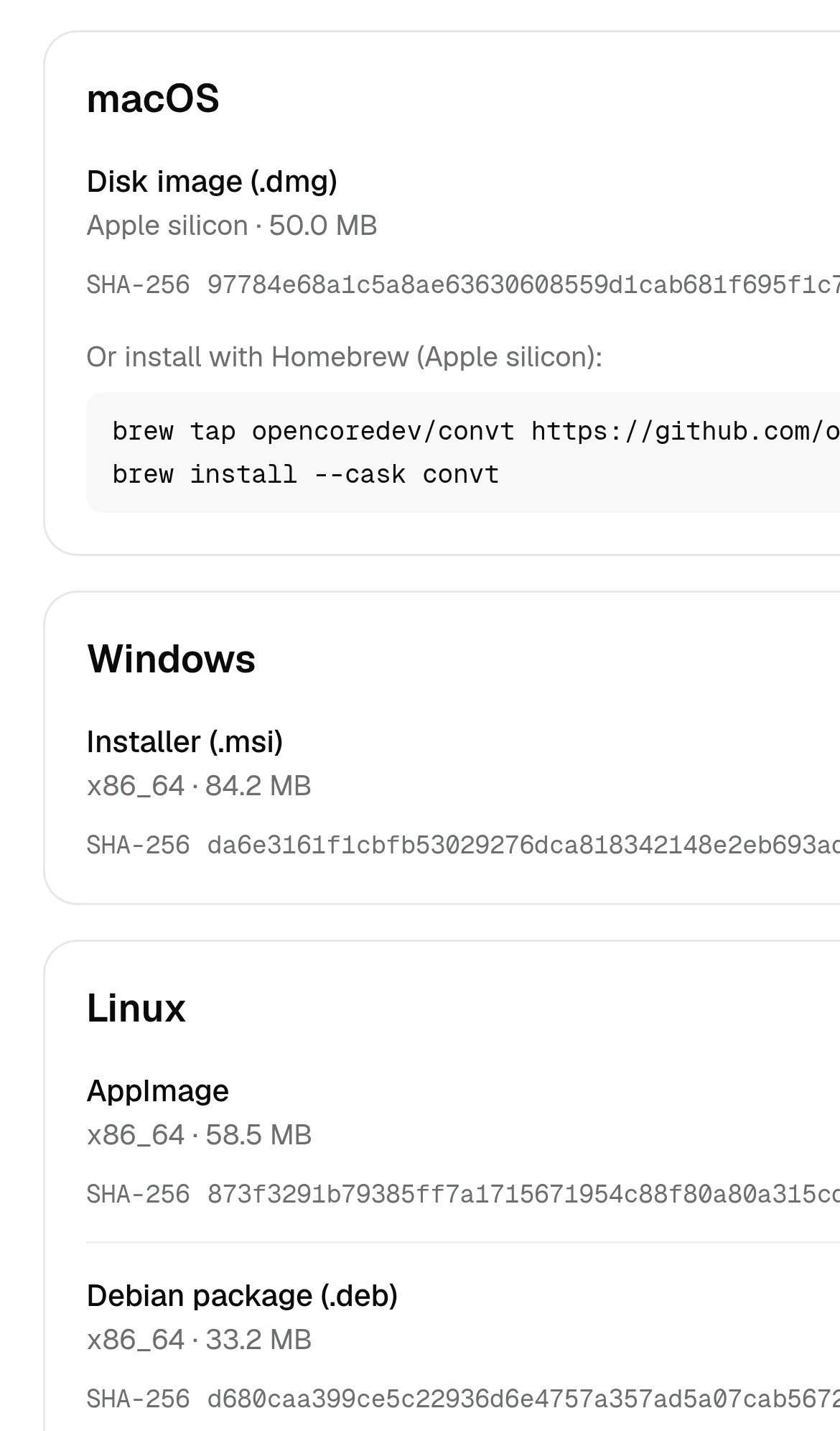
Try it: Open /download on a phone or a 390px wide browser window and try to read the macOS SHA-256 line; the hash and the brew command run off the right edge and the page scrolls sideways.
Phone visitors cannot read installer checksums
Visitors who want to verify a download before installing it cannot do so on a phone: on /download the SHA-256 checksum lines run past the right edge of each platform card and off the screen, cut mid-string. The Windows installer hash under "Installer (.msi)" is clipped after "da6e3161f1cbfb53029276dca818342148e2eb693a", and the macOS, AppImage, and Debian hashes plus the Homebrew tap command are cut the same way. Anyone who cares enough to check a checksum is left unable to confirm the file they are about to run.
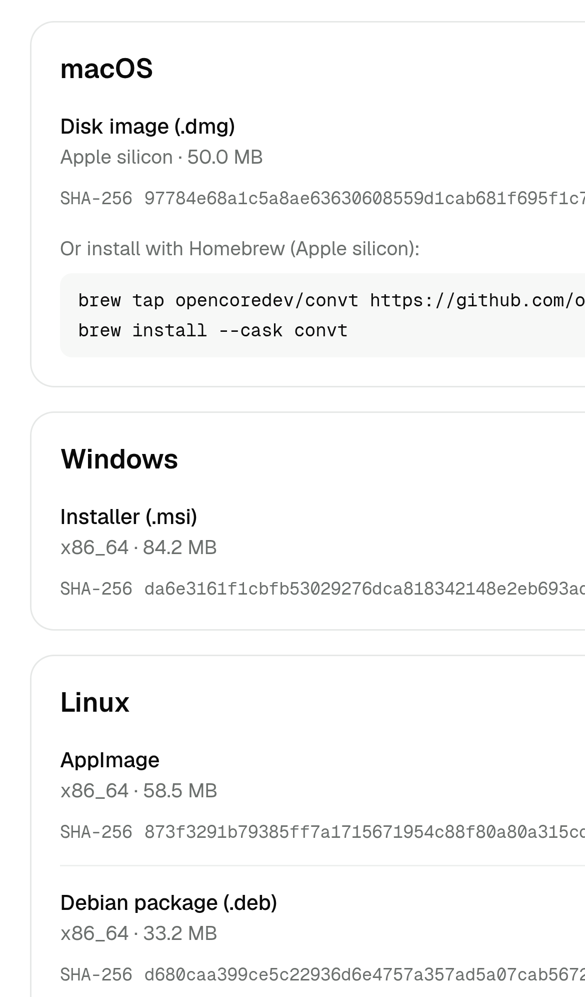
Try it: Open /download on a phone or a 390px-wide browser window and scroll to the Windows card, then try to read the full SHA-256 value.
Phone visitors have to fight the page to read your content
Visitors who want to verify a download before installing it cannot read the checksums on a phone. On /download, the SHA-256 lines for the Linux AppImage, the macOS disk image, the Windows installer, and the Debian package run straight past the right edge of their cards and off the viewport, and the Homebrew command block is cut off the same way. The page scrolls sideways instead of wrapping, so the full hash and the install command are never visible.
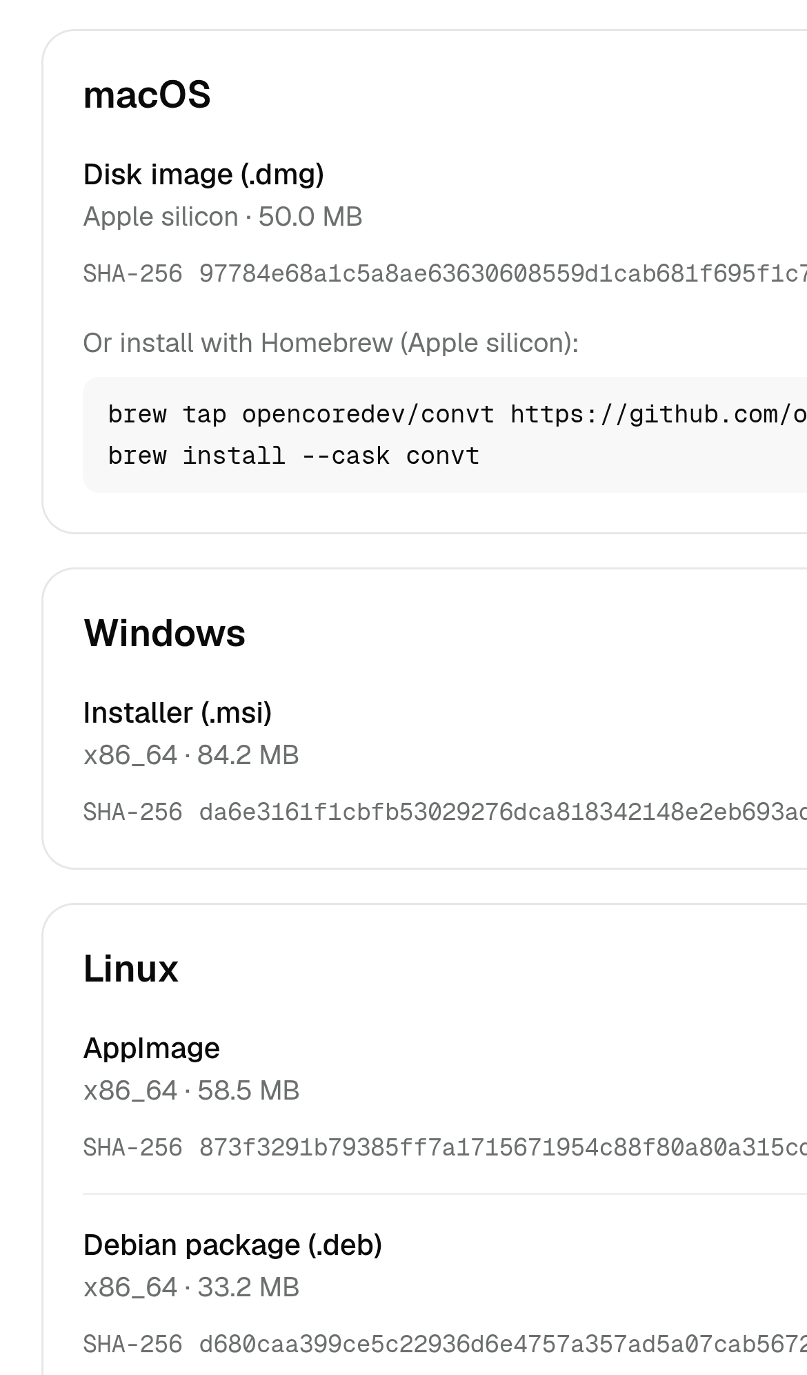
Try it: Open /download on a phone or a 390px wide browser window and look at the SHA-256 line under each package; the hash runs off the right edge and the page scrolls sideways.
Key browser protections are missing on the home page
The response from https://convt.app/ is missing Strict-Transport-Security, Content-Security-Policy, CSP frame-ancestors or X-Frame-Options, X-Content-Type-Options: nosniff, Referrer-Policy, and Cross-Origin-Resource-Policy.
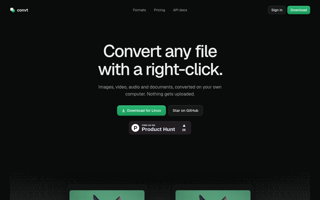
Try it: Run curl -I https://convt.app/ and check the response headers for Strict-Transport-Security, Content-Security-Policy, X-Frame-Options, X-Content-Type-Options, Referrer-Policy, and Cross-Origin-Resource-Policy.
Keyboard users cannot read the full Homebrew command
Visitors installing convt on macOS need the full Homebrew command, but the code block on /download clips it and scrolls sideways without keyboard access. That leaves part of the install instruction out of reach for those visitors.
Try it: Open /download, tab through the macOS card, and try to scroll the Homebrew code block horizontally with the keyboard alone.
A rough edge in the layout
The Dark/Light toggles in the three asset cards sit at different vertical offsets (y=226 in the Wordmark card versus y=217 and y=220 in the One-color mark and App icon cards), breaking the row's align
A rough edge in the layout
The Dark/Light toggle in the right logo card sits about 3px lower than the identical toggle in the left card, and the two cards' top edges are offset from each other.
A rough edge in the layout
The endpoint cards use inconsistent horizontal alignment: the POST badge and its title start about 20px further right than the GET badge and title in the adjacent card, so the method badges and endpoi
The "s, and the three cards" text sits awkwardly
The bottom row cards are vertically offset from each other: the Wordmark card's title/body/button block starts about 8px lower than the One-color mark card's, and the three cards' Copy/Save button row
A rough edge in the layout
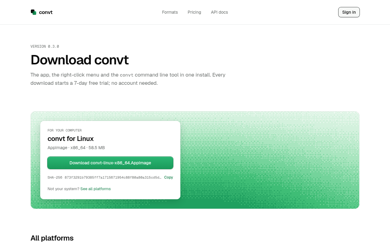
The SHA-256 checksum string in the download card is truncated with an ellipsis before the Copy link, so the hash cannot be read in full.
Probie fixes this for you.
Stop customers hitting the same friction. Connect your codebase and Probie reproduces these failures, tests the fix, and opens a pull request for your review.
Sign up and get this fixedFree inspection
What should Probie inspect next?
Enter a project URL. There is nothing to install.
Probie checks every issue twice, respects robots.txt, and backs off at bot challenges.
Enter an address and we will email the report card link.