We found 3 issueson opper.aiworth fixing.
Watch the inspection.
We navigate your site the way customers would. Idle time is skipped.
How the composite score works
The overall score is a weighted average: Visual 18.75%, Accessibility 25%, Buttons and links 31.25%, Under the hood 12.5%, and Mobile 12.5%. Unassessed categories are excluded and the remaining weights are normalized.
Product categories start at 100. Each distinct verified finding deducts 30 points for a serious issue, including a reproduced flow defect or material pricing contradiction, or 18 for critical, 12 for high, 7 for medium, and 3 for low stored detector severity. Scores stop at zero and round to whole numbers. All verified findings count, including those beyond the displayed list. The formula is fixed and versioned, so the same saved evidence always receives the same score.
Home page is missing a cross-origin resource header
The response from https://opper.ai/ is missing Cross-Origin-Resource-Policy.

Try it: Run curl -I https://opper.ai/ and check the response headers for Cross-Origin-Resource-Policy.
Hard-to-read text gets in the way of a customer's decision
Visitors comparing model cards on the home page rely on the provider line to see where each model runs, and the "+3 more" style counts that complete it are hard to read for anyone with reduced vision. Those counters on the Claude Opus 5.5, GPT-6 Sol and Gemini 3.8 Flash cards render at 12px in #ababab on white, a contrast ratio of 2.29:1 against the 4.5:1 required by WCAG 2 AA. The information about additional hosting regions is effectively lost for part of the audience.
Try it: Open the home page, look at the model cards under the hero, and check the "+3 more" text next to the provider line against a contrast checker.
A broken layout undermines confidence in your product
Phone visitors reading the home page hit a tall stretch of empty white between the customer logo row and the "Apps" section, which makes the page feel unfinished and invites them to stop scrolling before the product story continues. The gap is roughly 445 pixels of blank viewport at the mobile home page, sitting directly under the evroc and getTest logos and above the "Apps" pill. It appears the same way on repeat loads, so it is part of the layout rather than a loading hiccup.
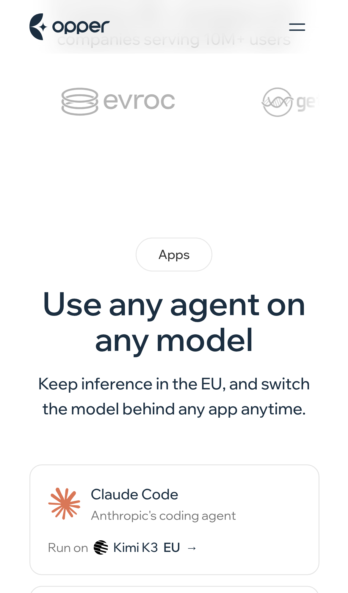
Try it: Open the home page on a phone and scroll to the customer logo strip, then watch the blank space between those logos and the "Apps" section.
Probie fixes this for you.
Stop customers hitting the same friction. Connect your codebase and Probie reproduces these failures, tests the fix, and opens a pull request for your review.
Sign up and get this fixedFree inspection
What should Probie inspect next?
Enter a project URL. There is nothing to install.
Probie checks every issue twice, respects robots.txt, and backs off at bot challenges.
Enter an address and we will email the report card link.