We found 3 issueson tein.aiworth fixing.
Watch the inspection.
We navigate your site the way customers would. Idle time is skipped.
How the composite score works
The overall score is a weighted average: Visual 18.75%, Accessibility 25%, Buttons and links 31.25%, Under the hood 12.5%, and Mobile 12.5%. Unassessed categories are excluded and the remaining weights are normalized.
Product categories start at 100. Each distinct verified finding deducts 30 points for a serious issue, including a reproduced flow defect or material pricing contradiction, or 18 for critical, 12 for high, 7 for medium, and 3 for low stored detector severity. Scores stop at zero and round to whole numbers. All verified findings count, including those beyond the displayed list. The formula is fixed and versioned, so the same saved evidence always receives the same score.
Search results cannot tell the project's pages apart
Visitors who find the project through search or share a link see the same label for every page, so they cannot tell docs from pricing or support. Five routes on tein.ai, /, /docs, /support, /pricing and /dashboard, all carry the identical title "Join the Tein waitlist". Someone comparing tabs or scanning results has no way to pick the page that answers their question.
Try it: Open /, /docs, /support, /pricing and /dashboard in separate tabs and read the browser tab labels: all five read "Join the Tein waitlist".
Waitlist page ships without standard browser protections
The response from https://tein.ai/ is missing Strict-Transport-Security, Content-Security-Policy, CSP frame-ancestors or X-Frame-Options, X-Content-Type-Options: nosniff, Referrer-Policy, and Cross-Origin-Resource-Policy.
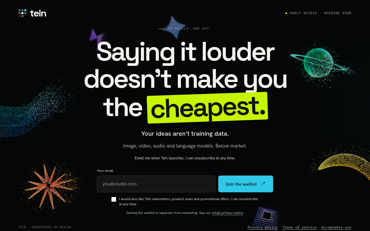
Try it: Run curl -I https://tein.ai/ and check the response headers for Strict-Transport-Security, Content-Security-Policy, X-Frame-Options, X-Content-Type-Options, Referrer-Policy, and Cross-Origin-Resource-Policy.
A broken layout undermines confidence in your product
The first thing a visitor reads above the headline is the one line that states what Tein is, and on the landing page it is barely legible. The small gray eyebrow text at the top of the hero sits directly on top of the bright blue particle starburst, so its opening characters blend into the speckled artwork. Visitors scanning the page for what the product does lose that line before they reach the headline.
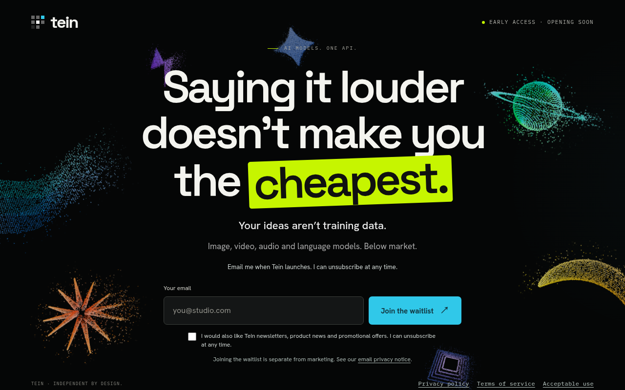
Try it: Open the landing page on a desktop browser at 1280 wide and look at the small uppercase line just above the headline, where it crosses the blue starburst graphic.
The "Acceptable use" text sits awkwardly
The footer link row wraps "Acceptable use" onto a second line far below the first two links, leaving a large gap between footer link rows while free horizontal space remains to the right of "Terms of
Probie fixes this for you.
Stop customers hitting the same friction. Connect your codebase and Probie reproduces these failures, tests the fix, and opens a pull request for your review.
Sign up and get this fixedFree inspection
What should Probie inspect next?
Enter a project URL. There is nothing to install.
Probie checks every issue twice, respects robots.txt, and backs off at bot challenges.
Enter an address and we will email the report card link.