We found 6 issueson 3dsolarsystem.onlineworth fixing.
Watch the inspection.
We navigate your site the way customers would. Idle time is skipped.
How the composite score works
The overall score is a weighted average: Visual 18.75%, Accessibility 25%, Buttons and links 31.25%, Under the hood 12.5%, and Mobile 12.5%. Unassessed categories are excluded and the remaining weights are normalized.
Product categories start at 100. Each distinct verified finding deducts 30 points for a serious issue, including a reproduced flow defect or material pricing contradiction, or 18 for critical, 12 for high, 7 for medium, and 3 for low stored detector severity. Scores stop at zero and round to whole numbers. All verified findings count, including those beyond the displayed list. The formula is fixed and versioned, so the same saved evidence always receives the same score.
An aurora FAQ question took 6.2 seconds to open on a phone
On /aurora/ on a phone, tapping an FAQ question (the details summary in the FAQ section) took 6184 ms to paint a response. Google rates anything over 500 ms as poor. On a second load the delay did not repeat, so it seems to depend on what the page is doing when the visitor taps.
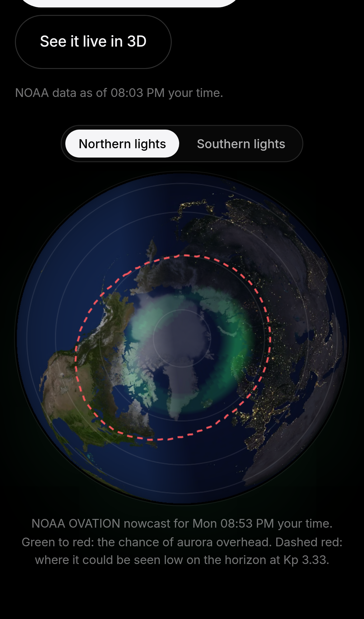
Try it: Open /aurora/ on a phone or in a mobile emulator with CPU throttling and tap an FAQ question while the aurora map and NOAA data are still loading. Then check the Interaction to Next Paint in the Performance panel.
The distance table's fifth column is cut off on phones
On /distance/ at a 390px phone width, the "From Earth, right now" table is wider than its container. Its fifth column is clipped partway through each character, so the header and the date values in every row show only fragments like "3 / 2(" and "28 / O(". Body, distance, light time and direction stay readable, but on a phone that column shows only these fragments, with nothing to suggest it continues.
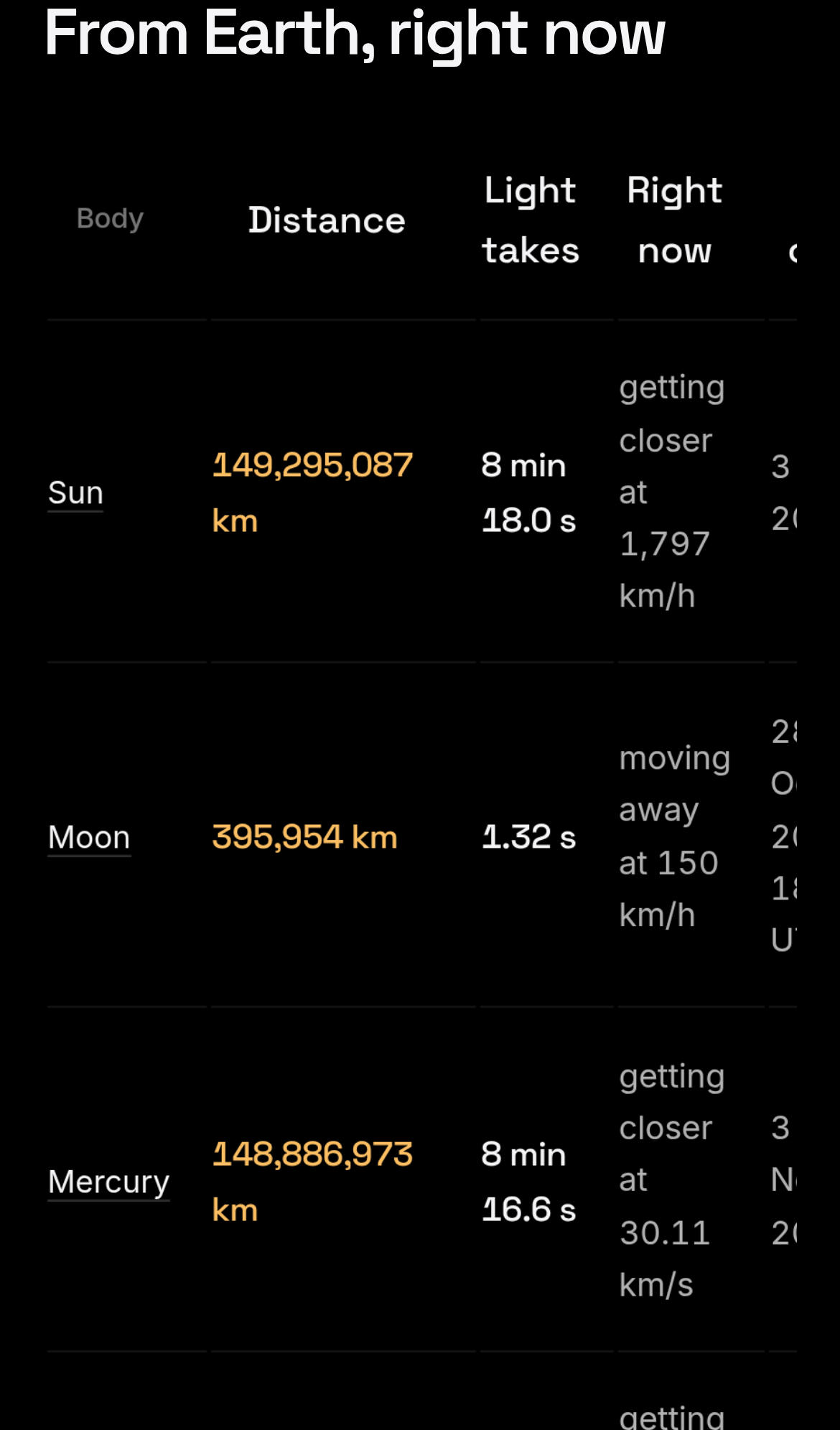
Try it: Open /distance/ on a phone or a 390px-wide emulator and scroll to the "From Earth, right now" table. The rightmost column shows only partial characters.
The phone distance table cuts off its date column mid-character
On a 390px-wide phone, the /distance/ table's fifth column is cut off about 20px before the right edge of the screen. Each date shows only fragments such as "25 O( 2(" and "20 Fe 2(" for Venus, Mars, Jupiter and Saturn. The distance, light-time and speed columns stay readable.
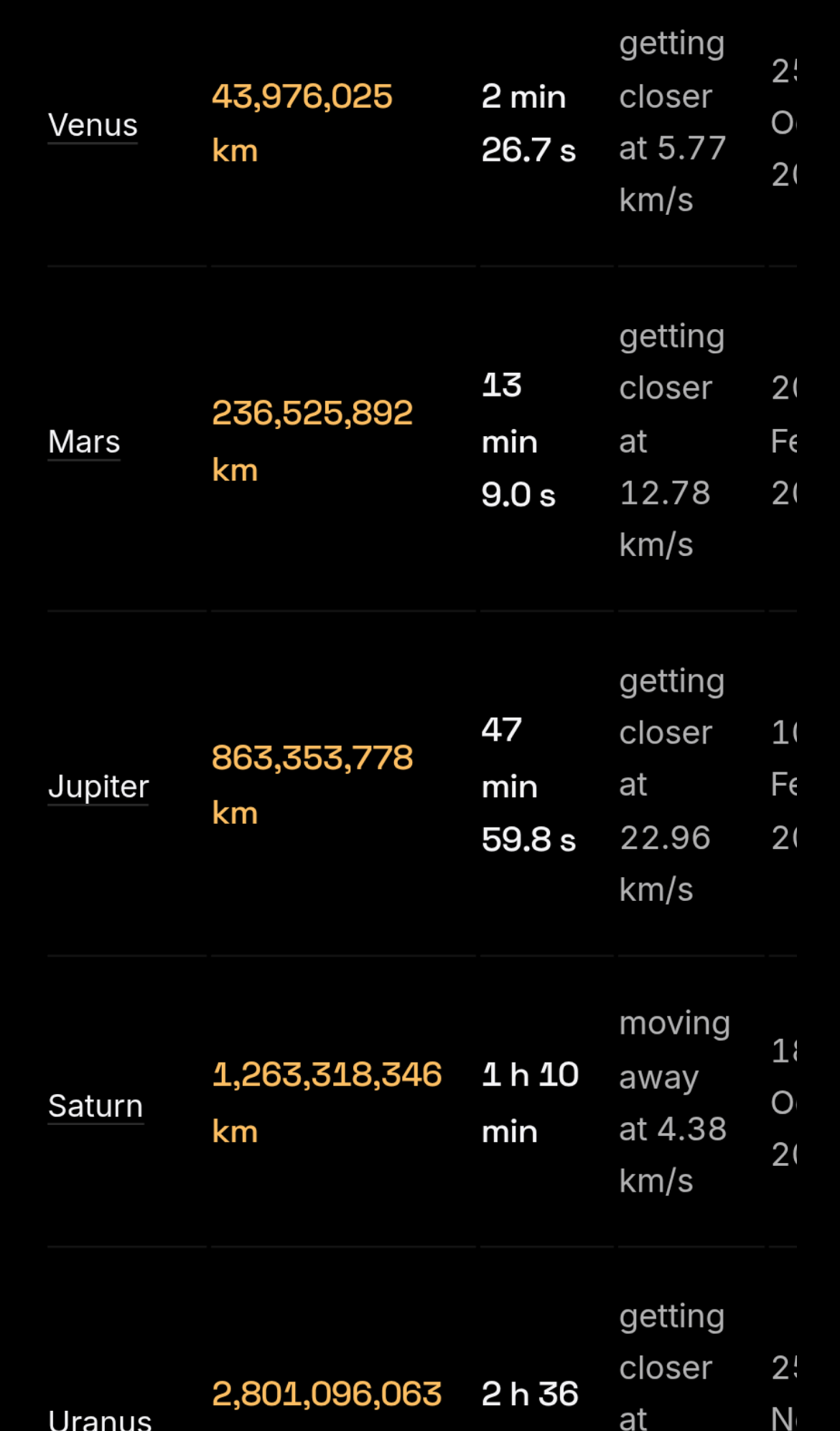
Try it: Open /distance/ on a 390px-wide phone and scroll to the planet table. The last column shows only partial characters of each date.
The home page is missing three security response headers
The response from https://3dsolarsystem.online/ is missing Content-Security-Policy, CSP frame-ancestors or X-Frame-Options, and Cross-Origin-Resource-Policy.
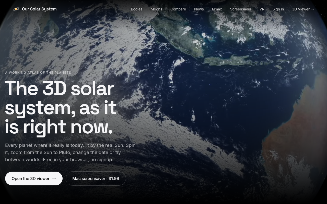
Try it: Run curl -I https://3dsolarsystem.online/ and check the output. There is no Content-Security-Policy, X-Frame-Options or Cross-Origin-Resource-Policy header.
Hard-to-read text gets in the way of a customer's decision
On the home page, the "Light: 8 min 18.0 s" captions in the distance-from-Earth panel are #696969 text on a #030303 background at about 12.5px. That gives a contrast ratio of 3.75:1, below the 4.5:1 that WCAG AA requires for text this size. The distances themselves and the calls to action are unaffected.
Try it: Open / and scroll to "Distance from Earth right now". Check the "Light:" captions with a contrast checker and confirm they measure 3.75:1.
A broken layout undermines confidence in your product
On /eclipses/ at phone width, a band about 155 CSS px tall sits under the next-eclipse countdown with only a thin divider line in it. The explainer paragraph and the Coming up list render normally below it. The gap shows on every load at the same spot.
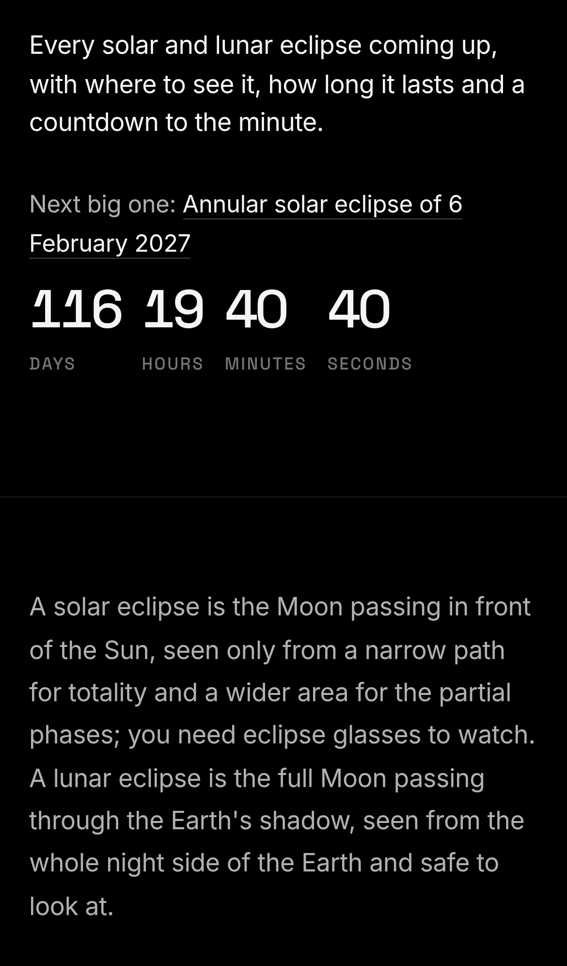
Try it: Open /eclipses/ on a 390px wide phone and scroll past the countdown. Check the empty space above and below the divider line.
The "Right now" text sits awkwardly
The 'Right now' column is squeezed into a very narrow width on mobile, so short phrases wrap to one or two words per line and each table row grows very tall.
A rough edge in the layout
The Mars vs Earth card excerpt ends in an ellipsis that wraps onto its own line. This leaves an orphaned line and uneven card spacing compared to the Jupiter vs Saturn card, where the ellipsis stays i
Probie fixes this for you.
Stop customers hitting the same friction. Connect your codebase and Probie reproduces these failures, tests the fix, and opens a pull request for your review.
Sign up and get this fixedFree inspection
What should Probie inspect next?
Enter a project URL. There is nothing to install.
Probie checks every issue twice, respects robots.txt, and backs off at bot challenges.
Enter an address and we will email the report card link.